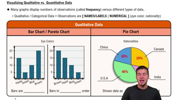
What are the main types of charts used to visualize qualitative (categorical) data, and how do they represent information?
The main types of charts for qualitative data are bar charts and pie charts. Bar charts display the frequency of each category using the height of bars, while pie charts show the percentage or proportion of each category as slices of a whole.
How do histograms and frequency polygons differ from bar charts when visualizing quantitative data?
Histograms and frequency polygons are used for quantitative (numerical) data, with histograms displaying frequencies using adjacent bars for continuous intervals, and frequency polygons connecting plotted points with lines. In contrast, bar charts are for categorical data and have separated bars.
What is a stem plot (stem-and-leaf plot), and what advantage does it offer when visualizing quantitative data?
A stem plot, or stem-and-leaf plot, organizes quantitative data by splitting each value into a 'stem' (e.g., tens digit) and a 'leaf' (e.g., ones digit), allowing you to see the distribution and actual data values, making it easy to identify common values and reconstruct the original dataset.
What type of data do bar charts and pie charts visualize, and how do they differ in representing information?
Bar charts and pie charts visualize qualitative (categorical) data; bar charts use the height of bars to show frequency, while pie charts use slices to show percentages or proportions.
How can you distinguish a histogram from a bar chart based on the appearance of their bars?
In a histogram, the bars are adjacent and touch each other because they represent continuous numerical intervals, while in a bar chart, the bars are separated to represent different categories.
What is a Pareto chart, and how does it differ from a regular bar chart?
A Pareto chart is a special type of bar chart where the bars are arranged in descending order of frequency, making it easier to identify the most significant categories.
What kind of data is best visualized using histograms and frequency polygons, and how do these two charts differ?
Histograms and frequency polygons are best for quantitative (numerical) data; histograms use adjacent bars to show frequency, while frequency polygons connect plotted points with lines.
How does a stem-and-leaf plot organize quantitative data, and what unique advantage does it offer?
A stem-and-leaf plot splits each value into a 'stem' (e.g., tens digit) and a 'leaf' (e.g., ones digit), allowing you to see both the distribution and the actual data values, making it possible to reconstruct the original dataset.
Why are pie charts particularly useful for displaying categorical data?
Pie charts are useful because they show the percentage or proportion of each category as a slice of a whole, making it easy to compare parts to the total.
What is the main purpose of using data visualization tools like charts and graphs in statistics?
The main purpose is to interpret and analyze data more effectively by revealing patterns, trends, and distributions that may not be obvious from raw data alone.
 Back
Back


 04:39
04:39