 Indietro
Introductory Statistics: Histograms and Related Concepts

 05:54
05:54
Termini in questo insieme (20)
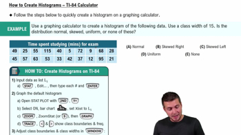
A histogram is a graphical representation of data using bars to show the frequency of data intervals or bins.
Bins are intervals that divide the range of data into equal or meaningful segments to group data points for frequency counting.
The height of each bar represents the frequency or count of data points within that bin.
A histogram displays data distribution with adjacent bars for continuous data, while a bar chart shows categorical data with separated bars.
To visualize the distribution, shape, and spread of a dataset, including identifying skewness and modality.
A symmetric histogram shows data evenly distributed around the center, with similar shapes on both sides.
Skewness describes the asymmetry of the data distribution; right skew means a longer tail on the right, left skew means a longer tail on the left.
Modality refers to the number of peaks or modes in the data distribution, such as unimodal, bimodal, or multimodal.
Outliers appear as bars separated from the main distribution or as bars with very low frequency at extreme values.
Increasing bins provides more detail but may cause noise; too few bins can oversimplify the data.
Decreasing bins smooths the data distribution but may hide important features or patterns.
Relative frequency histograms show the proportion of data in each bin instead of raw counts.
A cumulative histogram shows the cumulative frequency up to each bin, illustrating how data accumulates.
Labels clarify what data and frequencies are represented, aiding interpretation and communication.
Continuous numerical data or large discrete data sets are best visualized with histograms.
A frequency polygon connects midpoints of histogram bars with lines, showing distribution shape more smoothly.
A flat histogram suggests a uniform distribution where all intervals have roughly equal frequency.
The x-axis represents the data intervals or bins into which the data is grouped.
The y-axis shows the frequency or count of data points in each bin.
Histograms reveal data distribution shape, guiding the choice of parametric or non-parametric methods.