 Indietro
Introductory Statistics Key Concepts
 04:24
04:24

Termini in questo insieme (20)
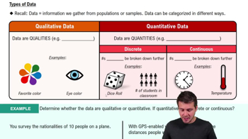
Data are values collected for analysis, representing information about variables or characteristics.
Data are classified as categorical (qualitative) or numerical (quantitative).
Categorical data represent categories or groups, such as colors or types.
Numerical data represent measurable quantities, like height or temperature.
To summarize and display data clearly using tables, bar charts, or pie charts.
Using histograms, dot plots, or stem-and-leaf plots to show distribution shape and spread.
By describing center, spread, shape, and identifying outliers.
Bar charts and pie charts are commonly used for categorical data visualization.
By reporting counts or percentages for each category.
The empirical rule states that for a symmetric, bell-shaped distribution, about 68%, 95%, and 99.7% of data fall within 1, 2, and 3 standard deviations of the mean.
A z-score measures how many standard deviations a data point is from the mean, calculated as \(z=\frac{x-\mu}{\sigma}\).
Use the mean and standard deviation as measures of center and spread.
Use the median and interquartile range (IQR) to describe center and spread.
The mean is affected by extreme values, while the median better represents the center in skewed distributions.
A boxplot displays the median, quartiles, and potential outliers of a numerical distribution.
Quartiles divide data into four equal parts; Q1 is the 25th percentile, Q2 the median, and Q3 the 75th percentile.
The IQR is the range between Q3 and Q1, measuring the middle 50% spread of the data.
Outliers are values below Q1 - 1.5×IQR or above Q3 + 1.5×IQR.
Careful data collection helps determine if relationships between variables are causal or just associations.
Graphs help reveal patterns, trends, and anomalies in data for better understanding and decision-making.