 Indietro
Visualizing Qualitative vs. Quantitative Data
 04:39
04:39
Termini in questo insieme (15)
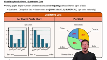
Qualitative data consists of observations that are names or labels, such as eye colors or nationalities.
Bar charts and pie charts are commonly used to visualize qualitative data.
A bar chart displays the frequency of observations on the y-axis, with categories on the x-axis; the height of each bar shows the number of observations.
A Pareto chart is a bar chart with bars arranged in descending order to highlight the most significant categories.
A pie chart shows data as percentages of a whole, with each slice size corresponding to its proportion of the total.
Quantitative data involves numerical observations, such as test scores or heights.
Histograms, frequency polygons, and stem plots are important visualizations for quantitative data.
A histogram is for quantitative data with bars touching to indicate continuity, and the x-axis shows numerical ranges or classes.
A frequency polygon is a line graph connecting points at the midpoints of class intervals, representing the same data as a histogram.
A stem plot separates the leftmost digits (stem) from the rightmost digits (leaf) to organize data while retaining actual values.
Bars in a histogram touch to indicate the continuity of quantitative data ranges.
The height of a bar in a bar chart indicates the number of observations in that category.
Each slice in a pie chart represents the proportion of a category relative to the whole.
By connecting midpoints of class intervals with lines, a frequency polygon offers a clear and streamlined visual of data distribution.
A stem plot retains the actual data values while providing a quick visual summary.