Ch. 2 - Descriptive Statistics
Larson - Elementary Statistics: Picturing the World 8th Edition
Larson8th EditionElementary Statistics: Picturing the WorldISBN: 9780137493470Non è quello che usi tu?Cambia libro di testo
Capitolo 2, Problema 2.T.5

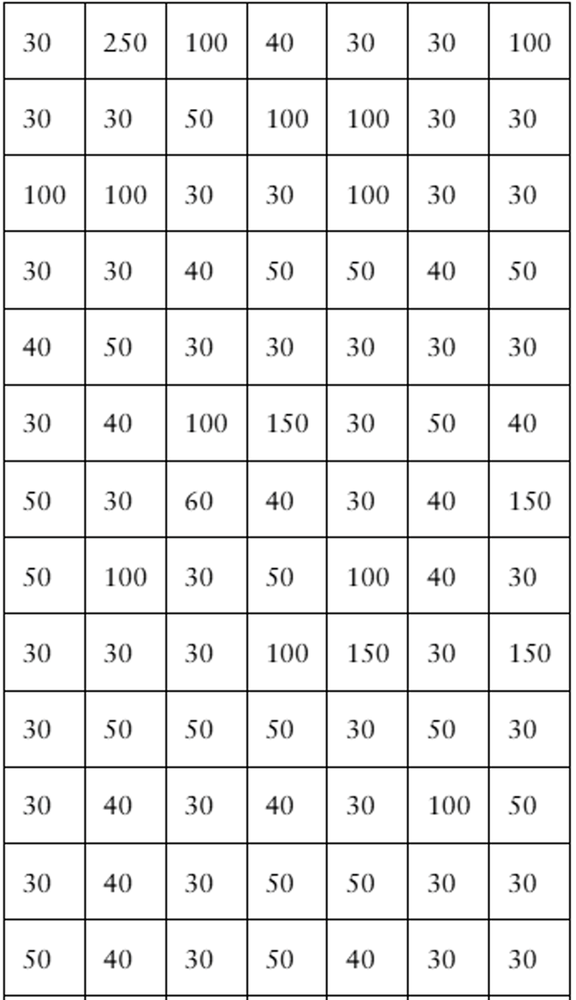
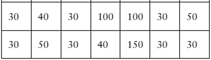
"According to data from the city of Toronto, Ontario, Canada, there were nearly 112,000 parking infractions in the city for December 2020, with fines totaling over 5,500,000 Canadian dollars. The fines (in Canadian dollars) for a random sample of 105 parking infractions in Toronto, Ontario, Canada, for December 2020 are listed below. (Source: City of Toronto)


Table displaying fines for 105 parking infractions in Toronto, with values ranging from 30 to 250 Canadian dollars.
Table displaying a dataset of parking fines in Toronto, with values ranging from 30 to 150 Canadian dollars.
In Exercises 1–5, use technology. If possible, print your results.


Draw a histogram for the data. Does the distribution appear to be bell-shaped?"

Guida verificata passo dopo passo
1
Step 1: Organize the data into intervals (bins). For example, you can group the fines into intervals such as 30-50, 51-100, 101-150, and so on. This helps in creating a histogram.
Step 2: Count the frequency of fines within each interval. For instance, count how many fines fall within the range of 30-50, 51-100, etc.
Step 3: Use technology or graphing software to plot the histogram. On the x-axis, represent the intervals (bins), and on the y-axis, represent the frequency of fines within each interval.
Step 4: Analyze the shape of the histogram. Check if the distribution appears symmetric and bell-shaped, or if it is skewed to the left or right.
Step 5: Interpret the results. If the histogram is bell-shaped, it suggests that the data follows a normal distribution. If not, describe the observed pattern (e.g., skewness or uniformity).

Risposta video verificata per un problema simile:

Questa soluzione video è stata consigliata dai nostri tutor come utile per risolvere questo problema.
Durata del video:
2m

Concetti chiave

Ecco i concetti essenziali che devi comprendere per rispondere correttamente alla domanda.

Histogram

A histogram is a graphical representation of the distribution of numerical data. It consists of bars that represent the frequency of data points within specified ranges, known as bins. The height of each bar indicates how many data points fall within that range, allowing for a visual assessment of the data's distribution shape, such as normal, skewed, or uniform.
Video consigliato:
Percorso guidato
05:54
Intro to Histograms

Distribution Shape

The shape of a distribution refers to the way data points are spread across different values. Common shapes include bell-shaped (normal distribution), skewed (left or right), and uniform. Understanding the distribution shape is crucial for statistical analysis, as it influences the choice of statistical tests and the interpretation of results.
Video consigliato:
Percorso guidato
06:06
Uniform Distribution

Bell-Shaped Distribution

A bell-shaped distribution, also known as a normal distribution, is characterized by its symmetric shape, where most data points cluster around a central peak and taper off equally on both sides. This shape is significant in statistics because many statistical methods assume normality, making it essential to identify whether a dataset follows this pattern for accurate analysis.
Video consigliato:
Percorso guidato
06:53
Sampling Distribution of Sample Mean