Ch. 2 - Descriptive Statistics
Larson - Elementary Statistics: Picturing the World 8th Edition
Larson8th EditionElementary Statistics: Picturing the WorldISBN: 9780137493470Non è quello che usi tu?Cambia libro di testo
Capitolo 2, Problema 2.1.35

Constructing a Frequency Distribution and a Frequency Polygon In Exercises 35 and 36, construct a frequency distribution and a frequency polygon for the data set using the indicated number of classes. Describe any patterns.
Ages of the Presidents Number of classes: 7 Data set: Ages of the U.S. presidents at Inauguration (Source: The White House) 57 61 57 57 58 57 61 54 68 51 49 64 50 48 65 52 56 46 54 49 51 47 55 55 54 42 51 56 55 51 54 51 60 62 43 55 56 61 52 69 64 46 54 47 70 78

Guida verificata passo dopo passo
1
Step 1: Organize the data by listing all the ages of the U.S. presidents at inauguration. Identify the minimum and maximum ages in the data set to determine the range. The range is calculated as \(\text{Range} = \text{Maximum age} - \text{Minimum age}\).
Step 2: Determine the class width for the frequency distribution. Since the number of classes is given as 7, calculate the class width using the formula \(\text{Class width} = \frac{\text{Range}}{\text{Number of classes}}\). Round up the class width to a convenient number if necessary to cover the entire range.
Step 3: Construct the frequency distribution table by creating 7 classes starting from the minimum age, each with the calculated class width. For each class interval, count how many ages fall within that interval to find the frequency.
Step 4: To create the frequency polygon, first find the midpoints of each class interval. The midpoint of a class is calculated as \(\text{Midpoint} = \frac{\text{Lower class limit} + \text{Upper class limit}}{2}\). Plot these midpoints on the x-axis against their corresponding frequencies on the y-axis.
Step 5: Connect the plotted points with straight lines to form the frequency polygon. Finally, analyze the shape of the frequency polygon to describe any patterns such as symmetry, skewness, or peaks in the distribution.

Risposta video verificata per un problema simile:

Questa soluzione video è stata consigliata dai nostri tutor come utile per risolvere questo problema.
Durata del video:
9m

Concetti chiave

Ecco i concetti essenziali che devi comprendere per rispondere correttamente alla domanda.

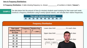
Frequency Distribution

A frequency distribution organizes data into classes or intervals and shows how many data points fall into each class. It helps summarize large data sets by grouping values, making patterns easier to identify. For example, grouping ages into ranges and counting how many presidents fall into each range.
Video consigliato:
Percorso guidato
06:38
Intro to Frequency Distributions

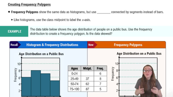
Frequency Polygon

A frequency polygon is a graphical representation of a frequency distribution, created by plotting class midpoints against their frequencies and connecting the points with straight lines. It helps visualize the shape and trends of the data, such as peaks or gaps, and is useful for comparing distributions.
Video consigliato:
Percorso guidato
04:41
Creating Frequency Polygons

Class Intervals and Number of Classes

Class intervals divide the data range into equal segments, and the number of classes determines how many intervals to create. Choosing an appropriate number of classes (here, 7) balances detail and clarity, avoiding too many or too few groups, which affects the accuracy and readability of the frequency distribution and polygon.
Video consigliato:
Percorso guidato
09:00
Prediction Intervals
Pratica correlata
Domanda del libro di testo

Grades In Exercise 46, one of the student’s B grades gets changed to an A. What is the student’s new grade point average?

133
views

Domanda del libro di testo

Graphical Analysis In Exercises 59 and 60, the letters A, B, and C are marked on the horizontal axis. Describe the shape of the data. Then determine which is the mean, which is the median, and which is the mode. Justify your answers.


" style="" width="270">

80
views
Domanda del libro di testo

Building Basic Skills and Vocabulary


Describe the relationship between quartiles and percentiles.

101
views
Domanda del libro di testo

Graphing Data Sets In Exercises 17–32, organize the data using the indicated type of graph. Describe any patterns.


Life Spans of Houseflies Use a dot plot to display the data, which represent the life spans (in days) of 30 houseflies. 

9 9 4 11 10 5 13 9 7 11 6 8 14 10 6 

10 10 7 14 11 7 8 6 13 10 14 14 8 13 10

189
views
Domanda del libro di testo

Using and Interpreting Concepts


Finding and Discussing the Mean, Median, and Mode In Exercises 17–34, find the mean, the median, and the mode of the data, if possible. If any measure cannot be found or does not represent the center of the data, explain why.


Power Failures The durations (in minutes) of power failures at a residence in the last 10 years

18 26 45 75 125 80 33

40 44 49 89 80 96 125

12 61 31 63 103 28 19

100
views
Domanda del libro di testo

Graphical Analysis In Exercises 13 and 14, use the box-and-whisker plot to identify the five-number summary.

139
views