
Ch. 2 - Descriptive Statistics
Larson - Elementary Statistics: Picturing the World 8th Edition
Larson8th EditionElementary Statistics: Picturing the WorldISBN: 9780137493470Non è quello che usi tu?Cambia libro di testo
Capitolo 2, Problema 2.2.34

Phone Screen Sizes Display the data below in a dot plot. Describe the differences in how the stem-and-leaf plot and the dot plot show patterns in the data.
stem

Guida verificata passo dopo passo
1
Step 1: Understand the stem-and-leaf plot provided. The stem represents the integer part of the phone screen sizes, and the leaf represents the decimal part. For example, '5|0' corresponds to a screen size of 5.0 inches.
Step 2: Extract the data from the stem-and-leaf plot. The screen sizes are: 5.0, 5.0, 5.5, 5.5, 5.6, 5.7, 5.8, 5.8, 5.9, 6.0, 6.0, 6.1, 6.2, 6.3, 6.4, 6.5, 6.5, 6.6, 6.8, 6.8, 6.9, 7.0, and 7.0.
Step 3: Create a dot plot using the extracted data. For each unique screen size, place a dot above the corresponding value on a number line. For example, for 5.0 inches, place two dots above 5.0 since it appears twice in the data.
Step 4: Compare the stem-and-leaf plot and the dot plot. The stem-and-leaf plot organizes the data by grouping screen sizes based on their integer part, making it easier to see clusters and individual values. The dot plot visually represents the frequency of each screen size, making it easier to identify patterns such as the most common sizes.
Step 5: Summarize the differences. The stem-and-leaf plot provides a compact numerical representation, while the dot plot offers a visual frequency distribution. Both are useful for identifying patterns, but the dot plot is more intuitive for visualizing the spread and frequency of the data.

Risposta video verificata per un problema simile:

Questa soluzione video è stata consigliata dai nostri tutor come utile per risolvere questo problema.
Durata del video:
3m

Concetti chiave

Ecco i concetti essenziali che devi comprendere per rispondere correttamente alla domanda.

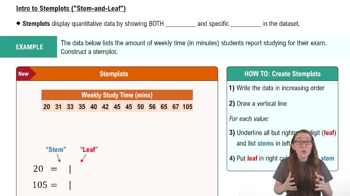
Stem-and-Leaf Plot

A stem-and-leaf plot is a method of displaying quantitative data in a graphical format, similar to a histogram. It separates each data point into a 'stem' (the leading digit or digits) and a 'leaf' (the trailing digit). This format allows for easy visualization of the distribution of data while preserving the original values, making it useful for identifying patterns, such as clusters or gaps in the data.
Video consigliato:
Percorso guidato
06:23
Creating Stemplots

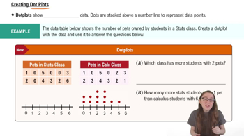
Dot Plot

A dot plot is a simple graphical display that uses dots to represent individual data points along a number line. Each dot corresponds to a value in the dataset, allowing for a quick visual assessment of frequency and distribution. Dot plots are particularly effective for small datasets, as they clearly show the shape of the data distribution and highlight any outliers or clusters.
Video consigliato:
Percorso guidato
04:01
Creating Dotplots

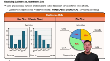
Data Visualization

Data visualization is the graphical representation of information and data. By using visual elements like charts, graphs, and maps, it helps to communicate complex data clearly and efficiently. Effective data visualization allows for easier interpretation of patterns, trends, and outliers, enabling better decision-making based on the insights derived from the data.
Video consigliato:
Percorso guidato
04:39
Visualizing Qualitative vs. Quantitative Data
Pratica correlata
Domanda del libro di testo

Using the Empirical Rule In Exercises 29–34, use the Empirical Rule.


The speeds for eight vehicles are listed. Using the sample statistics from Exercise 29, determine which of the data entries are unusual. Are any of the data entries very unusual? Explain your reasoning.

70, 78, 62, 71, 65, 76, 82, 64

185
views
Domanda del libro di testo

Using and Interpreting Concepts


Finding and Discussing the Mean, Median, and Mode In Exercises 17–34, find the mean, the median, and the mode of the data, if possible. If any measure cannot be found or does not represent the center of the data, explain why.


Prices (in dollars) of Flights from Chicago to Alanta

" style="" width="235">

64
views
Domanda del libro di testo

Using and Interpreting Concepts


Graphical Analysis In Exercises 13–16, give three observations that can be made from the graph.


120
views
Domanda del libro di testo

Building Basic Skills and Vocabulary


Describe the relationship between quartiles and percentiles.

101
views
Domanda del libro di testo

Graphing Data Sets In Exercises 17–32, organize the data using the indicated type of graph. Describe any patterns.


Life Spans of Houseflies Use a dot plot to display the data, which represent the life spans (in days) of 30 houseflies. 

9 9 4 11 10 5 13 9 7 11 6 8 14 10 6 

10 10 7 14 11 7 8 6 13 10 14 14 8 13 10

189
views
Domanda del libro di testo

Using and Interpreting Concepts


Finding and Discussing the Mean, Median, and Mode In Exercises 17–34, find the mean, the median, and the mode of the data, if possible. If any measure cannot be found or does not represent the center of the data, explain why.


Power Failures The durations (in minutes) of power failures at a residence in the last 10 years

18 26 45 75 125 80 33

40 44 49 89 80 96 125

12 61 31 63 103 28 19

100
views