Ch. 2 - Descriptive Statistics
Larson - Elementary Statistics: Picturing the World 8th Edition
Larson8th EditionElementary Statistics: Picturing the WorldISBN: 9780137493470Non è quello che usi tu?Cambia libro di testo
Capitolo 2, Problema 2.Q.1b

The data set represents the number of minutes a sample of 27 people exercise each week.
108 139 120 123 120 132 123 131 131
157 150 124 111 101 135 119 116 117
127 128 139 119 118 114 127 142 130
b. Display the data using a frequency histogram and a frequency polygon on the same axes.

Guida verificata passo dopo passo
1
Step 1: Organize the data by determining the range. Find the minimum and maximum values in the data set to understand the spread. The range is calculated as \(\text{Range} = \text{Maximum value} - \text{Minimum value}\).
Step 2: Decide on the number of class intervals (bins) for the histogram. A common rule of thumb is to use between 5 and 10 bins depending on the data size. Calculate the class width using \(\text{Class width} = \frac{\text{Range}}{\text{Number of classes}}\), then round up to a convenient number.
Step 3: Create the frequency distribution table by grouping the data into the class intervals determined in Step 2. Count how many data points fall into each class interval to get the frequency for each bin.
Step 4: Draw the frequency histogram by plotting the class intervals on the horizontal axis and the corresponding frequencies on the vertical axis. Each bar's height represents the frequency of that class interval, and bars should be adjacent without gaps.
Step 5: To add the frequency polygon, plot points at the midpoint of each class interval on the horizontal axis and the frequency on the vertical axis. Connect these points with straight lines. Make sure both the histogram and frequency polygon share the same axes for comparison.

Risposta video verificata per un problema simile:

Questa soluzione video è stata consigliata dai nostri tutor come utile per risolvere questo problema.
Durata del video:
8m

Concetti chiave

Ecco i concetti essenziali che devi comprendere per rispondere correttamente alla domanda.

Frequency Histogram

A frequency histogram is a bar graph that represents the distribution of numerical data by grouping values into intervals or bins. The height of each bar shows the number of data points within that interval, helping visualize the shape and spread of the data set.
Video consigliato:
Percorso guidato
05:54
Intro to Histograms

Frequency Polygon

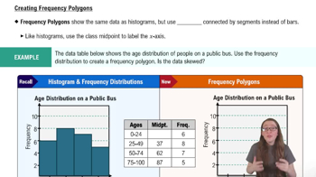
A frequency polygon is a line graph that connects the midpoints of the tops of the bars in a histogram. It provides a clear view of the distribution’s shape and trends, making it easier to compare multiple data sets or observe changes across intervals.
Video consigliato:
Percorso guidato
04:41
Creating Frequency Polygons

Data Grouping and Class Intervals

Data grouping involves dividing continuous data into class intervals or bins to simplify analysis. Choosing appropriate interval widths ensures meaningful representation in histograms and polygons, balancing detail and clarity in the visualization.
Video consigliato:
Percorso guidato
4:01
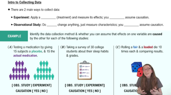
Introduction to Collecting Data
Pratica correlata
Domanda del libro di testo

Refer to the sample statistics from Exercise 5 and determine whether any of the house prices below are unusual. Explain your reasoning.


d. \$147,000

144
views

Domanda del libro di testo

The data set represents the number of minutes a sample of 27 people exercise each week.

108 139 120 123 120 132 123 131 131

157 150 124 111 101 135 119 116 117

127 128 139 119 118 114 127 142 130


g. Display the data using a box-and-whisker plot.

135
views
Domanda del libro di testo

Refer to the sample statistics from Exercise 5 and determine whether any of the house prices below are unusual. Explain your reasoning.


a. \$225,000

113
views
Domanda del libro di testo

The data set represents the number of minutes a sample of 27 people exercise each week.

108 139 120 123 120 132 123 131 131

157 150 124 111 101 135 119 116 117

127 128 139 119 118 114 127 142 130


a. Construct a frequency distribution for the data set using five classes. Include class limits, midpoints, boundaries, frequencies, relative frequencies, and cumulative frequencies.

150
views
Domanda del libro di testo

The heights (in feet) and the number of stories of the ten tallest buildings in New York City are listed. Use a scatter plot to display the data. Describe any patterns. (Source: Emporis)

157
views
Domanda del libro di testo

The data set represents the number of minutes a sample of 27 people exercise each week.

108 139 120 123 120 132 123 131 131

157 150 124 111 101 135 119 116 117

127 128 139 119 118 114 127 142 130


d. Describe the shape of the distribution as symmetric, uniform, skewed left, skewed right, or none of these.

99
views