Ch. 2 - Descriptive Statistics
Larson - Elementary Statistics: Picturing the World 8th Edition
Larson8th EditionElementary Statistics: Picturing the WorldISBN: 9780137493470Non è quello che usi tu?Cambia libro di testo
Capitolo 2, Problema 2.1.21

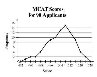
use the frequency polygon to identify the class with the greatest, and the class with the least, frequency.
Line graph showing MCAT score frequencies for 90 applicants, peaking at score 512 with highest frequency 15.

Guida verificata passo dopo passo
1
Step 1: Understand the graph type. A frequency polygon is a line graph that shows the frequencies of different classes or intervals. Here, the x-axis represents MCAT scores, and the y-axis represents the frequency of applicants with those scores.
Step 2: Identify the classes (score intervals) on the x-axis. Each point on the graph corresponds to a specific score or score range, and the height of the point shows how many applicants scored in that range.
Step 3: Locate the highest point on the frequency polygon. This point corresponds to the class with the greatest frequency. From the graph, observe which score has the highest frequency value on the y-axis.
Step 4: Locate the lowest point on the frequency polygon (excluding zero frequency if any). This point corresponds to the class with the least frequency. Check the points near the edges or where the line is closest to the x-axis.
Step 5: Record the score classes corresponding to these highest and lowest points. These classes represent the scores with the greatest and least number of applicants, respectively.

Risposta video verificata per un problema simile:

Questa soluzione video è stata consigliata dai nostri tutor come utile per risolvere questo problema.
Durata del video:
4m

Concetti chiave

Ecco i concetti essenziali che devi comprendere per rispondere correttamente alla domanda.

Frequency Polygon

A frequency polygon is a graphical representation of a frequency distribution. It is created by plotting points corresponding to class midpoints and their frequencies, then connecting these points with straight lines. This helps visualize the shape and spread of the data, making it easier to identify peaks and trends.
Video consigliato:
Percorso guidato
04:41
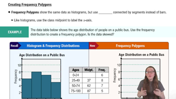
Creating Frequency Polygons

Class Frequency

Class frequency refers to the number of data points that fall within a specific class or interval. In a frequency polygon, the height of each point represents the frequency of that class. Identifying the class with the greatest or least frequency involves finding the highest or lowest points on the graph.
Video consigliato:
Percorso guidato
04:41
Creating Frequency Polygons

Interpreting Graphs to Identify Extremes

Interpreting graphs involves analyzing visual data to extract meaningful information, such as identifying maximum and minimum values. In this context, the class with the greatest frequency corresponds to the highest point on the frequency polygon, while the class with the least frequency corresponds to the lowest point, excluding zero frequencies.
Video consigliato:
Percorso guidato
04:36
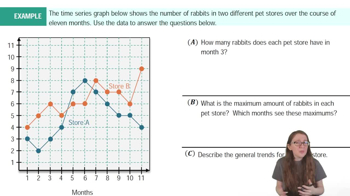
Time-Series Graphs Example 1