Ch. 2 - Descriptive Statistics
Larson - Elementary Statistics: Picturing the World 8th Edition
Larson8th EditionElementary Statistics: Picturing the WorldISBN: 9780137493470Non è quello che usi tu?Cambia libro di testo
Capitolo 2, Problema 2.1.23b

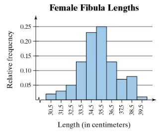
Use the relative frequency histogram to
approximate the greatest and least relative frequencies.
Histogram displaying relative frequencies of female fibula lengths in centimeters, with peaks around 34 and 35 centimeters.

Guida verificata passo dopo passo
1
Step 1: Observe the relative frequency histogram provided. The x-axis represents the length of female fibulas in centimeters, while the y-axis represents the relative frequency.
Step 2: Identify the bar with the greatest height on the histogram. The height of the bar corresponds to the greatest relative frequency. Approximate the value by observing the y-axis scale.
Step 3: Identify the bar with the smallest height on the histogram. The height of the bar corresponds to the least relative frequency. Approximate the value by observing the y-axis scale.
Step 4: Note the range of lengths (x-axis) associated with the bars of greatest and least relative frequencies. This provides additional context for the data distribution.
Step 5: Summarize the findings by stating the approximate greatest and least relative frequencies based on the histogram and their corresponding length ranges.

Risposta video verificata per un problema simile:

Questa soluzione video è stata consigliata dai nostri tutor come utile per risolvere questo problema.
Durata del video:
1m

Concetti chiave

Ecco i concetti essenziali che devi comprendere per rispondere correttamente alla domanda.

Relative Frequency

Relative frequency is the ratio of the frequency of a particular category to the total number of observations. It provides a way to understand how often a certain value occurs in relation to the entire dataset, expressed as a fraction or percentage. In histograms, relative frequencies help visualize the distribution of data points across different intervals.
Video consigliato:
Percorso guidato
06:38
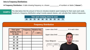
Intro to Frequency Distributions

Histogram

A histogram is a graphical representation of the distribution of numerical data, where the data is divided into intervals (bins) and the frequency of data points within each interval is represented by the height of bars. In the context of relative frequency, the height of each bar indicates the proportion of the total observations that fall within each interval, allowing for easy comparison of different ranges.
Video consigliato:
Percorso guidato
05:54
Intro to Histograms

Peaks in Distribution

Peaks in a distribution refer to the highest points in a histogram, indicating the intervals with the greatest frequency of data points. Identifying these peaks helps in understanding the most common values within the dataset. In the provided histogram, the peaks around 34 and 35 centimeters suggest that these lengths of female fibula are the most frequently observed in the sample.
Video consigliato:
Percorso guidato
02:50
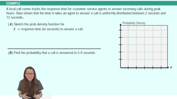
Uniform Distribution Example 1
Pratica correlata
Domanda del libro di testo

Drawing a Box-and-Whisker Plot In Exercises 15–18,

(b) draw a box-and-whisker plot that represents the data set.


39 36 30 27 26 24 28 35 39 60 50 41 35 32 51

169
views

Domanda del libro di testo

Drawing a Box-and-Whisker Plot In Exercises 15–18,

(b) draw a box-and-whisker plot that represents the data set.


171 176 182 150 178 180 173 170 174 178 181 180

124
views
Domanda del libro di testo

Life Spans of Fruit Flies The life spans of a species of fruit fly have a bell-shaped distribution, with a mean of 33 days and a standard deviation of 4 days.


b. The life spans of three randomly selected fruit flies are 29 days, 41 days, and 25 days. Using the Empirical Rule, find the percentile that corresponds to each life span.

137
views
Domanda del libro di testo

Scaling Data Sample annual salaries (in thousands of dollars) for employees at a company are listed.

42   36   48   51   39   39   42

36   48   33   39   42   45   50

b. Each employee in the sample receives a 5% raise. Find the sample mean and the sample standard deviation for the revised data set.

95
views
Domanda del libro di testo

Drawing a Box-and-Whisker Plot In Exercises 15–18,

(b) draw a box-and-whisker plot that represents the data set.


2 7 1 3 1 2 8 9 9 2 5 4 7 3 7 5 4

2 3 5 9 5 6 3 9 3 4 9 8 8 2 3 9 5

99
views
Domanda del libro di testo

Extending Concepts


Golf The distances (in yards) for nine holes of a golf course are listed.

336 393 408 522 147 504 177 375 360


b. Convert the distances to feet. Then rework part (a).

123
views