
Ch. 9 - Correlation and Regression
Larson - Elementary Statistics: Picturing the World 8th Edition
Larson8th EditionElementary Statistics: Picturing the WorldISBN: 9780137493470Non è quello che usi tu?Cambia libro di testo
Capitolo 9, Problema 9.1.12

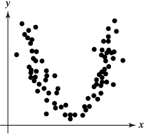
Graphical Analysis In Exercises 11–14, determine whether there is a perfect positive linear correlation, a strong positive linear correlation, a perfect negative linear correlation, a strong negative linear correlation, or no linear correlation between the variables.
Scatterplot showing a curved pattern of black dots, indicating no linear correlation between the x and y variables.

Guida verificata passo dopo passo
1
Step 1: Observe the scatterplot provided. The data points form a curved pattern resembling a 'U' shape, which indicates a non-linear relationship between the variables.
Step 2: Recall the definition of linear correlation. Linear correlation measures the strength and direction of a straight-line relationship between two variables. If the data points do not align along a straight line, there is no linear correlation.
Step 3: Analyze the pattern further. Since the data points curve upward and do not follow a straight-line trend, this suggests that the relationship between the variables is not linear.
Step 4: Conclude that the scatterplot does not exhibit a perfect positive linear correlation, a strong positive linear correlation, a perfect negative linear correlation, or a strong negative linear correlation.
Step 5: Final interpretation: The scatterplot shows no linear correlation between the variables, as the relationship is clearly non-linear.

Risposta video verificata per un problema simile:

Questa soluzione video è stata consigliata dai nostri tutor come utile per risolvere questo problema.
Durata del video:
2m

Concetti chiave

Ecco i concetti essenziali che devi comprendere per rispondere correttamente alla domanda.

Correlation

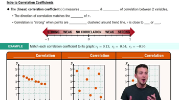
Correlation measures the strength and direction of a linear relationship between two variables. It is quantified using the correlation coefficient, which ranges from -1 to 1. A value of 1 indicates a perfect positive correlation, -1 indicates a perfect negative correlation, and 0 indicates no linear correlation.
Video consigliato:
Percorso guidato
05:43
Correlation Coefficient

Scatterplot

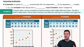
A scatterplot is a graphical representation of two variables, where each point represents an observation. It helps visualize the relationship between the variables, allowing for the identification of patterns, trends, or correlations. In this case, the scatterplot shows a curved pattern, indicating a non-linear relationship.
Video consigliato:
Percorso guidato
06:36
Scatterplots & Intro to Correlation

Linear vs. Non-linear Relationships

Linear relationships imply that changes in one variable result in proportional changes in another, represented by a straight line. Non-linear relationships, however, do not follow this pattern, as seen in the provided scatterplot, which suggests a quadratic relationship rather than a linear one, indicating no linear correlation.
Video consigliato:
Percorso guidato
07:01
Intro to Least Squares Regression
Pratica correlata
Domanda del libro di testo

"Constructing and Interpreting a Prediction Interval In Exercises 21-30, construct the indicated prediction interval and interpret the results.

28. Total Assets Construct a 90% prediction interval for the total assets in federal defined benefit plans in Exercise 18 when the total assets in IRAs are \$6400 billion."

60
views
Domanda del libro di testo

"Constructing and Interpreting a Prediction Interval In Exercises 21-30, construct the indicated prediction interval and interpret the results.

30. New Vehicle Sales Construct a 99% prediction interval for new vehicle sales for Honda in Exercise 20 when the number of new vehicles sold by Toyota is 2159 thousand."

48
views
Domanda del libro di testo

"In Exercises 9 and 10, identify the explanatory variable and the response variable.

10. An actuary at an insurance company wants to determine whether the number of hours of safety driving classes can be used to predict the number of driving accidents for each

driver."

102
views
Domanda del libro di testo

"Constructing and Interpreting a Prediction Interval In Exercises 21-30, construct the indicated prediction interval and interpret the results.

22. Mean Hourly Wage Construct a 95% prediction interval for the mean hourly wage in Exercise 12 when the median hourly wage is \$21.50."

53
views
Domanda del libro di testo

"Graphical Analysis In Exercises 1–3, use the figure.

1. Describe the total variation about a regression line in words and in symbols."

74
views
Domanda del libro di testo

"In Exercises 7-10, use the value of the correlation coefficient r to calculate the coefficient of determination r^2. What does this tell you about the explained variation of the data about the regression line? about the unexplained variation?

8.r =- 0.328"

71
views