
Ch. 2 - Exploring Data with Tables and Graphs
Triola - Elementary Statistics 14th Edition
Triola14th EditionElementary StatisticsISBN: 9780137366446Non è quello che usi tu?Cambia libro di testo
Capitolo 2, Problema 2.RE.6a

Environment


a. After collecting the average (mean) global temperatures for each of the most recent 100 years, we want to construct the graph that is most appropriate for these data. Which graph is best?

Guida verificata passo dopo passo
1
Determine the type of data: The data consists of average global temperatures collected over 100 years. This is quantitative data (numerical) and is measured over time, making it a time series.
Identify the purpose of the graph: Since the goal is to visualize how the average global temperatures have changed over time, the graph should clearly show trends and patterns.
Choose the most appropriate graph: For time series data, a line graph is typically the best choice because it effectively displays changes and trends over time by connecting data points with lines.
Label the axes: On the x-axis, place the years (time), and on the y-axis, place the average global temperatures. Ensure the units for temperature (e.g., °C or °F) are clearly indicated.
Plot the data: Use the collected data points to create the graph, connecting them with lines to show the trend of global temperatures over the 100-year period. Ensure the graph is properly titled and includes a legend if necessary.

Risposta video verificata per un problema simile:

Questa soluzione video è stata consigliata dai nostri tutor come utile per risolvere questo problema.
Durata del video:
1m

Concetti chiave

Ecco i concetti essenziali che devi comprendere per rispondere correttamente alla domanda.

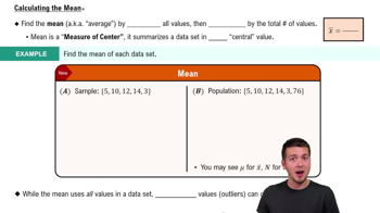
Mean

The mean, or average, is a measure of central tendency that summarizes a set of values by dividing the sum of all values by the number of values. In the context of global temperatures, calculating the mean provides a single representative value that reflects the overall trend in temperature changes over the specified period.
Video consigliato:
Percorso guidato
04:52
Calculating the Mean

Graph Types

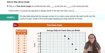
Different types of graphs serve various purposes in data visualization. For time series data, such as average global temperatures over 100 years, line graphs are often the most effective, as they clearly show trends and changes over time, allowing for easy comparison of values across the years.
Video consigliato:
Percorso guidato
04:13
Creating Time-Series Graphs

Data Visualization

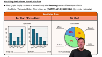
Data visualization is the graphical representation of information and data. It helps in understanding complex data sets by presenting them in a visual context, such as charts or graphs, making it easier to identify patterns, trends, and outliers in the data, which is crucial for interpreting the average global temperatures.
Video consigliato:
Percorso guidato
04:39
Visualizing Qualitative vs. Quantitative Data
Pratica correlata
Domanda del libro di testo

In Exercises 1–5, use the data listed in the margin, which are magnitudes (Richter scale) and depths (km) of earthquakes from Data Set 24 “Earthquakes” in Appendix B

[Image]

Data Type


a. The listed earthquake depths (km) are all rounded to one decimal place. Before rounding, are the exact depths discrete data or continuous data?

210
views
Domanda del libro di testo

It’s Like Time to Do This Exercise In a Marist survey of adults, these are the words or phrases that subjects find most annoying in conversation (along with their frequencies of response): like (127); just sayin’ (81); you know (104); whatever (219); obviously (35). Construct a pie chart. Identify one disadvantage of a pie chart.

147
views
Domanda del libro di testo

Whatever Use the same data from Exercise 7 to construct a Pareto chart. Which graph does a better job of illustrating the data: Pareto chart or pie chart?

170
views
Domanda del libro di testo

Estimating r For each of the following, estimate the value of the linear correlation coefficient r for the given paired data obtained from 50 randomly selected adults.


a. Their heights are measured in inches and those same heights are recorded in centimeters .

148
views
Domanda del libro di testo

Interpreting Normal Quantile Plots Which of the following normal quantile plots appear to represent data from a population having a normal distribution? Explain.


a. " style="" width="380">

236
views
1
rank
Domanda del libro di testo

Body Temperatures Listed below are the temperatures from nine males measured at 8 AM and again at 12 AM (from Data Set 5 “Body Temperatures” in Appendix B). Construct a scatterplot. Based on the graph, does there appear to be a relationship between 8 AM temperatures and 12 AM temperatures?

122
views