
Ch. 2 - Exploring Data with Tables and Graphs
Triola - Elementary Statistics 14th Edition
Triola14th EditionElementary StatisticsISBN: 9780137366446Non è quello che usi tu?Cambia libro di testo
Capitolo 2, Problema 2.3.11

In Exercises 11 and 12 construct the Pareto chart.


Box Office Boffo Recent annual gross revenue (millions of dollars) for the leading movie studios are as follows: 20th Century Fox (1082), Buena Vista (3092), Paramount (757), Sony/Columbia (1304), Universal (1772), Warner Brothers (1941). Are these data likely to be reasonably accurate?

Guida verificata passo dopo passo
1
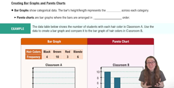
Step 1: Understand the problem. A Pareto chart is a type of bar graph where the bars are ordered from highest to lowest frequency or value. It is often used to identify the most significant factors in a dataset. Here, we are tasked with constructing a Pareto chart for the given movie studio revenues.
Step 2: Organize the data. List the movie studios and their corresponding revenues in descending order of revenue. For example, start with Buena Vista (3092), followed by Warner Brothers (1941), and so on.
Step 3: Calculate the cumulative percentage. For each studio, calculate the cumulative revenue as a percentage of the total revenue. Use the formula: \( \text{Cumulative Percentage} = \frac{\text{Cumulative Revenue}}{\text{Total Revenue}} \times 100 \).
Step 4: Create the Pareto chart. Plot the revenues as bars on the chart, with the studios on the x-axis and revenue on the y-axis. Order the bars from highest to lowest revenue. Then, overlay a line graph representing the cumulative percentage on the same chart.
Step 5: Analyze the data. Use the Pareto chart to identify which studios contribute the most to the total revenue. Additionally, consider the accuracy of the data by evaluating the source and context of the information provided.

Risposta video verificata per un problema simile:

Questa soluzione video è stata consigliata dai nostri tutor come utile per risolvere questo problema.
Durata del video:
10m

Concetti chiave

Ecco i concetti essenziali che devi comprendere per rispondere correttamente alla domanda.

Pareto Chart

A Pareto chart is a type of bar graph that represents the frequency or impact of problems in a descending order. It is based on the Pareto principle, which states that roughly 80% of effects come from 20% of the causes. In the context of the movie studios' revenues, a Pareto chart can help visualize which studios contribute most significantly to total revenue, aiding in identifying key players in the industry.
Video consigliato:
Percorso guidato
04:52
Creating Bar Graphs and Pareto Charts

Box Office Revenue

Box office revenue refers to the total income generated from ticket sales for films produced by movie studios. It is a critical measure of a film's success and the financial health of a studio. Understanding the gross revenue figures provided for each studio allows for comparisons and insights into market performance, which is essential for constructing the Pareto chart.
Video consigliato:
Percorso guidato
06:21
Step 1: Write Hypotheses

Data Accuracy

Data accuracy refers to the correctness and reliability of data collected. In the context of the movie studios' revenues, assessing whether the reported figures are likely accurate involves considering factors such as data sources, collection methods, and potential biases. Accurate data is crucial for making informed decisions and analyses, including the construction of the Pareto chart.
Video consigliato:
Percorso guidato
04:39
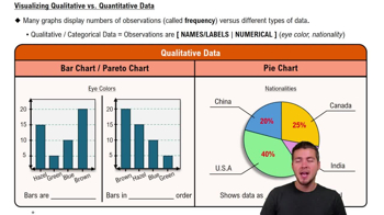
Visualizing Qualitative vs. Quantitative Data
Pratica correlata
Domanda del libro di testo

In Exercises 9–18, construct the histograms and answer the given questions.


Burger King Dinner Service Times Use the frequency distribution from Exercise 18 in Section 2-1 to construct a histogram. Using a strict interpretation of the criteria for being a normal distribution, does the histogram appear to depict data from a population with a normal distribution?

188
views
Domanda del libro di testo

Presidents Listed below are the ages (years) of presidents of the United States at the times of their first inaugurations (from Data Set 22 “Presidents” in Appendix B). Presidents who took office as a result of an assassination or resignation are not included. The data are current as of this writing. Use these ages to construct a frequency distribution. Use a class width of 5 years and begin with a lower class limit of 40 years. Do the ages appear to have a normal distribution?

244
views
Domanda del libro di testo

Hershey Kisses Refer to Data Set 38 “Candies” and use the weights (grams) of Hershey’s Kisses. Begin with a lower class limit of 4.300 g and use a class width of 0.100 g. Does this distribution appear to be a normal distribution?

144
views
Domanda del libro di testo

Exercises 29–34 involve large sets of data, so technology should be used. Complete lists of the data are not listed in Appendix B, but they can be downloaded from the website TriolaStats.com. Use the indicated data and construct the frequency distribution.


Diastolic Blood Pressure Use the diastolic blood pressures of the 300 subjects included in Data Set 1 “Body Data.” Use a class width of 15 mm Hg and begin with a lower class limit of 40 mm Hg. Does the frequency distribution appear to be a normal distribution?

160
views
Domanda del libro di testo

In Exercises 5–8, answer the questions by referring to the following Minitab-generated histogram, which depicts the weights (grams) of all quarters listed in Data Set 40 “Coin Weights” in Appendix B. (Grams are actually units of mass and the values shown on the horizontal scale are rounded.)

Class Width and Class Limits Give the approximate values of the class width, and the lower and upper class limits of the class depicted in the bar farthest to the left.

230
views
Domanda del libro di testo

In Exercises 25 and 26, construct the cumulative frequency distribution that corresponds to the frequency distribution in the exercise indicated.


Exercise 5 (Age of Best Actress When Oscar Was Won)

202
views