

Ch. 2 - Exploring Data with Tables and Graphs
Triola - Elementary Statistics 14th Edition
Triola14th EditionElementary StatisticsISBN: 9780137366446Non è quello che usi tu?Cambia libro di testo
Capitolo 2, Problema 2.2.1

IQ Scores IQ scores of adults are normally distributed. If a large sample of adults is randomly selected and the IQ scores are illustrated in a histogram, what is the shape of that histogram?

Guida verificata passo dopo passo
1
Understand that IQ scores are normally distributed, which means they follow a bell-shaped curve.
Recall that a normal distribution is symmetric around its mean, with most of the data clustering around the center and tapering off towards the tails.
Visualize the histogram: it will have a peak at the mean IQ score, and the frequencies of scores will decrease symmetrically as you move away from the mean.
Recognize that the histogram will resemble a bell curve, which is characteristic of a normal distribution.
Conclude that the shape of the histogram for IQ scores will be approximately bell-shaped, reflecting the properties of a normal distribution.

Risposta video verificata per un problema simile:

Questa soluzione video è stata consigliata dai nostri tutor come utile per risolvere questo problema.
Durata del video:
2m

Concetti chiave

Ecco i concetti essenziali che devi comprendere per rispondere correttamente alla domanda.

Normal Distribution

A normal distribution is a continuous probability distribution characterized by a symmetric, bell-shaped curve. It is defined by its mean and standard deviation, with most data points clustering around the mean. In the context of IQ scores, which are normally distributed, this means that most individuals will have scores near the average, with fewer individuals having extremely high or low scores.
Video consigliato:
Percorso guidato
09:47
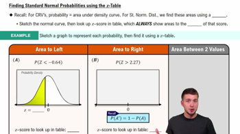
Finding Standard Normal Probabilities using z-Table

Histogram

A histogram is a graphical representation of the distribution of numerical data, where data is grouped into bins or intervals. The height of each bar in a histogram represents the frequency of data points within each bin. For normally distributed data, such as IQ scores, the histogram will typically exhibit a bell-shaped curve, reflecting the underlying normal distribution.
Video consigliato:
Percorso guidato
05:54
Intro to Histograms

Central Limit Theorem

The Central Limit Theorem states that the distribution of the sample mean will approximate a normal distribution as the sample size becomes large, regardless of the shape of the population distribution. This concept is crucial in understanding why the histogram of a large sample of IQ scores, which are normally distributed, will also display a normal distribution shape, reinforcing the bell curve pattern.
Video consigliato:
Percorso guidato
04:52
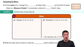
Calculating the Mean
Pratica correlata
Domanda del libro di testo

In Exercises 17–20, identify how the graph is deceptive.


Cost of Giving Birth According to the Agency for Healthcare Research and Quality Healthcare Cost and Utilization Project, the typical cost of a C-section baby delivery is \$4500, and the typical cost of a vaginal delivery is \$2600. See the following illustration.


128
views
Domanda del libro di testo

In Exercises 9 and 10, construct the time-series graph.


Home Runs Listed below are the numbers of home runs in Major League Baseball for each year beginning with 1993 (listed in order by row). Is there a trend?

117
views
Domanda del libro di testo

In Exercises 5 and 6, construct the dotplot.


Diastolic Blood Pressure Listed below are diastolic blood pressure measurements (mm Hg) of females selected from Data Set 1 “Body Data” in Appendix B. All of the values are even numbers. Are there any outliers? If so, identify their values.

102
views
Domanda del libro di testo

In Exercises 15 and 16, construct the frequency polygons.

Presidents Use the frequency distribution from Exercise 14 in Section 2-1 to construct a frequency polygon. Does the graph suggest that the distribution is skewed? If so, how?

151
views
Domanda del libro di testo

In Exercises 5–8, identify the class width, class midpoints, and class boundaries for the given frequency distribution. Also identify the number of individuals included in the summary. The frequency distributions are based on real data from Appendix B.

479
views
Domanda del libro di testo

Use Table 2-11 to find the critical values of r. Based on a comparison of the linear correlation coefficient r and the critical values, what do you conclude about a linear correlation?

Using the data from Exercise 6 “Airport Data Speeds,” the linear correlation coefficient is r = 0.866

255
views