Skip to main content
Introductory Statistics
나의 코스
배우기
시험 준비
AI 튜터
학습 가이드
교과서적 해결책
플래시카드
탐험해 보세요
앱을 사용해 보세요
나의 코스
배우기
시험 준비
AI 튜터
학습 가이드
교과서적 해결책
플래시카드
탐험해 보세요
앱을 사용해 보세요
뒤로
Introductory Statistics: Describing and Summarizing Data
카드를 뒤집기 위해 탭할 수 있습니다.
What is the goal of graphs in statistics?
카드를 뒤집기 위해 탭할 수 있습니다.
👆
What is the goal of graphs in statistics?
Graphs help identify
patterns
,
trends
,
missing values
,
shape
, and
outliers
in data.
진행 상황 추적
컨트롤 버튼이 '내비게이션' 모드로 변경되었습니다.
1/29
추천 영상
VideoThumbView.guidedCourse
01:52
Boxplots Example 1
2452
views
41
rank
VideoThumbView.guidedCourse
02:48
Boxplots Example 2
2192
views
86
rank
VideoThumbView.guidedCourse
03:54
Boxplots ("Box and Whisker Plots")
3499
views
59
rank
1
comments
이 집합의 용어 (29)
하이드의 정의
What is the goal of graphs in statistics?
Graphs help identify
patterns
,
trends
,
missing values
,
shape
, and
outliers
in data.
What is an outlier?
An
outlier
is an observation that is unusually high or low compared to the rest of the data.
Name five common types of graphs used to display data.
Pie chart, Bar chart, Histogram, Dotplot, and Boxplot.
What does a frequency table show?
A frequency table summarizes one categorical variable by showing how many observations fall into each category.
How do you calculate the proportion of a category in a dataset?
Divide the count in that category by the total sample size.
When is a pie chart appropriate for displaying data?
When the focus is on percentages and the number of categories is small.
What is a contingency table?
A table that summarizes two categorical variables simultaneously to show how they are related.
What is the difference between marginal and conditional proportions in contingency tables?
Marginal proportions consider the entire dataset; conditional proportions focus on a specific group.
What are the key features of a symmetric distribution?
Left and right sides are mirror images; mean and median are approximately equal and centered.
Describe a right-skewed distribution.
Has a long tail to the right; most data values are low; mean is greater than the median.
Describe a left-skewed distribution.
Has a long tail to the left; most data values are high; mean is less than the median.
What is a uniform distribution?
A distribution where all outcomes occur approximately equally often with no dominant peak.
What does modality refer to in a distribution?
The number of distinct peaks or modes in the data: unimodal, bimodal, or multimodal.
What is the difference between a histogram and a bar chart?
Histogram displays quantitative data with touching bars; bar chart displays categorical data with spaced bars.
What are the three common measures of center?
Mean (average), Median (middle value), and Mode (most frequent value).
When is the median preferred over the mean?
When data are skewed or have outliers, because the median is resistant to outliers.
How is the range calculated?
Range = Maximum value - Minimum value.
What are quartiles?
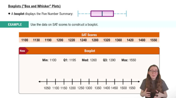
Values that divide the ordered dataset into four equal parts: Q1 (25th percentile), Q2 (median), Q3 (75th percentile).
How do you calculate the interquartile range (IQR)?
IQR = Q3 - Q1; it measures the spread of the middle 50% of the data.
What does the standard deviation measure?
How far observations typically are from the mean; a measure of spread or variability.
Why is standard deviation preferred over variance?
Because standard deviation has the same units as the data, making it more intuitive.
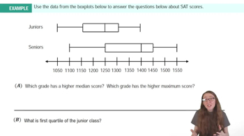
What is a boxplot and what does it show?
A graphical summary showing the median, spread (IQR), and potential outliers of a dataset.
How are outliers identified in a boxplot?
Data points outside the fences calculated as
Lower Fence = Q1 - 1.5*IQR
and
Upper Fence = Q3 + 1.5*IQR
.
What is a z-score?
A measure of how many standard deviations an observation is from the mean.
What does a positive or negative z-score indicate?
Positive z-score means the value is above the mean; negative means below the mean.
What is the Empirical Rule for bell-shaped distributions?
Approximately 68% of data fall within 1 SD, 95% within 2 SDs, and 99.7% within 3 SDs of the mean.
How does adding a constant to all data values affect measures of center and spread?
Measures of center shift by the constant; measures of spread (range, IQR, SD) remain unchanged.
How does multiplying all data values by a constant affect measures of center and spread?
Both measures of center and spread are multiplied by that constant.
What can side-by-side boxplots be used for?
To compare the distribution (center, spread, shape, outliers) of a quantitative variable across categories.
 뒤로뒤로
뒤로뒤로
 01:52
01:52