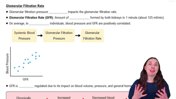
SCIENTIFIC THINKING Several studies have found a correlation between the activity levels of brown fat tissue in research participants following exposure to cold and their percentage of body fat. Devise a graph that would present the results from such a study, labeling the axes and drawing a line to show whether the results show a positive or negative correlation between the variables. Propose two hypotheses that could explain these results.
검증된 단계별 안내
1
Determine the two main variables involved in the study: the activity levels of brown fat tissue and the percentage of body fat in participants.
Based on the problem statement, decide whether the correlation is positive or negative. A positive correlation means that as one variable increases, the other also increases. A negative correlation means that as one variable increases, the other decreases.
On a graph, label the x-axis as 'Activity Levels of Brown Fat Tissue' and the y-axis as 'Percentage of Body Fat'.
Depending on the type of correlation identified in Step 2, draw a line on the graph. For a positive correlation, the line should slope upwards from left to right. For a negative correlation, the line should slope downwards from left to right.
Hypothesis 1: Increased activity of brown fat tissue leads to higher energy expenditure, thus reducing body fat percentage. Hypothesis 2: Individuals with lower body fat have more active brown fat tissue, which is more responsive to cold exposure.>
비슷한 문제에 대한 검증된 영상 답변:
이 영상 해법은 위 문제에 도움이 된다고 튜터들이 추천한 것입니다.
영상 길이:
1m
영상 재생:
0 댓글
주요 개념
질문에 올바르게 답하기 위해 반드시 이해해야 하는 핵심 개념들은 다음과 같습니다.
Correlation
Correlation refers to a statistical relationship between two variables, indicating how one may change in relation to the other. In this context, it examines the relationship between brown fat activity levels and body fat percentage. A positive correlation means that as one variable increases, the other does too, while a negative correlation indicates that as one increases, the other decreases.
Graphing data is a visual representation of information that helps to illustrate relationships between variables. In this case, the x-axis could represent the percentage of body fat, while the y-axis could represent the activity levels of brown fat. A line graph can effectively show the trend of the correlation, whether positive or negative, making it easier to interpret the results.
Hypothesis formation involves proposing explanations for observed phenomena based on existing knowledge. In this scenario, two hypotheses could be suggested: one might propose that higher brown fat activity leads to lower body fat due to increased energy expenditure, while another could suggest that individuals with lower body fat have more active brown fat due to metabolic adaptations. These hypotheses guide further research and experimentation.