Skip to main content
Statistics for Business
나의 코스
배우기
시험 준비
AI 튜터
학습 가이드
플래시카드
탐험해 보세요
앱을 사용해 보세요
나의 코스
배우기
시험 준비
AI 튜터
학습 가이드
플래시카드
탐험해 보세요
앱을 사용해 보세요
뒤로
Boxplots-Excel quiz
카드를 뒤집기 위해 탭할 수 있습니다.
What is the first step in creating a boxplot in Excel?
카드를 뒤집기 위해 탭할 수 있습니다.
👆
What is the first step in creating a boxplot in Excel?
The first step is to select the data you want to visualize by clicking and dragging across the relevant cells.
진행 상황 추적
컨트롤 버튼이 '내비게이션' 모드로 변경되었습니다.
1/15
관련 플래시카드
관련 실천
추천 영상
Boxplots-Excel definitions
Boxplots-Excel
15 용어
3. Describing Data Numerically
8 주제
19 문제점
장
Jonathan
05:14
Boxplots-Excel
136
views
1
rank
03:30
Boxplots-Excel Example 1
98
views
1
rank
이 집합의 용어 (15)
하이드의 정의
What is the first step in creating a boxplot in Excel?
The first step is to select the data you want to visualize by clicking and dragging across the relevant cells.
Which tab do you click after selecting your data to start creating a boxplot in Excel?
You click the 'Insert' tab in the Excel ribbon after selecting your data.
Where can you find the option to insert a statistical chart in Excel?
In the charts section of the Insert tab, look for the statistical chart option, which may be labeled or shown as a blue histogram icon.
What specific chart type should you select to create a boxplot in Excel?
You should select the 'Box and Whisker' chart type to create a boxplot.
How can you change the title of your boxplot in Excel?
Click on the chart title, highlight and delete the text, then type in your desired title.
Why might you want to change the color of your boxplot in Excel?
Changing the color can improve contrast and make elements like the median line easier to see.
How do you add data labels to your boxplot in Excel?
Go to 'Add Chart Elements,' select 'Data Labels,' and choose the position where you want the labels to appear.
What does the median line represent in a boxplot?
The median line shows the middle value of the data set, dividing it into two equal halves.
How can you remove the x-axis from your boxplot in Excel if it is unnecessary?
Go to 'Add Chart Element,' select 'Axes,' and click on 'Primary Horizontal' to remove the x-axis.
Why is it important to adjust the y-axis range when creating a boxplot in Excel?
Adjusting the y-axis range ensures the plot fits your data and prevents distortion, making it easier to interpret.
How do you change the minimum and maximum bounds of the y-axis in Excel?
Select the y-axis, go to 'More Axis Options,' and set the minimum and maximum values to better fit your data.
What statistical concepts does a boxplot help visualize?
A boxplot helps visualize the distribution, median, interquartile range (IQR), and outliers in a data set.
What is the purpose of customizing elements like chart title, colors, and axis bounds in a boxplot?
Customizing these elements enhances readability and interpretation of the boxplot.
What should you check after creating a boxplot to ensure it is effective?
You should check if the boxplot is easy to read and interpret, making any necessary cosmetic changes.
What Excel feature allows you to see the mean value in a boxplot?
Excel can display the mean as an 'x' on the boxplot, which can be made clearer by adjusting colors and adding data labels.
 뒤로
뒤로
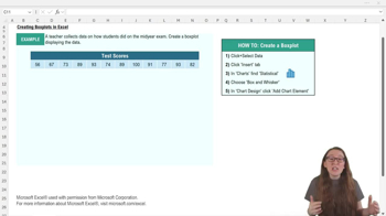
 05:14
05:14