Skip to main content
Statistics for Business
나의 코스
배우기
시험 준비
AI 튜터
학습 가이드
플래시카드
탐험해 보세요
앱을 사용해 보세요
나의 코스
배우기
시험 준비
AI 튜터
학습 가이드
플래시카드
탐험해 보세요
앱을 사용해 보세요
뒤로
Pie Charts quiz
카드를 뒤집기 위해 탭할 수 있습니다.
What type of data are pie charts most effective for displaying?
카드를 뒤집기 위해 탭할 수 있습니다.
👆
What type of data are pie charts most effective for displaying?
Pie charts are most effective for displaying qualitative data as percentages across categories.
진행 상황 추적
컨트롤 버튼이 '내비게이션' 모드로 변경되었습니다.
1/15
관련 플래시카드
관련 실천
추천 영상
Pie Charts definitions
Pie Charts
15 용어
Pie Charts
2. Describing Data with Tables and Graphs
10 문제점
주제
Ally
Frequency Polygons
2. Describing Data with Tables and Graphs
10 문제점
주제
2. Describing Data with Tables and Graphs
10 주제
15 문제점
장
David-Paige
VideoThumbView.guidedCourse
01:18
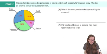
Example 1
282
views
12
rank
VideoThumbView.guidedCourse
06:10
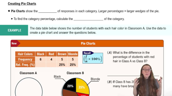
Creating Pie Charts
392
views
7
rank
이 집합의 용어 (15)
하이드의 정의
What type of data are pie charts most effective for displaying?
Pie charts are most effective for displaying qualitative data as percentages across categories.
How is each wedge in a pie chart determined?
Each wedge represents a category's percentage of the total, with larger percentages resulting in larger wedges.
What formula is used to calculate the percentage for a category in a pie chart?
The formula is (category frequency ÷ total number of responses) × 100.
If a category has a frequency of 6 out of 20 responses, what is its percentage in the pie chart?
Its percentage is 30% because (6 ÷ 20) × 100 = 30%.
Why might you prefer percentages over frequencies when using a pie chart?
Percentages show how each category relates to the total, making comparisons between groups easier.
What is the first step in creating a pie chart from a frequency table?
The first step is to find the total number of responses by adding all category frequencies.
How do you find the relative frequency for a category?
Divide the category frequency by the total number of responses and multiply by 100 to get a percentage.
In the example, what is the percentage of students with black hair if 6 out of 20 students have black hair?
The percentage is 30% because (6 ÷ 20) × 100 = 30%.
How many wedges would you draw in a pie chart if there are four categories?
You would draw four wedges, one for each category.
If two categories have the same relative frequency, how will their wedges appear in the pie chart?
Their wedges will be the same size.
What does a larger wedge in a pie chart indicate about a category?
A larger wedge indicates a higher percentage for that category.
How do you find the number of students in a category if you know the percentage and total number of students?
Multiply the percentage (as a decimal) by the total number of students.
If 40% of 20 students have brown hair, how many students is that?
That is 8 students, because 0.40 × 20 = 8.
What is the difference in the percentage of red-haired students between two classes if one has 20% and the other 15%?
The difference is 5 percentage points.
Why can't you say there are more students in a category just because its percentage is higher in a pie chart?
Because percentages do not reflect actual counts unless the total number of responses is the same in both groups.
 뒤로
뒤로

 01:18
01:18