 뒤로
뒤로Statistics for Business: Key Concepts and Tools
 02:46
02:46
이 집합의 용어 (34)
Population is the entire group of interest; Sample is a subset used to represent the population.
Descriptive summarizes data; Inferential draws conclusions about populations from samples; Predictive forecasts future data trends.
Qualitative data describe categories or qualities; Quantitative data are numerical measurements.
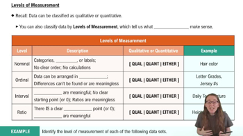
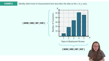
Four levels: Nominal, Ordinal, Interval, and Ratio, each with increasing measurement precision.
Data categorized without order, e.g., gender or color.
Data with a meaningful order but no fixed intervals, e.g., rankings.
Ordered data with equal intervals but no true zero, e.g., temperature in Celsius.
Ordered data with equal intervals and a true zero, e.g., weight or height.
Time Series data are collected over time; Cross-Sectional data are collected at one point in time.
Bias is systematic error causing results to deviate from the true value.
Discrete data are countable values; Continuous data can take any value within a range.
A graphical display of categorical data using bars of different heights.
A circular chart divided into sectors representing relative frequencies.
A table showing the number of occurrences of each data value or category.
Shows the proportion or percentage of total observations for each category.
Displays the running total of frequencies up to each class or category.
A bar graph representing frequency distribution of continuous data with adjacent bars.
A line graph showing cumulative frequencies for classes in a frequency distribution.
A bar chart ordered by frequency combined with a cumulative percentage line.
A graph showing the relationship between two quantitative variables.
A table showing frequency distribution of variables to analyze relationships.
A graph that connects data points with lines, often used for time series data.
The sum of all data values divided by the number of values.
The middle value when data are ordered from smallest to largest.
The most frequently occurring value in a data set.
The mean calculated by giving different weights to data values.
The difference between the maximum and minimum data values.
The average of squared deviations from the mean, measuring data spread.
The square root of variance, indicating average distance from the mean.
In a normal distribution, about 68%, 95%, and 99.7% of data fall within 1, 2, and 3 standard deviations from the mean.
Data organized into classes or intervals for frequency analysis.
Measures dividing data into equal parts: quartiles (4), deciles (10), percentiles (100).
A graphical summary showing median, quartiles, and potential outliers.
Data points significantly different from others, possibly indicating variability or errors.