What is a frequency polygon and how does it differ from a histogram?
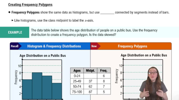
A frequency polygon is a graph that displays frequency distributions using points connected by segments instead of bars, unlike a histogram which uses bars.
How are the points plotted on a frequency polygon determined?
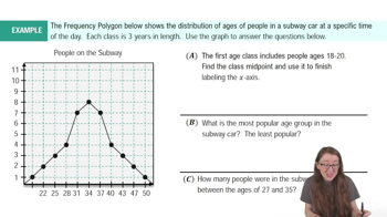
Points are plotted at the class midpoints on the x-axis, with their y-coordinates representing the frequencies of each class.
What does the y-axis represent in a frequency polygon?
The y-axis represents the frequencies of the classes, just like in a histogram.
How do you calculate a class midpoint for a frequency polygon?
Add the lower and upper limits of the class and divide by two to find the class midpoint.
How do you connect the points in a frequency polygon?
Connect the plotted points with straight line segments, and also connect the first and last points to the x-axis.
Why do we connect the first and last points of a frequency polygon to the x-axis?
This closes the polygon and visually represents the start and end of the data distribution.
How is the x-axis labeled in a frequency polygon?
The x-axis is labeled with the class midpoints for each class interval.
How do you interpret a point on a frequency polygon?
A point's x-coordinate is the class midpoint and its y-coordinate is the frequency for that class interval.
What is the main similarity between histograms and frequency polygons?
Both display the same frequency distribution data and use the same axes and scales.
How can you use a frequency polygon to analyze skewness in data?
Look for the peak of the polygon and check if the tails extend further to the left or right to determine skewness.
What does it mean if a frequency polygon has a peak with tails extending equally on both sides?
It means the data is not skewed and is roughly symmetric.
How is a frequency polygon different from a line graph?
A frequency polygon shows frequencies for class intervals, not exact values, while a line graph typically shows trends for specific data points.
If a frequency polygon has a long tail to the right, what type of skew does the data have?
The data is right-skewed.
What does a point at (37, 8) on a frequency polygon indicate?
It indicates that the class with midpoint 37 has a frequency of 8.
Why is understanding frequency polygons important in statistics?
They enhance data interpretation and visualization skills by providing an alternative way to display and analyze frequency distributions.
 뒤로
뒤로

 04:41
04:41