

Ch. 2 - Descriptive Statistics
Larson - Elementary Statistics: Picturing the World 8th Edition
Larson8th EditionElementary Statistics: Picturing the WorldISBN: 9780137493470당신이 사용하는 게 아니라요?교과서 변경
2장, 문제 2.1.33

Construct a frequency distribution and a frequency histogram for the data set using the indicated number of classes. Describe any patterns.
Reaction Times
Number of classes: 8
Data set: Reaction times (in milliseconds) of 30 adult females to an auditory stimulus 507 389 305 291 336 310 514 442 373 428 387 454 323 441 388 426 411 382 320 450 309 416 359 388 307 337 469 351 422 413

검증된 단계별 안내
1
Step 1: Determine the range of the data set. To do this, subtract the smallest value in the data set from the largest value. The smallest value is 291, and the largest value is 514. Compute the range as Range = Largest Value - Smallest Value.
Step 2: Calculate the class width. Divide the range by the number of classes (8 in this case) and round up to the nearest whole number. Use the formula: Class Width = ⌈Range / Number of Classes⌉.
Step 3: Create the class intervals. Start with the smallest value in the data set as the lower limit of the first class. Add the class width to determine the upper limit of the first class. Continue this process to create all 8 classes, ensuring there is no overlap between intervals.
Step 4: Tally the data into the class intervals to construct the frequency distribution. Count how many data points fall into each class interval and record these frequencies.
Step 5: Construct the frequency histogram. On the x-axis, represent the class intervals, and on the y-axis, represent the frequencies. Draw bars for each class interval with heights corresponding to their frequencies. Analyze the histogram for any patterns, such as skewness, peaks, or uniformity.

비슷한 문제에 대한 검증된 영상 답변:

이 영상 해법은 위 문제에 도움이 된다고 튜터들이 추천한 것입니다.
영상 길이:
3m
도움이 되었나요?

주요 개념

질문에 올바르게 답하기 위해 반드시 이해해야 하는 핵심 개념들은 다음과 같습니다.

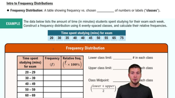
Frequency Distribution

A frequency distribution is a summary of how often each value occurs in a dataset. It organizes data into classes or intervals, showing the number of observations (frequency) that fall within each class. This helps in understanding the distribution of data points and identifying patterns, such as skewness or modality.
추천 영상:
가이드 코스
06:38
Intro to Frequency Distributions

Histogram

A histogram is a graphical representation of a frequency distribution, where the data is divided into intervals (bins) and the frequency of data points in each interval is represented by bars. The height of each bar corresponds to the frequency of observations in that interval, allowing for visual analysis of the data's distribution, trends, and potential outliers.
추천 영상:
가이드 코스
05:54
Intro to Histograms

Classes and Bin Width

Classes refer to the intervals into which data is grouped for analysis, while bin width is the range of values each class covers. Choosing the right number of classes and appropriate bin width is crucial, as it affects the clarity and interpretability of the histogram. Too few classes can oversimplify the data, while too many can obscure important patterns.
추천 영상:
가이드 코스
05:54
Intro to Histograms
관련 실천
교과서 질문

Putting Graphs in Context In Exercises 5–8, match the plot with the description of the sample.

a. Times (in minutes) it takes a sample of employees to drive to work

b. Grade point averages of a sample of students with finance majors

c. Top speeds (in miles per hour) of a sample of high-performance sports cars

d. Ages (in years) of a sample of residents of a retirement home


" style="" width="385">

91
views
교과서 질문

Constructing Data Sets In Exercises 25–28, construct a data set that has the given statistics.


N = 6

μ = 5

σ ≈ 2

109
views
교과서 질문

Comparing Variation in Different Data Sets In Exercises 45–50, find the coefficient of variation for each of the two data sets. Then compare the results.

Heights and Weights The heights (in inches) and weights (in pounds) of every France national soccer team player that started the 2018 FIFA Men’s World Cup final are listed. (Source: ESPN)

110
views
교과서 질문

Extending Concepts


A Misleading Graph? A misleading graph is not drawn appropriately, which can misrepresent data and lead to false conclusions. In Exercises 37–40, (a) explain why the graph is misleading, and (b) redraw the graph so that it is not misleading.


166
views
교과서 질문

use the given information about the data set and the number of classes to find the class width, the lower class limits, and the upper class limits.

min=17, range=118, 8 classes

189
views
교과서 질문

Project Find a real-life data set and use the techniques of Chapter 2, including graphs and numerical quantities, to discuss the center, variation, and shape of the data set. Describe any patterns.

117
views