
Ch. 2 - Descriptive Statistics
Larson - Elementary Statistics: Picturing the World 8th Edition
Larson8th EditionElementary Statistics: Picturing the WorldISBN: 9780137493470당신이 사용하는 게 아니라요?교과서 변경
2장, 문제 2.5.32

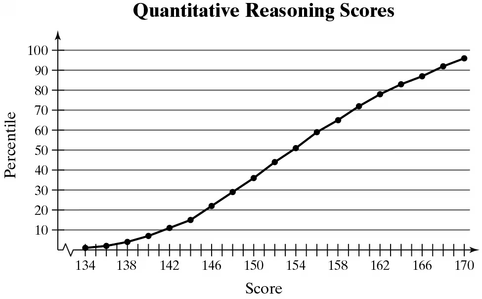
Interpreting Percentiles In Exercises 29–32, use the ogive, which represents the cumulative frequency distribution for quantitative reasoning scores on the Graduate Record Examination in a recent range of years. (Adapted from Educational Testing Service)
Graph showing the cumulative frequency distribution of quantitative reasoning scores with percentiles marked along the y-axis.
What percentile is a score of 170? How should you interpret this?

검증된 단계별 안내
1
Step 1: Understand the ogive graph. An ogive is a cumulative frequency graph that shows the percentage of data points below a certain value. The x-axis represents the scores, and the y-axis represents the percentiles.
Step 2: Locate the score of 170 on the x-axis of the graph. Draw a vertical line from this point upward until it intersects the curve.
Step 3: From the point of intersection, draw a horizontal line to the y-axis. This will give the corresponding percentile for the score of 170.
Step 4: Interpret the percentile value. The percentile indicates the percentage of test-takers who scored below 170. For example, if the percentile is 95, it means 95% of test-takers scored below 170.
Step 5: Use this information to understand the relative performance. A high percentile (e.g., 95th) suggests that the score of 170 is better than most test-takers, placing the individual in the top 5%.

비슷한 문제에 대한 검증된 영상 답변:

이 영상 해법은 위 문제에 도움이 된다고 튜터들이 추천한 것입니다.
영상 길이:
1m
도움이 되었나요?

주요 개념

질문에 올바르게 답하기 위해 반드시 이해해야 하는 핵심 개념들은 다음과 같습니다.

Percentiles

A percentile is a statistical measure that indicates the value below which a given percentage of observations fall. For example, if a score is at the 70th percentile, it means that 70% of the scores are below that value. This concept is crucial for interpreting individual scores in the context of a larger dataset, such as standardized test results.
추천 영상:
07:11
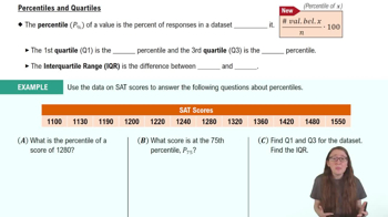
Percentiles and Quartiles

Ogive

An ogive is a graph that represents the cumulative frequency of a dataset. It is constructed by plotting the cumulative frequency against the upper boundaries of the classes. In the context of the question, the ogive allows us to visually determine the percentile rank of a specific score, such as 170, by locating it on the x-axis and reading the corresponding percentile on the y-axis.

Cumulative Frequency

Cumulative frequency is the running total of frequencies in a dataset, showing how many observations fall below a particular value. It is essential for understanding the distribution of scores and is used to create the ogive. By analyzing cumulative frequency, one can determine how a specific score compares to others in the dataset, aiding in the interpretation of percentiles.
추천 영상:
04:41
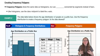
Creating Frequency Polygons
관련 실천
교과서 질문

Construct a cumulative frequency distribution and an ogive for the data set using six classes. Then describe the location of the greatest increase in frequency.

Retirement Ages

Data set: Retirement ages of 35 English professors 72 62 55 61 53 62 65 66 69 55 66 63 67 69 55 65 67 57 67 68 73 75 65 54 71 57 52 58 58 71 72 67 63 65 61

182
views
교과서 질문

Identifying the Shape of a Distribution In Exercises 53–56, construct a frequency distribution and a frequency histogram for the data set using the indicated number of classes. Describe the shape of the histogram as symmetric, uniform, negatively skewed, positively skewed, or none of these.


Heights of Males

Number of classes: 5

Data set: The heights (to the nearest inch) of 30 males

67 76 69 68 72 68 65 63 75 69

66 72 67 66 69 73 64 62 71 73

68 72 71 65 69 66 74 72 68 69

265
views
교과서 질문

Constructing Data Sets In Exercises 5– 8, construct the described data set. The entries in the data set cannot all be the same.


Mean and median are the same and the data is bimodal.

128
views
교과서 질문

Construct a frequency distribution for the data set using the indicated number of classes. In the table, include the midpoints, relative frequencies, and cumulative frequencies. Which class has the greatest class frequency and which has the least class frequency.

Textbook Spending

Number of classes: 6

Data set: Amounts (in dollars) spent on textbooks for a semester 91 472 279 249 530 376 188 341 266 199 142 273 189 130 489 266 248 101 375 486 190 398 188 269 43 30 127 354 84 319

232
views
교과서 질문

Using and Interpreting Concepts


Finding and Discussing the Mean, Median, and Mode In Exercises 17–34, find the mean, the median, and the mode of the data, if possible. If any measure cannot be found or does not represent the center of the data, explain why.


Weights (in pounds) of Packages on a Delivery Truck

" style="" width="380">

116
views
교과서 질문

Graphing Data Sets In Exercises 17–32, organize the data using the indicated type of graph. Describe any patterns.


Engineering Degrees Use a time series chart to display the data shown in the table. The data represent the number of bachelor’s degrees in engineering (in thousands) conferred in the U.S. (Source: U.S. Deapartment of Education)


122
views