
Ch. 2 - Descriptive Statistics
Larson - Elementary Statistics: Picturing the World 8th Edition
Larson8th EditionElementary Statistics: Picturing the WorldISBN: 9780137493470당신이 사용하는 게 아니라요?교과서 변경
2장, 문제 2.2.5

Putting Graphs in Context In Exercises 5–8, match the plot with the description of the sample.
a. Times (in minutes) it takes a sample of employees to drive to work
b. Grade point averages of a sample of students with finance majors
c. Top speeds (in miles per hour) of a sample of high-performance sports cars
d. Ages (in years) of a sample of residents of a retirement home


<IMAGE>

검증된 단계별 안내
1
Step 1: Analyze the stem-and-leaf plot provided. The key indicates that '0|8' represents 0.8. This means the data values are in decimal format, and each stem represents the integer part while the leaf represents the decimal part.
Step 2: List the data values from the stem-and-leaf plot. For example, the first row (stem 0, leaf 8) corresponds to 0.8, the second row (stem 1, leaves 5, 6, 8) corresponds to 1.5, 1.6, and 1.8, and so on.
Step 3: Consider the context of the data. The values range from 0.8 to 4.0, which suggests that the data could represent measurements that are typically small in magnitude, such as grade point averages (GPAs).
Step 4: Match the data to the given descriptions. The data does not seem to represent times to drive to work (which are usually larger numbers), top speeds of sports cars (which are much larger), or ages of retirement home residents (which are integers and larger). The data aligns best with GPAs of finance majors.
Step 5: Conclude that the stem-and-leaf plot matches description (b): 'Grade point averages of a sample of students with finance majors.'

비슷한 문제에 대한 검증된 영상 답변:

이 영상 해법은 위 문제에 도움이 된다고 튜터들이 추천한 것입니다.
영상 길이:
3m
도움이 되었나요?

주요 개념

질문에 올바르게 답하기 위해 반드시 이해해야 하는 핵심 개념들은 다음과 같습니다.

Data Representation

Data representation refers to the way in which data is organized and displayed for analysis. In the context of the question, the image shows a frequency distribution or a stem-and-leaf plot, which helps visualize the distribution of a dataset. This method allows for easy identification of the shape of the data, central tendencies, and potential outliers.
추천 영상:
가이드 코스
04:39
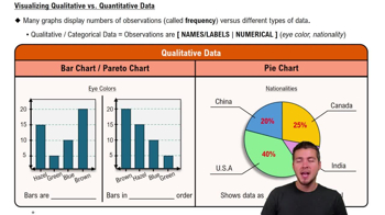
Visualizing Qualitative vs. Quantitative Data

Descriptive Statistics

Descriptive statistics summarize and describe the main features of a dataset. Key measures include mean, median, mode, and standard deviation. Understanding these statistics is essential for interpreting the data represented in the graphs and plots, as they provide insights into the overall trends and characteristics of the sample being analyzed.
추천 영상:
가이드 코스
05:53
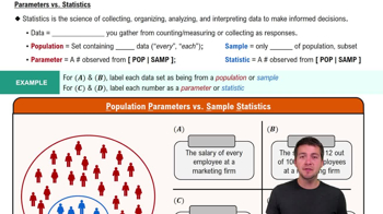
Parameters vs. Statistics

Contextual Analysis

Contextual analysis involves interpreting data within the framework of its real-world application. In this question, matching plots with descriptions requires understanding the context of each sample, such as employee commute times or student GPAs. This analysis helps in making informed conclusions about the data and its implications in practical scenarios.
추천 영상:
가이드 코스
01:35
Step 1: Write Hypotheses Example 1
관련 실천
교과서 질문

Finding Sample Statistics In Exercises 15 and 16, find the range, mean, variance, and standard deviation of the sample data set.


Pregnancy Durations The durations (in days) of pregnancies for a random sample of pregnant people

277 291 295 280 268 278 291

277 282 279 296 285 269 293

267 281 286 269 264 299 275

108
views
교과서 질문

Finding the Sample Mean and Standard Deviation for Grouped Data In Exercises 39 and 40, make a frequency distribution for the data. Then use the table to find the sample mean and the sample standard deviation of the data set.


3 3 5 3 8 0 3 9 6 6 7 1 6 3 2 6 9 1 8 5 0 2 3 4 9

5 8 1 9 7 6 9 6 7 0 6 3 8 6 8 7 3 8 9 3 7 2 4 4 1

279
views
교과서 질문

Graphical Analysis In Exercises 9–12, determine whether the approximate shape of the distribution in the histogram is symmetric, uniform, skewed left, skewed right, or none of these. Justify your answer.

114
views
교과서 질문

Graphical Analysis In Exercises 9–12, determine whether the approximate shape of the distribution in the histogram is symmetric, uniform, skewed left, skewed right, or none of these. Justify your answer.

155
views
교과서 질문

Graphical Analysis In Exercises 41 and 42, the midpoints A, B, and C are marked on the histograms at the left. Match them with the indicated z-scores. Which z-scores, if any, would be considered unusual?


z = 0, z = 2.14, z = −1.43


105
views
교과서 질문

Using the Empirical Rule In Exercises 29–34, use the Empirical Rule.


The speeds for eight vehicles are listed. Using the sample statistics from Exercise 29, determine which of the data entries are unusual. Are any of the data entries very unusual? Explain your reasoning.

70, 78, 62, 71, 65, 76, 82, 64

185
views