Ch. 2 - Descriptive Statistics
Larson - Elementary Statistics: Picturing the World 8th Edition
Larson8th EditionElementary Statistics: Picturing the WorldISBN: 9780137493470당신이 사용하는 게 아니라요?교과서 변경
2장, 문제 2.2.15

Using and Interpreting Concepts


Graphical Analysis In Exercises 13–16, give three observations that can be made from the graph.


pie

검증된 단계별 안내
1
Observe the pie chart and note the percentages associated with each category of least popular American drivers. This will help identify which categories are most and least significant.
Identify the category with the highest percentage, which is 'The Texter' at 22%. This indicates that texting while driving is considered the least popular behavior among American drivers.
Identify the category with the second highest percentage, which is 'The Tailgater' at 14%. This suggests that tailgating is another major concern for drivers.
Compare the smaller percentages, such as 'The Speeder' and 'The Drifter,' both at 5%. These behaviors are less significant compared to others in terms of unpopularity.
Note that the 'Other' category accounts for 6%, which implies there are additional behaviors not specifically listed that contribute to the overall unpopularity of certain driving habits.

비슷한 문제에 대한 검증된 영상 답변:

이 영상 해법은 위 문제에 도움이 된다고 튜터들이 추천한 것입니다.
영상 길이:
7m
도움이 되었나요?

주요 개념

질문에 올바르게 답하기 위해 반드시 이해해야 하는 핵심 개념들은 다음과 같습니다.

Pie Chart Interpretation

A pie chart is a circular statistical graphic divided into slices to illustrate numerical proportions. Each slice represents a category's contribution to the total, making it easy to compare relative sizes. In this context, the pie chart displays the least popular American drivers, with each segment showing the percentage of respondents identifying each type of driver.
추천 영상:
06:10
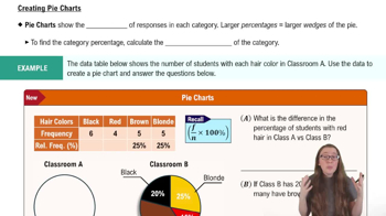
Creating Pie Charts

Percentage Representation

Percentages are a way to express a number as a fraction of 100, providing a clear understanding of proportions. In the graph, each driver type is represented by a percentage, indicating how many respondents view them as the least popular. This allows for quick comparisons between different categories, highlighting which driver types are perceived most negatively.
추천 영상:
가이드 코스
05:54
Intro to Histograms

Data Analysis and Observations

Data analysis involves examining, cleaning, and interpreting data to extract meaningful insights. In the context of the pie chart, making observations requires identifying trends, such as which driver types are most and least popular. Observations can include noting the highest percentage (The Textter at 22%) and comparing it to others, which helps in understanding public perceptions of driving behaviors.
추천 영상:
4:01
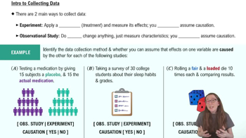
Introduction to Collecting Data
관련 실천
교과서 질문

Graphical Analysis In Exercises 41 and 42, the midpoints A, B, and C are marked on the histograms at the left. Match them with the indicated z-scores. Which z-scores, if any, would be considered unusual?


z = 0, z = 2.14, z = −1.43


105
views

교과서 질문

Using the Empirical Rule In Exercises 29–34, use the Empirical Rule.


The speeds for eight vehicles are listed. Using the sample statistics from Exercise 29, determine which of the data entries are unusual. Are any of the data entries very unusual? Explain your reasoning.

70, 78, 62, 71, 65, 76, 82, 64

185
views
교과서 질문

Using and Interpreting Concepts


Finding and Discussing the Mean, Median, and Mode In Exercises 17–34, find the mean, the median, and the mode of the data, if possible. If any measure cannot be found or does not represent the center of the data, explain why.


Prices (in dollars) of Flights from Chicago to Alanta

" style="" width="235">

64
views
교과서 질문

Phone Screen Sizes Display the data below in a dot plot. Describe the differences in how the stem-and-leaf plot and the dot plot show patterns in the data.

145
views
교과서 질문

Building Basic Skills and Vocabulary


Describe the relationship between quartiles and percentiles.

101
views
교과서 질문

Graphing Data Sets In Exercises 17–32, organize the data using the indicated type of graph. Describe any patterns.


Life Spans of Houseflies Use a dot plot to display the data, which represent the life spans (in days) of 30 houseflies. 

9 9 4 11 10 5 13 9 7 11 6 8 14 10 6 

10 10 7 14 11 7 8 6 13 10 14 14 8 13 10

188
views