
Ch. 2 - Descriptive Statistics
Larson - Elementary Statistics: Picturing the World 8th Edition
Larson8th EditionElementary Statistics: Picturing the WorldISBN: 9780137493470당신이 사용하는 게 아니라요?교과서 변경
2장, 문제 2.1.6

What is the difference between a frequency polygon and an ogive?

검증된 단계별 안내
1
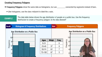
A frequency polygon is a graphical representation of the distribution of a dataset. It is created by plotting points that represent the frequencies of data intervals and connecting these points with straight lines. The x-axis represents the midpoints of the intervals, and the y-axis represents the frequencies.
An ogive, on the other hand, is a cumulative frequency graph. It is constructed by plotting points that represent the cumulative frequencies of data intervals and connecting these points with straight lines. The x-axis represents the upper boundaries of the intervals, and the y-axis represents the cumulative frequencies.
The key difference between the two is that a frequency polygon shows the frequency of individual intervals, while an ogive shows the cumulative frequency, which accumulates as you move across intervals.
Frequency polygons are useful for comparing distributions and visualizing the shape of the data, while ogives are helpful for understanding cumulative trends and determining percentiles or medians.
Both graphs are constructed using similar principles, but they serve different purposes in statistical analysis and data visualization.

비슷한 문제에 대한 검증된 영상 답변:

이 영상 해법은 위 문제에 도움이 된다고 튜터들이 추천한 것입니다.
영상 길이:
1m
도움이 되었나요?

주요 개념

질문에 올바르게 답하기 위해 반드시 이해해야 하는 핵심 개념들은 다음과 같습니다.

Frequency Polygon

A frequency polygon is a graphical representation of a frequency distribution. It is created by plotting the midpoints of each class interval on the x-axis and the corresponding frequencies on the y-axis, then connecting these points with straight lines. This type of graph helps visualize the shape of the distribution and is particularly useful for comparing multiple distributions.
추천 영상:
04:41
Creating Frequency Polygons

Ogive

An ogive is a cumulative frequency graph that represents the cumulative frequency of data points up to a certain value. It is constructed by plotting the upper boundaries of class intervals on the x-axis and the cumulative frequencies on the y-axis, connecting the points with a line. Ogives are useful for determining percentiles and understanding the distribution of data over time or categories.

Cumulative Frequency

Cumulative frequency is the running total of frequencies through the classes in a frequency distribution. It indicates the number of observations that fall below a particular value or within a certain range. Understanding cumulative frequency is essential for constructing ogives, as it allows for the visualization of how data accumulates across intervals, providing insights into the overall distribution.
추천 영상:
04:41
Creating Frequency Polygons
관련 실천
교과서 질문

Extending Concepts


A Misleading Graph? A misleading graph is not drawn appropriately, which can misrepresent data and lead to false conclusions. In Exercises 37–40, (a) explain why the graph is misleading, and (b) redraw the graph so that it is not misleading.


166
views
교과서 질문

use the given information about the data set and the number of classes to find the class width, the lower class limits, and the upper class limits.

min=17, range=118, 8 classes

189
views
교과서 질문

Project Find a real-life data set and use the techniques of Chapter 2, including graphs and numerical quantities, to discuss the center, variation, and shape of the data set. Describe any patterns.

117
views
교과서 질문

Finding and Interpreting Percentiles In Exercises 37– 40, use the data set, which represents wait times (in minutes) for various services at a state’s Department of Motor Vehicles locations.

6 10 1 22 23 10 6 7 2 1 6 6 2 4 14 15 16 4

19 3 19 26 5 3 4 7 6 10 9 10 20 18 3 20 10 13

14 11 14 17 4 27 4 8 4 3 26 18 21 1 3 3 5 5

Which wait time represents the 50th percentile? How would you interpret this?

279
views
교과서 질문

Finding z-Scores The distribution of the ages of the winners of the Tour de France from 1903 to 2020 is approximately bell-shaped. The mean age is 27.9 years, with a standard deviation of 3.4 years. In Exercises 43–48, use the corresponding z-score to determine whether the age is unusual. Explain your reasoning. (Source: Le Tour de France)


100
views
교과서 질문

Finding a Weighted Mean In Exercises 41– 46, find the weighted mean of the data.


Grades A student receives the grades shown below, with an A worth 4 points, a B worth 3 points, a C worth 2 points, and a D worth 1 point. What is the student’s grade point average?


238
views