Ch. 9 - Correlation and Regression
Larson - Elementary Statistics: Picturing the World 8th Edition
Larson8th EditionElementary Statistics: Picturing the WorldISBN: 9780137493470당신이 사용하는 게 아니라요?교과서 변경
9장, 문제 9.2.27

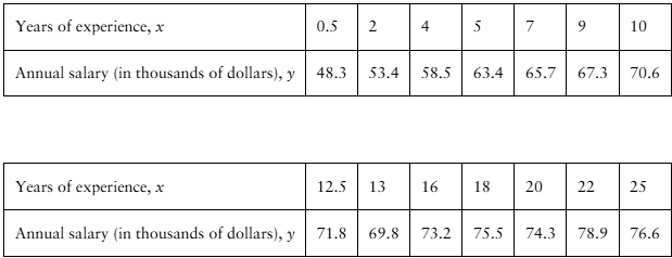
"[APPLET] Registered Nurse Salaries In Exercises 27–30, use the table, which shows the years of experience of 14 registered nurses and their annual salaries (in thousands of dollars). (Adapted from Payscale, Inc.)

27. Correlation Using the scatter plot of the registered nurse salary data shown below, what type of correlation, if any, do you think the data have? Explain.


"

검증된 단계별 안내
1
Observe the data provided in the table. The table lists the years of experience (x) and the corresponding annual salaries (y) of 14 registered nurses. The data appears to show a relationship between these two variables.
To determine the type of correlation, plot the data points on a scatter plot with 'Years of Experience' on the x-axis and 'Annual Salary' on the y-axis. Each pair (x, y) represents a point on the scatter plot.
Examine the pattern of the points in the scatter plot. If the points tend to rise from left to right, this indicates a positive correlation. If they tend to fall, it indicates a negative correlation. If the points are scattered randomly, there may be no correlation.
Based on the data, as the years of experience (x) increase, the annual salary (y) also tends to increase. This suggests a positive correlation. The relationship appears to be fairly strong, as the increase in salary is consistent with the increase in experience.
Conclude that the data likely exhibit a strong positive correlation. This means that as the years of experience of registered nurses increase, their annual salaries tend to increase as well.

비슷한 문제에 대한 검증된 영상 답변:

이 영상 해법은 위 문제에 도움이 된다고 튜터들이 추천한 것입니다.
영상 길이:
2m
도움이 되었나요?

주요 개념

질문에 올바르게 답하기 위해 반드시 이해해야 하는 핵심 개념들은 다음과 같습니다.

Correlation

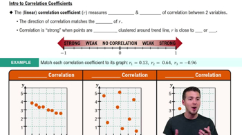
Correlation measures the strength and direction of a linear relationship between two variables. It is quantified using the correlation coefficient, which ranges from -1 to 1. A positive correlation indicates that as one variable increases, the other also tends to increase, while a negative correlation suggests the opposite. Understanding correlation is essential for interpreting the relationship between years of experience and salary in this context.
추천 영상:
가이드 코스
05:43
Correlation Coefficient

Scatter Plot

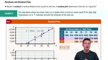
A scatter plot is a graphical representation of two quantitative variables, where each point represents an observation. It helps visualize the relationship between the variables, making it easier to identify patterns, trends, or correlations. In this case, the scatter plot of registered nurse salaries against years of experience will illustrate how salary changes with increasing experience, aiding in the analysis of correlation.
추천 영상:
가이드 코스
07:38
Residuals and Residual Plots

Linear Relationship

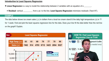
A linear relationship between two variables means that the change in one variable is proportional to the change in the other, often represented by a straight line in a scatter plot. This concept is crucial for understanding correlation, as it indicates whether the relationship can be described by a linear equation. In the context of the question, determining if the salary increases linearly with years of experience will help assess the nature of the correlation.
추천 영상:
가이드 코스
07:01
Intro to Least Squares Regression