

Ch. 10 - Correlation and Regression
Triola - Elementary Statistics 14th Edition
Triola14th EditionElementary StatisticsISBN: 9780137366446당신이 사용하는 게 아니라요?교과서 변경
10장, 문제 10.CQQ.1

Exercises 1–10 are based on the following sample data consisting of costs of dinner (dollars) and the amounts of tips (dollars) left by diners. The data were collected by students of the author.
[IMAGE]
Scatterplot Construct a scatterplot and comment on the pattern of points.

검증된 단계별 안내
1
Step 1: Understand the problem. A scatterplot is a graphical representation of data points where each point represents a pair of values (in this case, dinner costs and tip amounts). The goal is to visually analyze the relationship between these two variables.
Step 2: Identify the variables. The x-axis will represent the independent variable (dinner costs), and the y-axis will represent the dependent variable (tip amounts). Ensure you have the data points ready for plotting.
Step 3: Plot the data points. For each pair of values (dinner cost, tip amount), plot a point on the graph where the x-coordinate corresponds to the dinner cost and the y-coordinate corresponds to the tip amount. Use a consistent scale for both axes to ensure clarity.
Step 4: Analyze the pattern of points. Look for trends or relationships in the scatterplot. For example, check if the points form a linear pattern, cluster in certain areas, or show no apparent relationship. This will help you comment on the correlation between dinner costs and tip amounts.
Step 5: Comment on the pattern. Based on the scatterplot, describe the observed relationship. For instance, if the points form an upward trend, it may indicate a positive correlation (higher dinner costs lead to higher tips). If the points are scattered randomly, it may suggest no correlation.

비슷한 문제에 대한 검증된 영상 답변:

이 영상 해법은 위 문제에 도움이 된다고 튜터들이 추천한 것입니다.
영상 길이:
1m
도움이 되었나요?

주요 개념

질문에 올바르게 답하기 위해 반드시 이해해야 하는 핵심 개념들은 다음과 같습니다.

Scatterplot

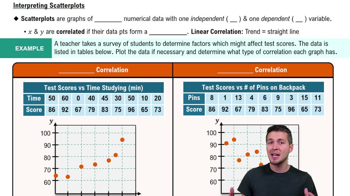
A scatterplot is a graphical representation of two quantitative variables, where each point represents an observation in the dataset. The x-axis typically represents one variable (e.g., cost of dinner), while the y-axis represents the other variable (e.g., tip amount). This visualization helps identify relationships, trends, or patterns between the variables, such as correlation or clustering.
추천 영상:
가이드 코스
06:36
Scatterplots & Intro to Correlation

Correlation

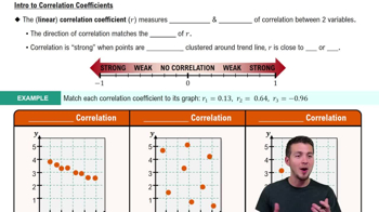
Correlation refers to the statistical relationship between two variables, indicating how one variable may change in relation to another. It is measured by the correlation coefficient, which ranges from -1 to 1. A positive correlation means that as one variable increases, the other tends to increase as well, while a negative correlation indicates that one variable increases as the other decreases.
추천 영상:
가이드 코스
05:43
Correlation Coefficient

Pattern Recognition

Pattern recognition in data analysis involves identifying trends, clusters, or anomalies within a dataset. In the context of a scatterplot, this means observing how the points are distributed, whether they form a linear relationship, or if there are any outliers. Recognizing these patterns is crucial for making inferences about the relationship between the variables and for guiding further statistical analysis.
추천 영상:
가이드 코스
05:54
Intro to Histograms
관련 실천
교과서 질문

Time and Motion In a physics experiment at Doane College, a soccer ball was thrown upward from the bed of a moving truck. The table below lists the time (sec) that has lapsed from the throw and the corresponding height (m) of the soccer ball.

[IMAGE]

a. Find the value of the linear correlation coefficient r.

177
views
교과서 질문

Exercises 1–10 are based on the following sample data consisting of costs of dinner (dollars) and the amounts of tips (dollars) left by diners. The data were collected by students of the author.

[IMAGE]

Change in Scale Exercise 1 stated that for the given paired data, r = 0.846. How does that value change if all of the amounts of dinners are left unchanged but all of the tips are expressed in cents instead of dollars?

255
views
교과서 질문

Exercises 1–10 are based on the following sample data consisting of costs of dinner (dollars) and the amounts of tips (dollars) left by diners. The data were collected by students of the author.

Predictions The sample data result in a linear correlation coefficient of r = 0.846 and the regression equation y^ = -0.00777 + 0.145x. What is the best predicted amount of tip, given that the cost of dinner was \$84.62? How was the predicted value found?

132
views
교과서 질문

Time and Motion In a physics experiment at Doane College, a soccer ball was thrown upward from the bed of a moving truck. The table below lists the time (sec) that has lapsed from the throw and the corresponding height (m) of the soccer ball.

[IMAGE]

c. What horrible mistake would be easy to make if the analysis is conducted without a scatterplot?

166
views
교과서 질문

Casino Size and Revenue Use the same paired data from the preceding exercise.

b. What is the best predicted amount of revenue for a casino with a size of 200 thousand square feet? Is it likely that the best predicted amount of revenue will be accurate?


101
views
교과서 질문

Exercises 1–10 are based on the following sample data consisting of costs of dinner (dollars) and the amounts of tips (dollars) left by diners. The data were collected by students of the author.

[IMAGE]

Fixed Percentage If a restaurant were to change its tipping policy so that a constant tip of 20% of the bill is added to the cost of the dinner, what would be the value of the linear correlation coefficient for the paired amounts of dinners/tips?

264
views