
Ch. 2 - Exploring Data with Tables and Graphs
Triola - Elementary Statistics 14th Edition
Triola14th EditionElementary StatisticsISBN: 9780137366446당신이 사용하는 게 아니라요?교과서 변경
2장, 문제 2.1.34

Exercises 29–34 involve large sets of data, so technology should be used. Complete lists of the data are not listed in Appendix B, but they can be downloaded from the website TriolaStats.com. Use the indicated data and construct the frequency distribution.


Earthquake Depths Use the depths (km) of the 600 earthquakes included in Data Set 24 “Earthquakes.” Use a class width of 10.0 km and begin with a lower class limit of 0.0 km. Does the frequency distribution appear to be a normal distribution?

검증된 단계별 안내
1
Step 1: Understand the problem. You are tasked with constructing a frequency distribution for the depths of 600 earthquakes using a class width of 10.0 km, starting with a lower class limit of 0.0 km. Additionally, you need to assess whether the resulting frequency distribution resembles a normal distribution.
Step 2: Define the class intervals. Start with the lower class limit of 0.0 km and add the class width of 10.0 km to create successive intervals. For example, the first interval will be 0.0–10.0 km, the second will be 10.0–20.0 km, and so on. Continue this process until you cover the range of the data.
Step 3: Count the frequencies. For each class interval, count the number of earthquake depths that fall within that range. This can be done using technology such as Excel, a statistical calculator, or statistical software. Record the frequencies for each class interval.
Step 4: Construct the frequency distribution table. Create a table with two columns: one for the class intervals and one for the corresponding frequencies. Populate the table with the intervals and their respective frequencies from Step 3.
Step 5: Assess normality. To determine if the frequency distribution appears to be a normal distribution, plot a histogram of the data using the class intervals and frequencies. A normal distribution will typically have a bell-shaped curve, with frequencies increasing to a peak in the middle and then symmetrically decreasing. Analyze the shape of the histogram to make your assessment.

비슷한 문제에 대한 검증된 영상 답변:

이 영상 해법은 위 문제에 도움이 된다고 튜터들이 추천한 것입니다.
영상 길이:
5m
도움이 되었나요?

주요 개념

질문에 올바르게 답하기 위해 반드시 이해해야 하는 핵심 개념들은 다음과 같습니다.

Frequency Distribution

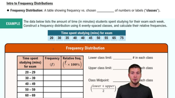
A frequency distribution is a summary of how often each value occurs in a dataset. It organizes data into classes or intervals, showing the number of observations (frequency) that fall within each class. This helps in visualizing the distribution of data points and identifying patterns, such as skewness or modality.
추천 영상:
가이드 코스
06:38
Intro to Frequency Distributions

Class Width

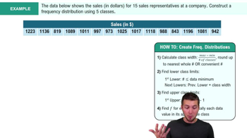
Class width refers to the range of values that each class in a frequency distribution covers. It is calculated by subtracting the lower limit of a class from its upper limit. In this case, a class width of 10.0 km means each class will encompass a range of 10 kilometers, which helps in grouping the earthquake depths effectively for analysis.
추천 영상:
가이드 코스
05:18
How to Create Frequency Distributions Example 2

Normal Distribution

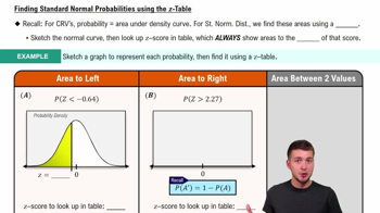
A normal distribution is a probability distribution that is symmetric about the mean, showing that data near the mean are more frequent in occurrence than data far from the mean. It is characterized by its bell-shaped curve. To determine if the frequency distribution of earthquake depths is normal, one would look for symmetry and the presence of a single peak in the distribution.
추천 영상:
가이드 코스
09:47
Finding Standard Normal Probabilities using z-Table
관련 실천
교과서 질문

Exercises 29–34 involve large sets of data, so technology should be used. Complete lists of the data are not listed in Appendix B, but they can be downloaded from the website TriolaStats.com. Use the indicated data and construct the frequency distribution.

Systolic Blood Pressure Use the systolic blood pressures of the 300 subjects included in Data Set 1 “Body Data.” Use a class width of 20 mm Hg and begin with a lower class limit of 80 mm Hg. Does the frequency distribution appear to be a normal distribution?

111
views
교과서 질문

Airport Data Speeds Listed below are the cellular data speeds (Mbps) from Sprint and Verizon measured at nine different airports (based on data from CNN). What would the presence of a correlation suggest about Sprint and Verizon?

123
views
교과서 질문

V and Digital Ads Listed below are amounts (billions of dollars) spent on TV and digital advertising. The amounts are listed in order by year ending with the year 2022. The last few years are projected amounts (based on data from Magna Global). Construct a graph that reveals the story that the data are trying to tell. What story does the graph depict?

TV Ads:

[Image]

105
views
교과서 질문

Ethics There are data showing that smoking is detrimental to good health. Given that people could be helped and lives could be saved by reducing smoking, is it ethical to graph the data in a way that is misleading by exaggerating the health risks of smoking?

124
views
교과서 질문

Cell Phone Radiation If we collect a sample of cell phone radiation amounts much larger than the sample included with Exercise 3, and if our sample includes a single outlier, how will that outlier appear in a histogram?

152
views
교과서 질문

In Exercises 13–16, write a statement that interprets the P-value and includes a conclusion about linear correlation.


Using the data from Exercise 6 “Airport Data Speeds,” the P-value is 0.003.

167
views