
Ch. 2 - Exploring Data with Tables and Graphs
Triola - Elementary Statistics 14th Edition
Triola14th EditionElementary StatisticsISBN: 9780137366446당신이 사용하는 게 아니라요?교과서 변경
2장, 문제 2.RE.7

It’s Like Time to Do This Exercise In a Marist survey of adults, these are the words or phrases that subjects find most annoying in conversation (along with their frequencies of response): like (127); just sayin’ (81); you know (104); whatever (219); obviously (35). Construct a pie chart. Identify one disadvantage of a pie chart.

검증된 단계별 안내
1
Step 1: Calculate the total frequency by summing up all the given frequencies: 127 (like) + 81 (just sayin’) + 104 (you know) + 219 (whatever) + 35 (obviously). This total will represent the entire dataset.
Step 2: For each category, calculate the proportion of the total frequency it represents. Use the formula: Proportion = (Frequency of the category) / (Total frequency). For example, for 'like', the proportion would be 127 / Total frequency.
Step 3: Convert each proportion into a percentage by multiplying it by 100. For example, the percentage for 'like' would be (127 / Total frequency) × 100.
Step 4: Use the percentages to determine the angle for each category in the pie chart. Use the formula: Angle = (Percentage / 100) × 360°. For example, the angle for 'like' would be ((127 / Total frequency) × 100) × 360°.
Step 5: Draw the pie chart by dividing the circle into slices based on the calculated angles for each category. Label each slice with the corresponding category and percentage. A disadvantage of a pie chart is that it can be difficult to compare the sizes of slices accurately, especially when the differences are small.

비슷한 문제에 대한 검증된 영상 답변:

이 영상 해법은 위 문제에 도움이 된다고 튜터들이 추천한 것입니다.
영상 길이:
2m
도움이 되었나요?

주요 개념

질문에 올바르게 답하기 위해 반드시 이해해야 하는 핵심 개념들은 다음과 같습니다.

Pie Chart

A pie chart is a circular statistical graphic that is divided into slices to illustrate numerical proportions. Each slice represents a category's contribution to the total, making it easy to visualize relative sizes. In the context of the survey, each annoying phrase's frequency can be represented as a slice of the pie, allowing for quick comparisons of how often each phrase is mentioned.
추천 영상:
가이드 코스
06:10
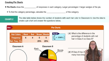
Creating Pie Charts

Data Visualization

Data visualization is the graphical representation of information and data. By using visual elements like charts, graphs, and maps, it helps to make complex data more accessible and understandable. Effective data visualization can reveal patterns, trends, and insights that might not be immediately apparent in raw data, which is crucial when interpreting survey results.
추천 영상:
가이드 코스
04:39
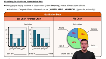
Visualizing Qualitative vs. Quantitative Data

Disadvantages of Pie Charts

One disadvantage of pie charts is that they can be misleading when comparing similar-sized slices, as small differences in size can be hard to discern visually. Additionally, pie charts do not effectively convey changes over time or the exact values of each category, which can limit their usefulness in certain analytical contexts. This can lead to misinterpretation of the data presented.
추천 영상:
가이드 코스
06:10
Creating Pie Charts
관련 실천
교과서 질문

In Exercises 1–5, use the data listed in the margin, which are magnitudes (Richter scale) and depths (km) of earthquakes from Data Set 24 “Earthquakes” in Appendix B

[Image]

Data Type


a. The listed earthquake depths (km) are all rounded to one decimal place. Before rounding, are the exact depths discrete data or continuous data?

210
views
교과서 질문

Whatever Use the same data from Exercise 7 to construct a Pareto chart. Which graph does a better job of illustrating the data: Pareto chart or pie chart?

170
views
교과서 질문

Environment


a. After collecting the average (mean) global temperatures for each of the most recent 100 years, we want to construct the graph that is most appropriate for these data. Which graph is best?

89
views
교과서 질문

Body Temperatures Listed below are the temperatures from nine males measured at 8 AM and again at 12 AM (from Data Set 5 “Body Temperatures” in Appendix B). Construct a scatterplot. Based on the graph, does there appear to be a relationship between 8 AM temperatures and 12 AM temperatures?

122
views
교과서 질문

In Exercises 1–5, use the data listed in the margin, which are magnitudes (Richter scale) and depths (km) of earthquakes from Data Set 24 “Earthquakes” in Appendix B

[Image]

Data Type


c. Identify the level of measurement of the listed earthquake depths: nominal, ordinal, interval, or ratio.

213
views
교과서 질문

In Exercises 1–5, use the data listed in the margin, which are magnitudes (Richter scale) and depths (km) of earthquakes from Data Set 24 “Earthquakes” in Appendix B

[Image]

Data Type


d. Given that the listed earthquake depths are part of a larger collection of depths, do the data constitute a sample or a population?

172
views