Refer to Figure 15-4. Which area on the graph represents the monopolist's profit?
The area between the price (from the demand curve) and the average total cost (from the ATC curve) at the profit-maximizing quantity, multiplied by the quantity produced, represents the monopolist's profit.
Refer to Table 15-1. At what price will the monopolist maximize profit?
The monopolist will maximize profit at the price found on the demand curve corresponding to the quantity where marginal revenue equals marginal cost.
How is economic profit for a monopoly calculated?
Economic profit for a monopoly is calculated as (Price - Average Total Cost) × Quantity.
What is the monopolist's profit at the profit-maximizing level of output?
The monopolist's profit is the difference between price (from the demand curve) and average total cost (from the ATC curve) at the profit-maximizing quantity, multiplied by that quantity.
Refer to Figure 15-7. What profits would a profit-maximizing monopolist earn?
A profit-maximizing monopolist would earn profits equal to (Price - Average Total Cost) × Quantity, where price is determined from the demand curve at the profit-maximizing quantity.
Why is the marginal revenue curve separate from the demand curve in a monopoly graph?
In a monopoly, the marginal revenue curve is separate from the demand curve because the monopolist must lower the price to sell additional units, causing marginal revenue to fall below price.
What does the intersection of the marginal revenue and marginal cost curves indicate for a monopolist?
The intersection of the marginal revenue and marginal cost curves indicates the profit-maximizing (or loss-minimizing) quantity that the monopolist should produce.
How do you determine the price a monopolist will charge at the profit-maximizing quantity?
To determine the price, find the profit-maximizing quantity and then locate the corresponding price on the demand curve at that quantity.
What graphical area represents a loss for a monopolist?
A loss is represented by the area where the average total cost at the profit-maximizing quantity exceeds the price from the demand curve, multiplied by the quantity produced.
How does the process of finding profit or loss in a monopoly differ from perfect competition?
In a monopoly, marginal revenue and price are different, so you use marginal revenue to find quantity, but price is taken from the demand curve, whereas in perfect competition, marginal revenue equals price.
 Back
Back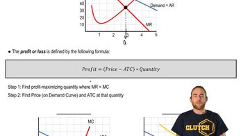
 07:41
07:41