 Back
BackGrouped Frequency Distribution and Histogram Analysis
Study Guide - Smart Notes
 Tailored notes based on your materials, expanded with key definitions, examples, and context.
Q13b. Construct a histogram and polygon representing the given data. Does the data seem to be normally distributed?
Background
Topic: Frequency Distributions and Data Visualization
This question tests your ability to interpret grouped frequency distributions, construct histograms and polygons, and assess whether a dataset appears to follow a normal distribution.
Key Terms:
Grouped Frequency Distribution: A table that shows how data is distributed across intervals (classes).
Histogram: A bar graph representing the frequency of data within each interval.
Frequency Polygon: A line graph connecting the midpoints of each class interval at their respective frequencies.
Normal Distribution: A symmetric, bell-shaped distribution where most values cluster around the mean.
Step-by-Step Guidance
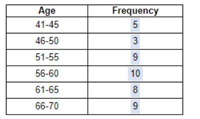
Review the grouped frequency distribution table. Note the class intervals (age ranges) and their frequencies.
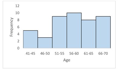
Observe the histogram. Each bar represents the frequency for a specific age interval. Check for symmetry and the shape of the distribution.
To construct a frequency polygon, plot the midpoint of each age interval on the x-axis and the corresponding frequency on the y-axis. Connect these points with straight lines.
Assess the histogram and polygon for characteristics of a normal distribution: symmetry, single peak, and tapering tails.
Try solving on your own before revealing the answer!
Final Answer:
The histogram and frequency polygon show that the data is not perfectly symmetric and does not have a clear bell-shaped curve. Therefore, it does not appear to be normally distributed.
Normal distributions are characterized by symmetry and a single central peak, which is not evident in this dataset.
