 Back
BackBusiness Statistics I: Data Types, Acquisition, and Descriptive Statistics
Study Guide - Smart Notes
 Tailored notes based on your materials, expanded with key definitions, examples, and context.
Data Types and Statistical Practice
Cross-Sectional vs. Time Series Data
Understanding the distinction between types of data is fundamental in business statistics. Cross-sectional data are collected at a single point in time, while time series data are collected over multiple time periods, allowing for trend analysis and forecasting.
Cross-Sectional Data: Snapshot of multiple subjects at one time (e.g., number of building permits issued in each county in November 2023).
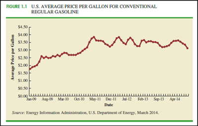
Time Series Data: Observations of a single subject over time (e.g., monthly gasoline prices).
Applications: Time series analysis helps identify trends, seasonal effects, and project future values.
Data Acquisition and Sources
Considerations in Data Acquisition
Acquiring data involves balancing time, cost, and accuracy. Poor data quality can lead to misleading conclusions.
Time Requirement: Data collection can be time-consuming; outdated data may lose relevance.
Cost of Acquisition: Data may be expensive, even if not the primary business activity.
Data Errors: Careless acquisition can introduce errors and bias.
Data Sources
Data can be obtained from internal records, government agencies, business databases, industry associations, and the internet.
Internal Company Records: Employee, production, inventory, sales, credit, and customer profile data.
Government Agencies: Census Bureau, Federal Reserve, Office of Management & Budget, Department of Commerce, Bureau of Labor Statistics.
Experimental vs. Observational Data
Statistical studies may be experimental (variables are controlled) or observational (data are collected without intervention).
Experimental: E.g., clinical trials with treatment and control groups.
Observational: E.g., surveys, studies where variables are not manipulated.
Ethical Guidelines
Statistical practice requires fairness, objectivity, and neutrality. Unethical behavior includes improper sampling, misleading graphs, and biased interpretation.
Descriptive Statistics: Tabular and Graphical Displays
Summarizing Categorical Data
Categorical data can be summarized using frequency, relative frequency, and percent frequency distributions, as well as bar charts and pie charts.
Frequency Distribution: Tabular summary showing counts in each category.
Relative Frequency: Proportion of total in each category.
Percent Frequency: Relative frequency multiplied by 100.
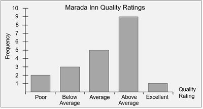
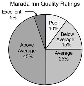
Example: Marada Inn Quality Ratings
Guests rated their stay as Poor, Below Average, Average, Above Average, or Excellent. The frequency distribution and graphical summaries help visualize the data.

Interpreting Pie Charts
Pie charts visually represent the proportion of each category. For Marada Inn, half of customers rated their stay as "above average" or "excellent," while the ratio of "excellent" to "poor" ratings is 1:2.
Summarizing Quantitative Data
Frequency Distribution Tables
Quantitative data are grouped into mutually exclusive classes, showing the number of observations in each class. This helps identify central tendency, spread, and clustering.
Step 1: Decide the number of classes using (where is sample size).
Step 2: Determine class interval using (where is highest, is lowest value).
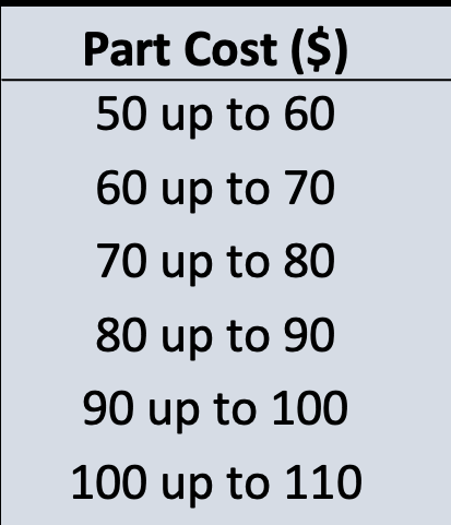
Step 3: Set class limits.
Step 4: Count items in each class.

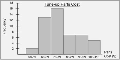
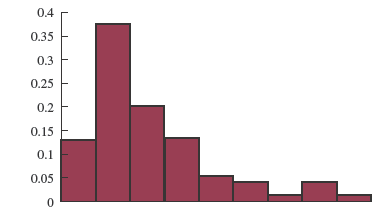
Displaying Frequency Distributions: Histograms
Histograms are graphical displays of frequency distributions for quantitative data. Unlike bar charts, histogram bars touch, indicating continuous data.
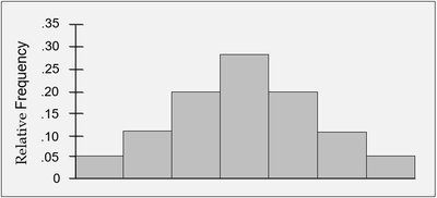
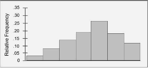
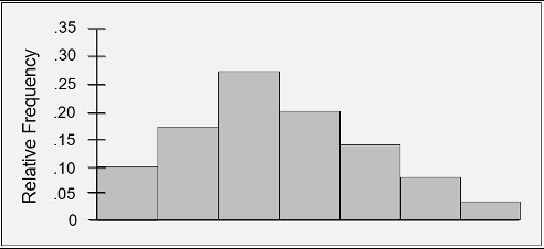
Relative Frequency Histograms
Relative frequency histograms show the proportion of observations in each class, useful for comparing distributions.
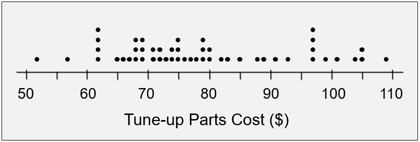
Dot Plots
Dot plots are simple graphical summaries where each data value is represented by a dot above a horizontal axis.
Cumulative Frequency Distributions
Cumulative frequency distributions show the number, proportion, or percentage of items with values less than or equal to the upper limit of each class.
Stem-and-Leaf Displays
Stem-and-leaf displays show both the rank order and shape of a distribution, preserving actual data values. Each line (stem) represents leading digits, and leaves are trailing digits.
Statistics in Practice: Quality Control Example
Application: Carton Filling and Density
Statistical sampling is used to monitor product quality, such as the density of detergent powder in cartons. Acceptable density ranges are defined, and histograms help visualize the distribution and identify outliers.

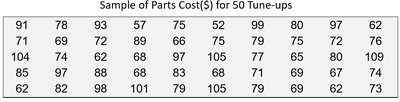
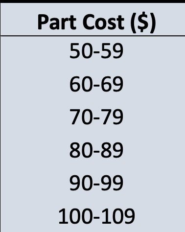
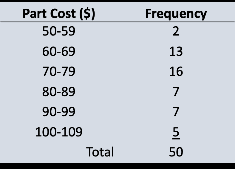
Summary Table: Frequency Distribution Example
The following table summarizes the frequency distribution for tune-up parts cost:
Part Cost ($) | Frequency |
|---|---|
50-59 | 2 |
60-69 | 13 |
70-79 | 16 |
80-89 | 7 |
90-99 | 7 |
100-109 | 5 |
Total | 50 |
Key Points: Frequency distributions, histograms, dot plots, and stem-and-leaf displays are essential tools for summarizing and visualizing business data. Ethical practice and careful data acquisition are critical for reliable statistical analysis.
