 Back
BackDescriptive Statistics and Exploratory Data Analysis: Foundations for Business Statistics
Study Guide - Smart Notes
 Tailored notes based on your materials, expanded with key definitions, examples, and context.
Descriptive Statistics (Exploratory Data Analysis)
Introduction to Statistics in Accounting and Economics
Statistics is essential in accounting and economics for summarizing, analyzing, and interpreting data to support decision-making. It transforms raw data into meaningful information, enabling organizations to make informed choices under uncertainty.
Applications in Accounting: Financial reporting, risk management, budgeting, and forecasting.
Applications in Economics: Understanding economic indicators (GDP, inflation), analyzing demand and supply, policy evaluation, and economic forecasting.

Key Terms: Statistics (science of data), Data (raw facts), Information (processed data).
Example: Using averages to summarize company profits or unemployment rates to assess economic health.
Importance of Statistics in Business
Statistics supports operational efficiency, strategic planning, customer analysis, performance measurement, and risk management in business contexts.
Improves decision-making by providing evidence-based insights.
Measures performance and identifies trends.
Historical Figures in Statistics
Major contributors to the field include Bernoulli (probability theory), Gauss (probability and statistics), and Pearson (mathematical statistics).
Sampling
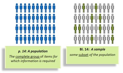
Concepts of Population, Sample, and Sampling
Sampling involves selecting a subset (sample) from a larger group (population) to draw conclusions about the whole. This is crucial when studying the entire population is impractical.
Population: The complete group of items or individuals of interest.
Sample: A subset of the population selected for analysis.
Sampling: The process of choosing the sample.

Sampling Methods
Sampling methods are divided into probability and non-probability types, each with specific applications and implications for data quality.
Probability Sampling: Every member has a known chance of selection.
Non-Probability Sampling: Selection is based on subjective judgment or convenience.
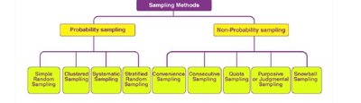
Probability Sampling Methods
Simple Random Sampling: Every member has an equal chance of being selected.
Stratified Sampling: Population divided into strata; samples drawn from each stratum.
Systematic Sampling: Selection at regular intervals from an ordered list.
Cluster Sampling: Population divided into clusters; entire clusters are randomly selected.

Non-Probability Sampling Methods
Purposive/Judgmental Sampling: Researcher selects based on expertise.
Convenience Sampling: Selection based on ease of access.
Comparison Table of Sampling Methods
Technique | Main Purpose | Key Difference |
|---|---|---|
Simple Random | Fair selection | Everyone equal chance |
Systematic | Easy and structured | Uses fixed interval |
Stratified | Representation | Divides by characteristics |
Cluster | Cost-effective | Divides by location/group |
Types of Data and Scales of Measurement
Types of Data
Data can be classified as qualitative (categorical) or quantitative (numerical). Understanding data types is essential for selecting appropriate statistical methods.
Qualitative Data: Describes categories or qualities (e.g., gender, color).
Quantitative Data: Represents numerical values (e.g., age, income).

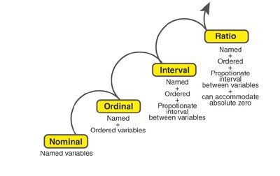
Scales of Measurement
Measurement scales determine the nature of data and the statistical analyses that can be performed.
Nominal: Labels or names (no order).
Ordinal: Ordered categories (ranked, but intervals not meaningful).
Interval: Ordered, equal intervals, no true zero (e.g., temperature in Celsius).
Ratio: Ordered, equal intervals, true zero (e.g., weight, height).
Graphs and Diagrams
Types of Graphs
Graphs and diagrams are visual tools for presenting data, making patterns and trends easier to identify.
Line Diagram: Represents data trends over time or categories using lines.
Bar Diagram: Uses bars to compare quantities across categories.
Multiple Bar Diagram: Compares multiple sets of data side by side.
Pie Chart: Shows proportions of a whole as slices of a circle.
Histogram: Displays frequency distribution of continuous data using adjacent bars.
Frequency Distributions and Related Graphs
Frequency Distribution
A frequency distribution organizes data into categories or intervals, showing the number of observations in each.
Ungrouped Frequency Distribution: Lists individual values and their frequencies (for small datasets).
Grouped Frequency Distribution: Groups data into intervals (for large datasets).
Constructing a Frequency Distribution (Continuous Data)
Calculate the range:
Decide on the number of classes:
Calculate class width:
Determine class boundaries
Tabulate observations into classes
Cumulative and Relative Frequencies
Cumulative Frequency: Number of observations less than a given value.
Relative Frequency: Frequency divided by total number of observations.
Measures of Central Tendency
Definition and Types
Measures of central tendency summarize a dataset with a single value representing its center or typical value.
Arithmetic Mean (\( \bar{x} \)): Sum of all values divided by the number of values.
Median: Middle value when data is ordered. If even number of values, median is the mean of the two middle values.
Mode: Most frequently occurring value in the dataset.
Grouped Data
For grouped data, the mean is estimated using class midpoints and frequencies.
Properties and Comparisons
Mean: Uses all data, affected by outliers.
Median: Not affected by outliers, best for skewed data.
Mode: Useful for categorical data, may not be unique.
Measures of Variability (Spread, Dispersion)
Introduction
Measures of variability describe how spread out the data values are in a dataset.
Range (R): Difference between the largest and smallest values.
Interquartile Range (IQR): Range of the middle 50% of data.
Quartile Deviation: Half the IQR.
Standard Deviation (s): Average distance of data points from the mean.
Variance (s^2): Square of the standard deviation.
Coefficient of Variation (CV): Standard deviation as a percentage of the mean.
Measures of Position: Quantiles, Percentiles, and Five-Number Summary
Quantiles
Quantiles divide ordered data into equal parts. Quartiles split data into four parts; percentiles into 100 parts.
Quartiles (Q1, Q2, Q3): Values that divide data into four equal parts.
Percentiles: Values below which a certain percentage of data falls.
Five-Number Summary and Box-Whisker Plot
The five-number summary consists of the minimum, Q1, median (Q2), Q3, and maximum. A box-whisker plot visually displays this summary, highlighting the spread and skewness of the data, and identifying outliers.
Box: Extends from Q1 to Q3.
Line in box: Median (Q2).
Whiskers: Extend to minimum and maximum (excluding outliers).
Outliers: Values more than 1.5 × IQR from Q1 or Q3.
Stem-and-Leaf Plots
A stem-and-leaf plot is a graphical method that retains all original data values while showing the distribution. Each value is split into a "stem" (leading digits) and a "leaf" (last digit).
Example: Donations to a fund can be displayed to quickly see the distribution and identify clusters or gaps.
Self-Evaluation and Application
Practice problems and exercises are provided throughout to reinforce understanding of concepts such as sampling methods, constructing graphs, calculating measures of central tendency and variability, and interpreting data displays.
Additional info: This summary covers the foundational topics in descriptive statistics, as outlined in the business statistics curriculum, and prepares students for further study in inferential statistics and data analysis.
