 Back
BackDisplaying Descriptive Statistics: Visualizing and Summarizing Data in Business Statistics
Study Guide - Smart Notes
 Tailored notes based on your materials, expanded with key definitions, examples, and context.
Chapter 2: Displaying Descriptive Statistics
2.1 The Role Technology Plays in Statistics
Modern statistical analysis often relies on technology to efficiently organize, analyze, and visualize data. Microsoft Excel is a widely used tool in business statistics for these purposes, offering built-in options for data presentation and statistical analysis through its Data Analysis ToolPak.
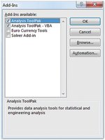
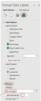
Activating the Data Analysis ToolPak: To access advanced statistical tools in Excel, users may need to activate the Data Analysis ToolPak Add-in.
Steps to Activate: Navigate to the File tab, select Options, choose Add-Ins, and enable the Analysis ToolPak and Analysis ToolPak - VBA.
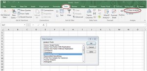
Application: Once activated, the Data Analysis option appears under the Data tab, providing access to various statistical procedures such as descriptive statistics, histograms, and regression analysis.
2.2 Displaying Quantitative Data
Types of Data
Quantitative data represent numerical values and can be further classified as discrete or continuous:
Discrete Data: Values that can be counted (e.g., number of products sold).
Continuous Data: Values that can take any real number, often measured (e.g., weight, time).
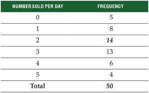
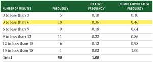
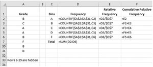
Constructing a Frequency Distribution
A frequency distribution summarizes how many data observations fall into specific intervals or categories, called classes.
Example: Number of iPads sold per day over 50 days.
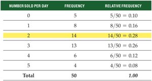
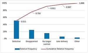
Relative Frequency Distributions
Relative frequency distributions show the proportion of observations in each class relative to the total number of observations. The sum of all relative frequencies equals 1.00.
Formula:
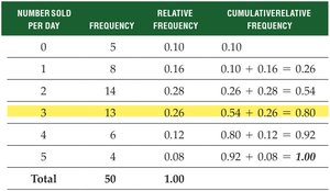
Cumulative Relative Frequency Distributions
Cumulative relative frequency distributions display the accumulated proportion of observations less than or equal to each class.
Formula:
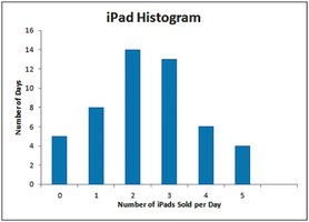
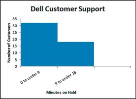
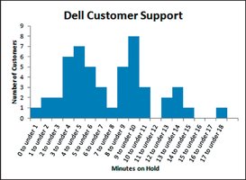
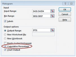
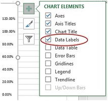
Using a Histogram to Graph a Frequency Distribution
A histogram is a graphical representation of the frequency distribution, where the x-axis represents the classes (or bins) and the y-axis shows the frequency of observations in each class.
Grouped Quantitative Data
For large or continuous data sets, values are grouped into intervals (classes) to simplify the frequency distribution. The number of classes should typically be between 4 and 20.
Rule for Number of Classes: , where is the number of classes and is the number of data points.
Class Width: (rounded to a convenient value).
Class Boundaries and Frequencies
Class boundaries define the minimum and maximum values for each class. Frequencies are determined by counting the number of observations in each class.
Rules for Classes for Grouped Data
All classes must be of equal width.
Classes must be mutually exclusive (no overlap).
All data values must be included.
Avoid empty or open-ended classes if possible.
Consequences of Too Few or Too Many Classes
Choosing too few classes can obscure patterns, while too many classes can make the histogram jagged and difficult to interpret.
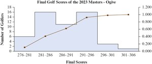
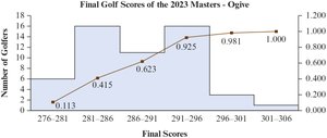
The Ogive
An ogive is a line graph that plots cumulative relative frequencies, providing a visual summary of the proportion of observations below each class boundary.
2.3 Displaying Qualitative Data
Qualitative Data and Frequency Distributions
Qualitative (categorical) data describe characteristics or categories, such as gender or education level. Frequency distributions for qualitative data show the number of occurrences in each category.
Excel's COUNTIF function can be used to count occurrences for each category.
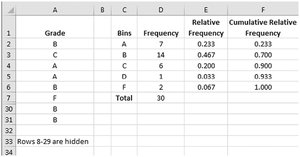
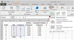
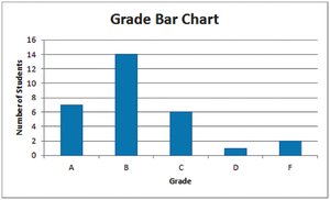
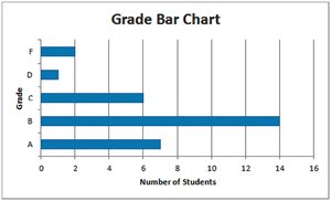
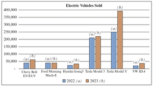
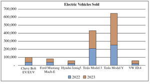
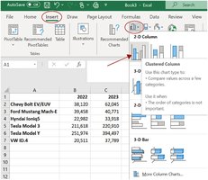
Bar Charts
Bar charts are effective for displaying qualitative data, with bars representing the frequency or proportion of each category. They can be oriented vertically or horizontally.
Clustered and Stacked Bar Charts
Clustered bar charts display multiple values side by side within each category, while stacked bar charts show values stacked within a single bar for each category.
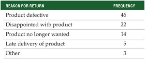
Pareto Charts
Pareto charts are specialized bar charts that display the frequency of categories in descending order, often used in quality control to identify the most significant factors. They also include a cumulative relative frequency line (ogive).
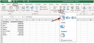
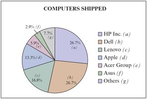
Pie Charts
Pie charts visually represent the proportion of each category as a segment of a circle. They are useful for comparing the relative sizes of all categories in a dataset.

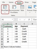
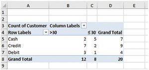
2.4 Contingency Tables
Contingency tables (cross-tabulations) display the frequency distribution of two qualitative variables simultaneously, helping to identify relationships between them.
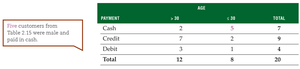
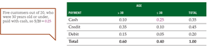
Constructing in Excel: Use the Pivot Table feature to create contingency tables from raw data.

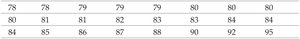
2.5 Stem and Leaf Display
A stem and leaf display splits data values into stems (higher place values) and leaves (lower place values), preserving all original data points and providing a histogram-like view.
Example: Exam scores split into tens (stems) and units (leaves).
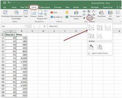
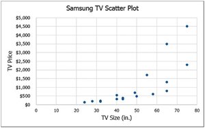
2.6 Scatter Plots
Scatter plots graphically display the relationship between two paired quantitative variables. The independent variable is plotted on the x-axis, and the dependent variable on the y-axis.
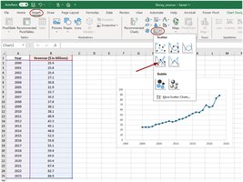
Line Charts
Line charts connect data points in a scatter plot with line segments, often used for time series data (time on the x-axis).
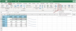
Sparklines
Sparklines are small, cell-sized charts in Excel that provide a compact visual summary of data trends within a worksheet.
Additional info: These notes cover the essential methods for displaying and summarizing both quantitative and qualitative data in business statistics, with practical Excel applications and visual examples to reinforce key concepts.
