 Back
BackGraphical Methods for Describing Sets of Data in Business Statistics
Study Guide - Smart Notes
 Tailored notes based on your materials, expanded with key definitions, examples, and context.
Graphical Methods for Describing Sets of Data
Introduction
Graphical methods are essential tools in business statistics for summarizing, visualizing, and interpreting data sets. These methods help reveal patterns, trends, and relationships within data, making complex information more accessible and actionable for decision-making. The choice of graphical technique depends on the type of data—qualitative or quantitative—and the context of analysis.
Cross-Sectional Data: Graphical Techniques
Qualitative Data: Frequency and Relative Frequency Bar Charts
Qualitative data, such as categorical preferences, are often summarized using frequency and relative frequency bar charts. These charts display the number or proportion of observations in each category, making it easy to compare groups.
Frequency Bar Chart: Shows the count of observations in each category.
Relative Frequency Bar Chart: Shows the proportion of observations in each category, calculated as .
Pie Chart: Represents the relative frequencies as sectors of a circle, useful for visualizing proportions.
Example: Preferences of 50 beer drinkers for Miller Lite (M), Budweiser (B), or Special Export (S) are summarized in bar charts and a pie chart. 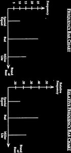


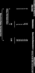
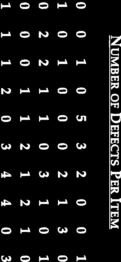
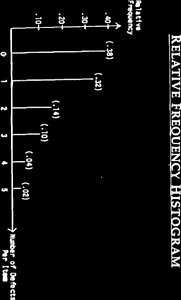
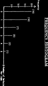
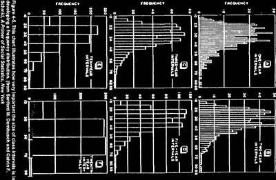
Discrete Quantitative Data: Frequency Distributions and Histograms
Discrete quantitative data can be summarized using frequency distributions, histograms, and stem-and-leaf plots. These methods help visualize the distribution and identify patterns such as skewness or modality.
Frequency Distribution Table: Lists each possible value and its frequency.
Histogram: Uses bars to represent the frequency or relative frequency of each value or group of values.
Stem-and-Leaf Plot: Displays individual data values while showing the distribution shape.
Example: Number of defects per item in a sample of 50 items from a production process. 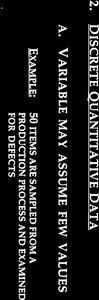
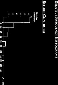
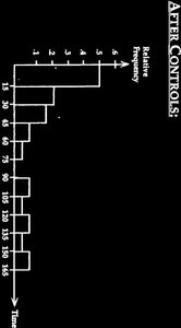
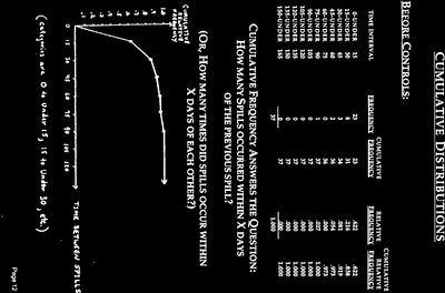
Continuous Quantitative Data: Histograms and Cumulative Distributions
Continuous data are typically grouped into intervals for graphical display. Histograms and cumulative distribution graphs are used to summarize and interpret these data.
Histogram: Shows the frequency or relative frequency of data within specified intervals.
Cumulative Distribution: Plots the cumulative frequency or relative frequency, answering questions about the proportion of data below a certain value.
Example: Oil spill intervals before and after pollution controls, visualized with histograms and cumulative distributions. 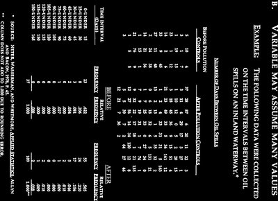
Stem-and-Leaf Displays
Definition and Construction
A stem-and-leaf plot is a graphical method for displaying quantitative data, preserving individual data values while showing the overall distribution. Each data value is split into a "stem" (leading digit(s)) and a "leaf" (trailing digit).
Advantages: Data are not lost in grouping, individual observations are visible, and it is easy to construct for small to medium-sized data sets.
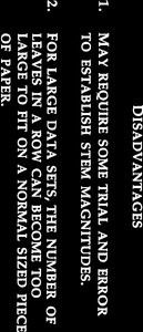
Disadvantages: May require trial and error to choose stem magnitudes; large data sets may be unwieldy.
Example: Data set: 10, 15, 8, 33, 16, 33, 10, 41, 32, 33, 2, 31, 30, 25, 22, 11, 18, 24, 45, 37, 39. 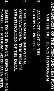
Time-Series Data: Run Charts
Definition and Construction
Time-series data are collected over intervals of time. The run chart is the fundamental technique for visualizing time-series data, showing how a variable changes over time.
Run Chart: Plots measurements against time or observation number, revealing trends, cycles, or shifts.
Control Chart: Used to monitor process stability and detect out-of-control conditions.
Example: Measurements plotted over time to reveal variation. 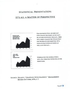
Graphical Methods for Studying Relationships Between Variables
Scatter Plots
Scatter plots are used to study the relationship between two quantitative variables. Each point represents a pair of values, and patterns may indicate correlation or other relationships.
Scatter Plot: Useful for detecting linear or nonlinear relationships, clusters, and outliers.
Example: Relationship between team value and revenue in NFL teams. 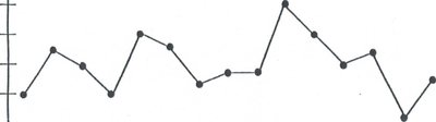
Pareto Analysis and Diagrams
Definition and Application
Pareto analysis is a technique for identifying the most significant factors in a data set, based on the principle that a small number of causes often account for a large proportion of the effect (the 80/20 rule).
Pareto Diagram: A bar chart that arranges categories in descending order of frequency, highlighting the most important contributors.
Application: Used in quality control and business process improvement to prioritize issues.
Example: Car defects categorized and visualized in Pareto diagrams. 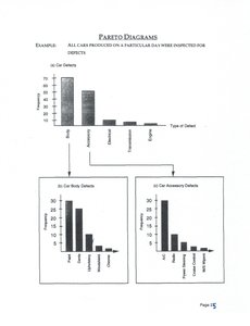
Summary Table: Graphical Methods and Their Purposes
Graphical Method | Type of Data | Main Purpose |
|---|---|---|
Bar Chart | Qualitative | Compare category frequencies |
Pie Chart | Qualitative | Show category proportions |
Histogram | Quantitative | Show distribution shape |
Stem-and-Leaf Plot | Quantitative | Show distribution and individual values |
Run Chart | Time-Series | Show changes over time |
Scatter Plot | Quantitative (2 variables) | Show relationships |
Pareto Diagram | Qualitative/Quantitative | Highlight most significant categories |
Conclusion
Graphical methods are foundational in business statistics for summarizing, interpreting, and communicating data. Selecting the appropriate graphical technique depends on the data type and the analytical objective, ensuring clarity and insight in statistical analysis.
