 Back
BackGraphs, Charts, and Tables: Describing Your Data (Business Statistics Study Notes)
Study Guide - Smart Notes
 Tailored notes based on your materials, expanded with key definitions, examples, and context.
Graphs, Charts, and Tables—Describing Your Data
Introduction
Effective data presentation is essential in business statistics for transforming raw data into meaningful information. Graphs, charts, and tables are fundamental descriptive statistical tools that help summarize, visualize, and interpret data, enabling better decision-making and communication.
Frequency Distributions and Histograms
Frequency Distribution
A frequency distribution is a summary of a set of data that displays the number of observations in each distinct category or class. It is especially useful for discrete data, which can take on a countable number of possible values.
Discrete Data: Data with countable values (e.g., number of trips).
Frequency: The count of observations in each category.
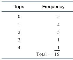
Example: Taxi Ride Sharing Frequency Distribution
City employees were polled on their use of ride sharing services in the past month. The frequency distribution is shown below:
Trips | Frequency |
|---|---|
0 | 5 |
1 | 4 |
2 | 5 |
3 | 1 |
4 | 1 |
Total | 16 |
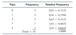
Relative Frequency Distribution
The relative frequency is the proportion of total observations in a given category, calculated as:
Formula:
Can be converted to percentages by multiplying by 100.
Example: Taxi Ride Sharing Relative Frequency Distribution
Trips | Frequency | Relative Frequency |
|---|---|---|
0 | 5 | 5/16 = 0.3125 |
1 | 4 | 4/16 = 0.2500 |
2 | 5 | 5/16 = 0.3125 |
3 | 1 | 1/16 = 0.0625 |
4 | 1 | 1/16 = 0.0625 |
Total | 16 | 1.0000 |
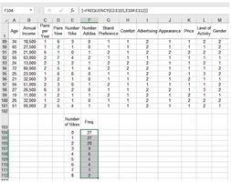
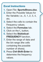
Constructing Frequency Distributions in Excel
Excel can be used to construct frequency distributions efficiently. The process involves entering possible values, selecting cells, and using the FREQUENCY function.
Open the data file.
Enter possible values for the variable.
Select cells for frequency values.
Use the Statistical-FREQUENCY function.
Press Ctrl-Shift-Enter to compute frequencies.
Continuous Data and Grouped Frequency Distributions
Continuous data can assume any value within an interval and are uncountable (e.g., weight, time, length). For such data, grouped frequency distributions are used, where data are sorted and grouped into classes.
Data Array: Sorted quantitative data.
Classes: Defined intervals for grouping data.
Criteria for Classes
Mutually Exclusive: No overlap between classes.
All-Inclusive: All possible values are included.
Equal-Width: Each class has the same interval width.
No Empty Classes: Avoid empty classes if possible.
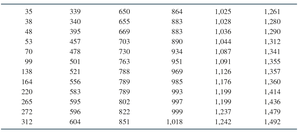
Example: Emergency Response Communication Times
Data on time to link systems (in seconds) for 72 cities:
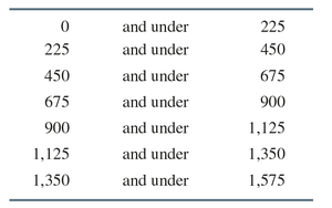
Class boundaries for grouped data:
Lower Bound | Upper Bound |
|---|---|
0 | 225 |
225 | 450 |
450 | 675 |
675 | 900 |
900 | 1,125 |
1,125 | 1,350 |
1,350 | 1,575 |
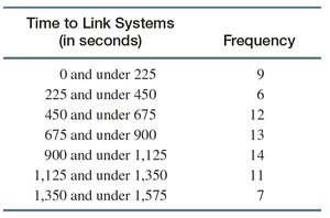
Frequency distribution for time to link systems:
Time to Link Systems (in seconds) | Frequency |
|---|---|
0 and under 225 | 9 |
225 and under 450 | 6 |
450 and under 675 | 12 |
675 and under 900 | 13 |
900 and under 1,125 | 14 |
1,125 and under 1,350 | 11 |
1,350 and under 1,575 | 7 |
Histograms
Definition and Interpretation
A histogram is a graphical representation of a frequency distribution for a quantitative variable. It helps identify the center, spread, and shape of the data distribution.
Center: The point around which data cluster.
Spread: The degree of variation in the data.
Shape: Distribution can be flat, skewed, balanced, or bell-shaped.
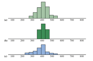
Example: Histograms Showing Different Centers
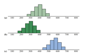
Example: Histograms—Same Center, Different Spread
The standard deviation is a numerical measure of spread in the values of a random variable.
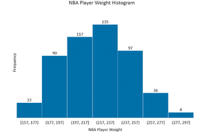
Frequency Histogram Example
NBA Player Weights: Frequency histogram constructed using Excel for 505 NBA players.
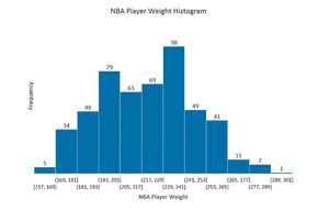
Frequency Table for NBA Player Weights
NBA Player Weight | Frequency |
|---|---|
[157, 177) | 22 |
[177, 197) | 90 |
[197, 217) | 117 |
[217, 237) | 135 |
[237, 257) | 97 |
[257, 277) | 36 |
[277, 297) | 8 |
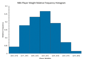
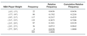
Relative Frequency Histograms and Ogives
Relative Frequency Histogram
A relative frequency histogram displays the relative frequencies on the vertical axis. The shape is identical to the frequency histogram, but the scale differs.
Ogive
An ogive is a graph of cumulative relative frequency. It is constructed by plotting points above the upper limit of each class at a height corresponding to the cumulative relative frequency and connecting them with a line.
Relative and Cumulative Relative Frequency Table
NBA Player Weight | Frequency | Relative Frequency | Cumulative Relative Frequency |
|---|---|---|---|
[157, 177) | 22 | 0.0436 | 0.0436 |
[177, 197) | 90 | 0.1782 | 0.2218 |
[197, 217) | 117 | 0.2317 | 0.4535 |
[217, 237) | 135 | 0.2673 | 0.7208 |
[237, 257) | 97 | 0.1921 | 0.9129 |
[257, 277) | 36 | 0.0713 | 0.9842 |
[277, 297) | 8 | 0.0158 | 1.0000 |
Total | 505 | 1.0000 | 1.0000 |
Joint Frequency Distribution
Definition
A joint frequency distribution examines data characterized by more than one variable, allowing for the analysis of relationships between variables (e.g., gender and credit card balance).
Bar Charts, Pie Charts, and Stem and Leaf Diagrams
Bar Chart
A bar chart is a graphical representation of categorical data, where each bar represents the frequency or percentage of observations in a category. Bars can be vertical or horizontal and may be colored to distinguish categories.
Pie Chart
A pie chart is a circular graph divided into slices, each representing a category. The size of each slice is proportional to the magnitude of the variable associated with the category.
Stem and Leaf Diagram
A stem and leaf diagram is similar to a histogram but retains individual data values, making it useful for exploratory analysis of quantitative data.
Line Charts, Scatter Diagrams, and Pareto Charts
Line Chart
A line chart is a two-dimensional chart with time on the horizontal axis and the variable of interest on the vertical axis. It is commonly used to show trends over time.
Scatter Diagram
A scatter diagram (or scatter plot) is a two-dimensional graph of plotted points, where the vertical axis represents the dependent variable and the horizontal axis represents the independent variable. It is used to visualize relationships between two quantitative variables.
Pareto Chart
A Pareto chart is a special type of bar chart where bars are arranged from high to low. It is used in quality improvement applications to identify the most significant causes of problems, following the Pareto Principle (80-20 rule).
Summary Table: Types of Graphs and Their Uses
Graph Type | Purpose | Data Type |
|---|---|---|
Frequency Distribution | Summarize data by category/class | Discrete/Continuous |
Histogram | Visualize distribution, center, spread, shape | Quantitative |
Bar Chart | Compare frequencies/percentages across categories | Categorical |
Pie Chart | Show proportions of categories | Categorical |
Stem and Leaf Diagram | Display distribution and individual values | Quantitative |
Line Chart | Show trends over time | Time series |
Scatter Diagram | Visualize relationships between variables | Quantitative |
Pareto Chart | Identify major causes of problems | Categorical |
Key Takeaway: Mastery of these graphical and tabular techniques is essential for effective data analysis and communication in business statistics.
