 Back
BackTables and Graphs in Business Statistics: Frequency Table, Histogram, Stem-and-Leaf, Dot Plot, and Boxplot
Study Guide - Smart Notes
 Tailored notes based on your materials, expanded with key definitions, examples, and context.
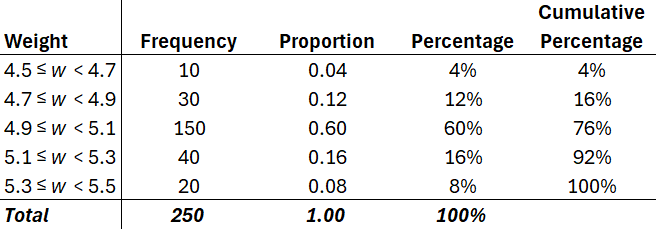
Q1. Analyze the frequency table for manufactured item weights.
Background
Topic: Frequency Tables and Data Summarization
This question tests your ability to interpret a frequency table, identify variable types, and understand summary statistics such as frequency, proportion, percentage, and cumulative percentage.
Key Terms and Formulas:
Frequency: The count of items in each weight interval.
Proportion: The fraction of the total represented by each interval.
Percentage: Proportion expressed as a percent.
Cumulative Percentage: Running total of percentages up to each interval.
Variable Type: Continuous quantitative variable (weight is measured, not counted).
Step-by-Step Guidance
Examine the table and note the intervals for weight, the frequency for each interval, and the total frequency.
Identify the variable type: Since weight is measured and can take any value within a range, it is a continuous quantitative variable.
Find the most common weight group by looking for the interval with the highest frequency.
Calculate the percentage of items in a specific group by dividing the frequency by the total and multiplying by 100.
To find the percentage of items weighing less than a certain value, sum the percentages of all relevant intervals.
Try solving on your own before revealing the answer!
Final Answer:
The variable shown is a continuous quantitative variable. The most common weight group is 4.9 ≤ w < 5.1. The percentage of items weighing less than 5.1 kg is 76% (sum of percentages for intervals below 5.1).
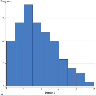
Q2. Interpret the histogram for Dataset 1.
Background
Topic: Histograms and Distribution Shape
This question tests your ability to interpret a histogram, identify the shape of a distribution, and understand frequency counts for quantitative data.
Key Terms and Formulas:
Histogram: A graphical representation of the distribution of quantitative data, showing frequency for each interval.
Distribution Shape: Can be symmetric, right-skewed, or left-skewed based on the histogram's appearance.
Step-by-Step Guidance
Observe the histogram and note the frequency for each interval.
Identify the mode (interval with highest frequency).
Assess the shape: If the tail is longer on the right, it's right-skewed; if longer on the left, left-skewed; if balanced, symmetric.
Consider how the mean and median might relate to the shape.
Try solving on your own before revealing the answer!
Final Answer:
The histogram shows a right-skewed distribution, with the mode around 2–3. The tail extends to higher values, indicating more low-frequency high values.
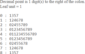
Q3. Interpret the stem-and-leaf plot.
Background
Topic: Stem-and-Leaf Plots
This question tests your ability to read a stem-and-leaf plot, identify the distribution shape, and locate the mode and median.
Key Terms and Formulas:
Stem-and-Leaf Plot: Displays quantitative data, with stems representing intervals and leaves representing individual values.
Mode: Most frequent value(s).
Median: Middle value when data is ordered.
Step-by-Step Guidance
Read the stems and leaves to reconstruct the data values.
Identify the mode by finding the stem with the most leaves.
Assess the distribution shape by observing the spread of leaves across stems.
Locate the median by counting the total number of values and finding the middle one.
Try solving on your own before revealing the answer!
Final Answer:
The mode is the value with the most leaves, and the distribution appears right-skewed. The median can be found by counting the leaves and locating the middle value.
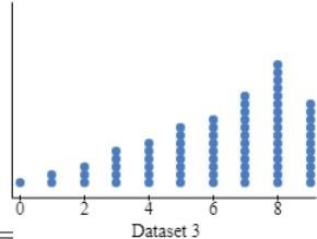
Q4. Interpret the dot plot for Dataset 3.
Background
Topic: Dot Plots and Distribution Shape
This question tests your ability to interpret a dot plot, identify the mode, and assess the distribution shape.
Key Terms and Formulas:
Dot Plot: Each dot represents a data value; useful for small datasets.
Mode: Value with the most dots.
Distribution Shape: Can be symmetric, skewed, or uniform.
Step-by-Step Guidance
Count the dots for each value to find the mode.
Observe the spread of dots to assess the shape of the distribution.
Compare the distribution to typical shapes (e.g., right-skewed, left-skewed, symmetric).
Try solving on your own before revealing the answer!
Final Answer:
The mode is the value with the most dots, and the distribution appears to be right-skewed, with more values concentrated at higher numbers.
Q5. Interpret the boxplot.
Background
Topic: Boxplots and Five-Number Summary
This question tests your ability to interpret a boxplot, identify the median, quartiles, and possible outliers, and assess the distribution shape.
Key Terms and Formulas:
Boxplot: Visual display of the five-number summary (minimum, Q1, median, Q3, maximum).
Median: Line inside the box.
Quartiles: Edges of the box (Q1 and Q3).
Whiskers: Extend to minimum and maximum values.
Outliers: Values outside the whiskers (not shown here).
Step-by-Step Guidance
Identify the five-number summary from the boxplot: minimum, Q1, median, Q3, maximum.
Assess the distribution shape: If the median is closer to Q1 or Q3, or if whiskers are uneven, the distribution may be skewed.
Look for possible outliers (not shown in this boxplot).
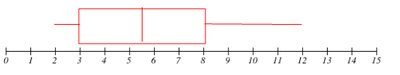
Try solving on your own before revealing the answer!
Final Answer:
The boxplot shows the five-number summary and suggests a right-skewed distribution, with the median closer to Q1 and a longer whisker on the right.
