Back
BackVisual Presentation and Numerical Measures: Describing Data in Business Statistics
Study Guide - Learn with Videos
 Curated lessons matched to your uploaded material – learn every topic step by step.
Visualizing Qualitative vs. Quantitative Data
- Guided course
 04:39
04:39
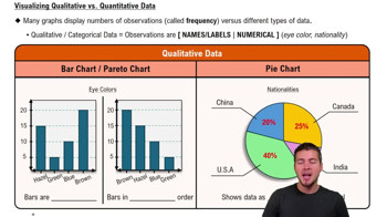
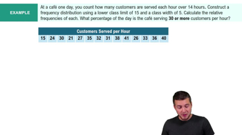
Frequency Distributions
- Guided course 06:19
- Guided course 05:18
- Guided course 06:29
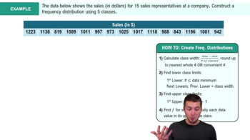
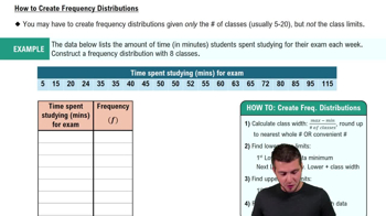
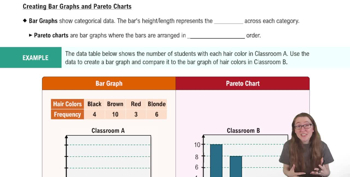
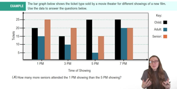
Bar Graphs and Pareto Charts
- Guided course 04:52
- Guided course 05:26
Pie Charts
- Guided course 01:18
- Guided course 06:10
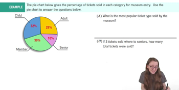
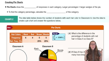
Frequency Polygons
- Guided course 04:41
- Guided course 04:15
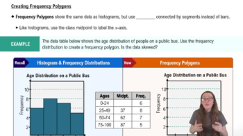
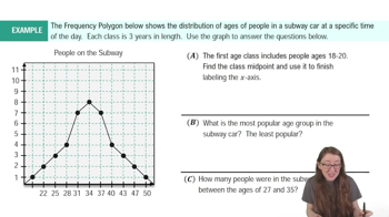
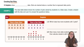
Dot Plots
- Guided course 04:01
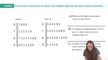
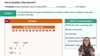
Stemplots (Stem-and-Leaf Plots)
- Guided course 06:09
- Guided course 06:23
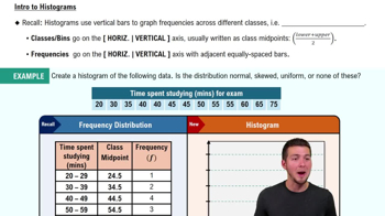
Histograms
- Guided course 05:54
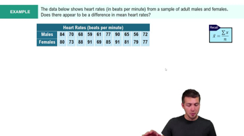
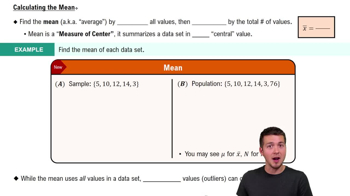
Mean
- Guided course 03:08
- Guided course 04:52
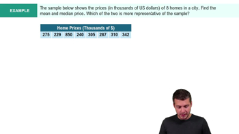
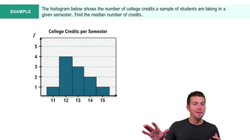
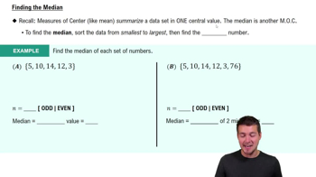
Median
- Guided course 04:56
- Guided course 02:35
- Guided course 03:26
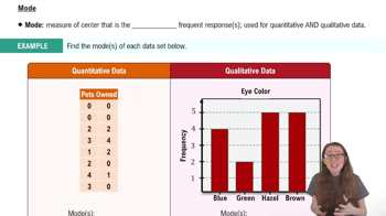
Mode
- Guided course 03:20
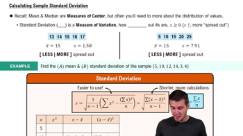
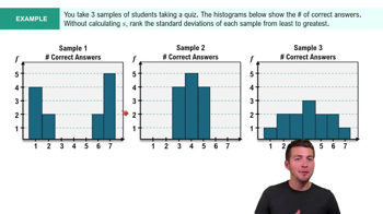
Standard Deviation
- Guided course 08:45
- Guided course 02:59