 Indietro
Chapter 2
Guida di studio - Note intelligenti
 Appunti personalizzati basati sui tuoi materiali, ampliati con definizioni chiave, esempi e contesto.
Displaying Descriptive Statistics
Introduction
Descriptive statistics are essential for summarizing and presenting data in business contexts. This chapter focuses on methods for displaying quantitative and qualitative data using tables and graphical tools, and introduces the use of Excel for statistical analysis.
Frequency Distributions
Frequency Distribution Tables
A frequency distribution is a table that shows the number of data observations that fall into specific intervals or categories. It is fundamental for organizing raw data and identifying patterns.
Quantitative Data: Data measured on a numerical scale (e.g., sales, grades).
Qualitative Data: Data categorized by attributes or qualities (e.g., product type, customer satisfaction).
Relative Frequency: The proportion of observations in each class relative to the total number of observations.
Cumulative Relative Frequency: The sum of relative frequencies up to a given class.
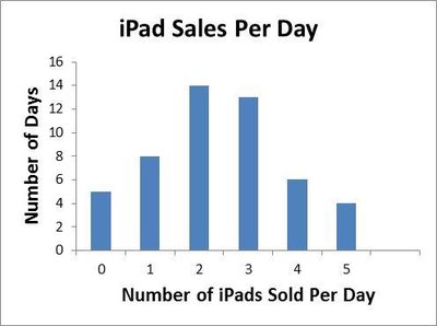
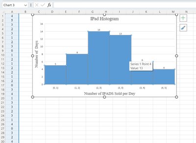
Example: Frequency distribution of iPad sales per day.
# Sold Per Day | Frequency | Relative Frequency | Cumulative Relative Frequency |
|---|---|---|---|
0 | 5 | 0.10 | 0.10 |
1 | 8 | 0.16 | 0.26 |
2 | 14 | 0.28 | 0.54 |
3 | 13 | 0.26 | 0.80 |
4 | 6 | 0.12 | 0.92 |
5 | 4 | 0.08 | 1.00 |
Graphical Representation of Data
Histograms
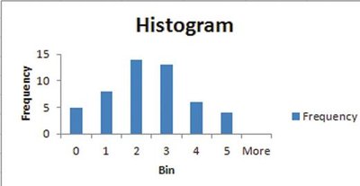
A histogram is a bar graph that shows the frequency of observations in each class. It is used for quantitative data and helps visualize the distribution, including symmetry and skewness.
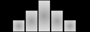
Symmetric Histogram: Bars are evenly distributed around the center.
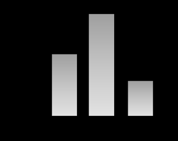
Skewed Histogram: Bars are concentrated on one side (left or right).
U-shaped Histogram: Bars are high at both ends and low in the middle.
Bar Charts
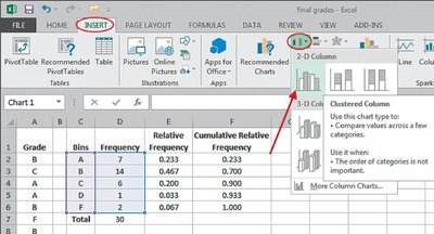
Bar charts are used to display qualitative data. Each bar represents a category, and the height shows the frequency or proportion. Bar charts can be vertical or horizontal.
Clustered Bar Chart: Compares values across categories and groups.
Stacked Bar Chart: Shows the total and breakdown of categories.
Pareto Charts
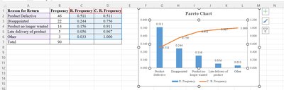
A Pareto chart is a special bar chart that displays categories in descending order of frequency, often used in quality control to identify major causes of problems.
Pie Charts
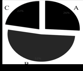
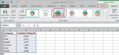
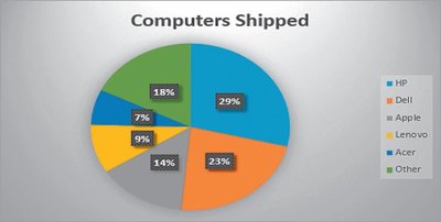
Pie charts are used to compare proportions for qualitative data. Each slice represents a category's share of the total.
Contingency Tables
Contingency Table Construction
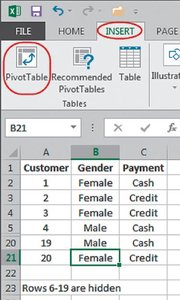
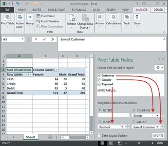
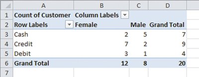
A contingency table displays the frequencies of two qualitative variables, showing the breakdown of one variable in terms of another. It is useful for analyzing relationships between categorical variables.
Payment/Gender | Female | Male | Total |
|---|---|---|---|
Cash | 2 | 5 | 7 |
Credit | 7 | 2 | 9 |
Debit | 3 | 1 | 4 |
Total | 12 | 8 | 20 |
Conditional Distributions and Association
Conditional Distribution
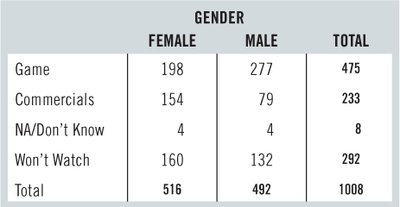
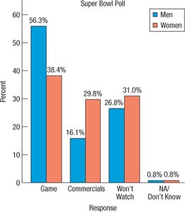
Conditional distributions show the percentage of one variable within categories of another. This is useful for identifying associations between variables.
Gender | Game | Commercials | NA/Don’t Know | Won’t Watch | Total |
|---|---|---|---|---|---|
Female | 198 | 154 | 4 | 160 | 516 |
Male | 277 | 79 | 4 | 132 | 492 |
Using Excel for Descriptive Statistics
Activating Excel's Analysis ToolPak
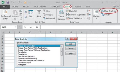
Excel provides built-in options for data presentation and statistical analysis. The Analysis ToolPak add-in must be activated to access these features.
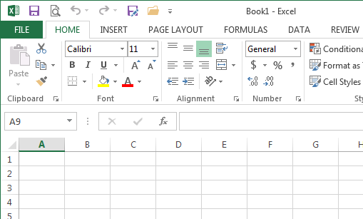
Open Excel and click on the File tab.
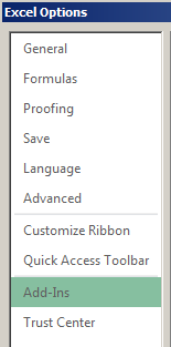
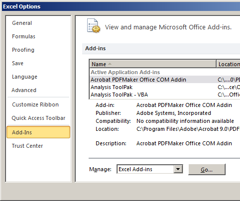
Select Options, then Add-Ins.
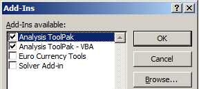
Click Go and check Analysis ToolPak and Analysis ToolPak - VBA.
Click OK to activate.
Constructing Frequency Tables and Histograms in Excel
Excel can be used to construct frequency tables and histograms using the Data Analysis ToolPak or formulas such as =FREQUENCY().
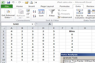
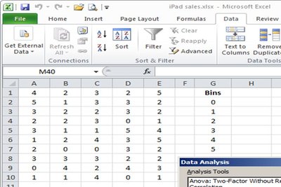
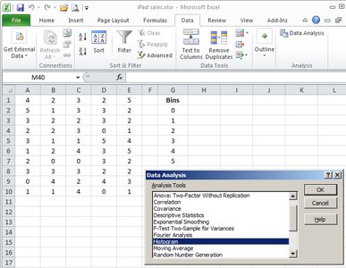
Enter data and bins in the worksheet.
Highlight the output range and use the =FREQUENCY() function.
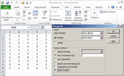
Use Data Analysis > Histogram to create graphical representations.
Summary Table: Descriptive Statistics Tools
Statistics Tool | Variable Type | Main Objective |
|---|---|---|
Frequency Tables | Quantitative/Qualitative | Constructs a frequency table |
Histogram | Quantitative | Displays the variable distribution |
Scatter Plot | Quantitative | Examines the relationship between two quantitative variables |
Line Chart | Quantitative | Shows the change in the value of a variable over time |
Bar Chart | Qualitative | Compare the value of the variables |
Pie Chart | Qualitative | Compares the values of the variables |
Contingency Table | Qualitative | Shows the breakdown of the variable's values in terms of other variables |
Key Formulas
Relative Frequency:
Cumulative Relative Frequency:
Class Width:
Conclusion
Displaying descriptive statistics is crucial for understanding and communicating business data. Frequency tables, histograms, bar charts, pie charts, and contingency tables are foundational tools. Excel provides powerful features for constructing these displays, making data analysis accessible and efficient for business students.
