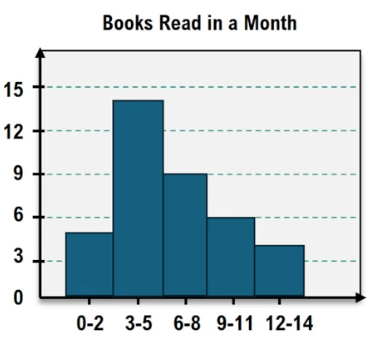


In data analysis, transforming a dataset into a frequency distribution and then visualizing it with a histogram can be a tedious process, especially with larger datasets. However, using a TI-84 graphing calculator can significantly streamline this process, allowing for quicker insights into the shape of the distribution, such as whether it is normal or skewed.
To begin, input your dataset into the calculator. Access the statistics menu by pressing the STAT button, then select EDIT. Here, you can enter your data points into a list. For instance, if you have study times for students, simply type each number followed by ENTER. After entering all data points, you should see a confirmation indicating the total number of entries.
Next, to create a histogram, access the STAT PLOT by pressing 2nd followed by the Y= button. Turn on the plot and select the histogram option, which is a bar graph. The calculator will automatically reference the list you populated. After setting this up, exit to the main screen by pressing 2nd and then MODE.
To ensure the histogram accurately represents your data, adjust the viewing window. Press the ZOOM button and select 9: ZoomStat, which automatically optimizes the window for your data. You can further refine the histogram by adjusting the class width. Access the WINDOW settings and set the XSCL (x scale) to your desired class width, such as 15. Additionally, set the Xmin to the minimum value of your dataset and the Xmax to a value slightly above the maximum.
After these adjustments, return to the graph function to view your updated histogram. Utilize the TRACE function to examine the frequencies and class limits. This will help you analyze the distribution's characteristics. For instance, if the histogram shows a peak towards the left and a tail extending to the right, the distribution is skewed to the right. Conversely, if it peaks to the right, it would be skewed to the left.
In summary, using a TI-84 calculator to create histograms allows for efficient data visualization and analysis. By following these steps, you can quickly determine the nature of your dataset's distribution, whether it is normal, skewed, or uniform, enhancing your understanding of the underlying data trends.