 Indietro
College Algebra & Statistics Final Review – Step-by-Step Study Guidance
Guida di studio - Note intelligenti
 Appunti personalizzati basati sui tuoi materiali, ampliati con definizioni chiave, esempi e contesto.
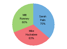
Q2. What is wrong with the pie chart below?
Background
Topic: Data Representation – Pie Charts
This question tests your ability to critically analyze graphical representations of data, specifically pie charts. You are asked to identify any errors or misleading aspects in the chart.
Key Terms and Concepts:
Pie Chart: A circular chart divided into sectors, each representing a proportion of the whole.
Percentages: The numbers in each sector should add up to 100% to represent the entire data set.
Data Integrity: The chart should accurately reflect the data it is meant to represent.
Step-by-Step Guidance
Examine the percentages shown in each section of the pie chart.
Add the percentages together to check if they total 100%.
Consider whether the chart visually matches the data (e.g., do the sector sizes look proportional to the percentages?).
Think about what a pie chart is supposed to represent and whether this chart fulfills that purpose.
Try solving on your own before revealing the answer!
Final Answer:
The percentages in the pie chart add up to more than 100% (70% + 60% + 63% = 193%), which is not possible for a pie chart. A pie chart should always total 100% because it represents the whole. This makes the chart misleading and incorrect.
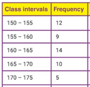
Q3. Use each chart to answer the questions below about the number of birds at a watering hole each hour.
Background
Topic: Frequency Distributions and Data Interpretation
This question asks you to interpret data from a frequency table and a stem-and-leaf plot. You will identify the modal class, class width, class mark, most common data point, and the largest and smallest numbers of birds.
Key Terms and Formulas:
Modal Class: The class interval with the highest frequency.
Class Width: The difference between the upper and lower boundaries of a class interval.
Class Mark (Midpoint): The average of the lower and upper boundaries of a class interval.
Frequency: The number of data points in each class interval.
Step-by-Step Guidance
To find the modal class, look for the class interval with the highest frequency in the table.
To find the class width of the 3rd class, subtract the lower boundary from the upper boundary of that class interval.
To find the class mark of the 4th class, add the lower and upper boundaries of the class interval and divide by 2.
To find the most common data point, check the stem-and-leaf plot for the value that appears most frequently.
To find the largest and smallest numbers of birds, look for the highest and lowest values in the stem-and-leaf plot.
Try solving on your own before revealing the answer!
Final Answer:
Modal class: 160–165 (frequency = 14)
Class width of 3rd class: 165 – 160 = 5
Class mark of 4th class: (165 + 170) / 2 = 167.5
Most common data point: 8 (appears most in the stem-and-leaf plot)
Largest number of birds: 67
Smallest number of birds: 12
These answers are based on interpreting the frequency table and the stem-and-leaf plot provided.
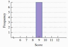
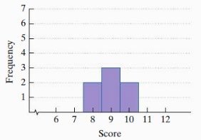
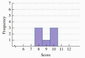
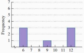
Q12. Consider each histogram below.
Background
Topic: Standard Deviation and Data Spread
This question asks you to compare several histograms and reason about which has the highest or lowest standard deviation, and whether any have a standard deviation of zero. Standard deviation measures how spread out the data is from the mean.
Key Terms and Concepts:
Standard Deviation (): A measure of how much the values in a data set differ from the mean.
Histogram: A bar graph representing the frequency of data within certain intervals.
Spread: The extent to which data values are dispersed.
Step-by-Step Guidance
Look at each histogram and observe how spread out the data is. The more spread out, the higher the standard deviation.
Identify if any histogram has all data points in a single value (which would mean a standard deviation of zero).
Compare the histograms to see which has the most tightly clustered data (lowest non-zero standard deviation).
Compare the histograms to see which has the most widely spread data (highest standard deviation).
Try solving on your own before revealing the answer!
Final Answer:
Highest standard deviation: Histogram D (data is most spread out)
Lowest non-zero standard deviation: Histogram B (data is tightly clustered but not all the same)
Standard deviation of zero: Histogram A (all data points are the same value)
Standard deviation is highest when data is most spread out and zero when all values are identical.
