 Indietro
College Algebra Study Guidance: Statistics, Data, and Logic
Guida di studio - Note intelligenti
 Appunti personalizzati basati sui tuoi materiali, ampliati con definizioni chiave, esempi e contesto.
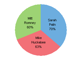
Q2. What is wrong with the pie chart below?
Background
Topic: Data Representation – Pie Charts
This question tests your ability to critically analyze graphical representations of data, specifically pie charts, and identify errors or misleading features.
Key Terms and Concepts:
Pie Chart: A circular chart divided into sectors, each representing a proportion of the whole.
Percentages: The sum of all sectors in a pie chart should be 100%.
Step-by-Step Guidance
Examine the percentages shown for each category in the pie chart.
Add the percentages together to check if they total 100%. n
Consider whether the size of each sector visually matches the percentage it represents.
Think about what a pie chart is supposed to communicate and whether this chart does so accurately.
Try solving on your own before revealing the answer!
Final Answer:
The percentages in the pie chart add up to more than 100% (60% + 63% + 70% = 193%), which is not possible for a pie chart. The total should be exactly 100%. This makes the chart misleading and incorrect.
