 Indietro
Association: Contingency, Correlation, and Regression – Study Notes
Guida di studio - Note intelligenti
 Appunti personalizzati basati sui tuoi materiali, ampliati con definizioni chiave, esempi e contesto.
Association: Contingency, Correlation, and Regression
Section 3.1: Exploring Association Between Two Categorical Variables
Response and Explanatory Variables
When analyzing data involving two variables, it is important to distinguish between the response variable (dependent variable) and the explanatory variable (independent variable). The response variable is the outcome of interest, while the explanatory variable defines the groups being compared.
Response Variable: The variable whose values are compared across groups.
Explanatory Variable: The variable that defines the groups or conditions.
Example: In a study of blood alcohol level and number of beers consumed, blood alcohol level is the response variable, and number of beers is the explanatory variable.
Association
The main purpose of analyzing two variables is to determine if there is an association between them. An association exists if certain values of one variable are more likely to occur with specific values of the other variable.
Definition: Association means that the occurrence of one variable is related to the occurrence of another.
Example: If organic foods are less likely to contain pesticides than conventional foods, there is an association between food type and pesticide presence.
Contingency Tables
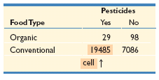
A contingency table is used to display the frequencies of two categorical variables. The rows represent categories of one variable, and the columns represent categories of the other. Each cell shows the frequency for a specific combination of categories.
Purpose: To summarize and compare frequencies for combinations of categorical variables.
Example: Food type (organic/conventional) vs. pesticide status (present/not present).
Food Type | Pesticides Yes | Pesticides No |
|---|---|---|
Organic | 29 | 98 |
Conventional | 19485 | 7086 |
Frequencies and Totals
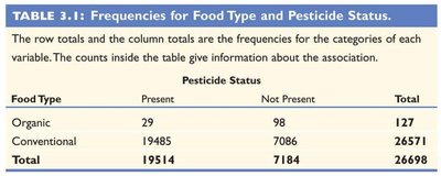
Contingency tables can also include row and column totals, which help in calculating proportions and understanding the overall distribution.
Food Type | Present | Not Present | Total |
|---|---|---|---|
Organic | 29 | 98 | 127 |
Conventional | 19485 | 7086 | 26571 |
Total | 19514 | 7184 | 26698 |
Conditional Proportions
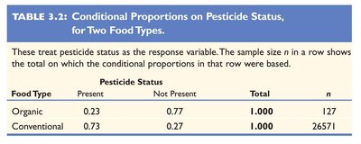
Conditional proportions are calculated to compare the likelihood of an outcome within each group. For example, the proportion of organic foods containing pesticides is calculated as the number of organic foods with pesticides divided by the total number of organic foods sampled.
Formula: Proportion = (Number in category) / (Total in group)
Example: Proportion of organic foods with pesticides = 29 / 127 ≈ 0.23
Food Type | Present | Not Present | Total | n |
|---|---|---|---|---|
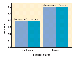
Organic | 0.23 | 0.77 | 1.000 | 127 |
Conventional | 0.73 | 0.27 | 1.000 | 26571 |
Visualizing Conditional Proportions
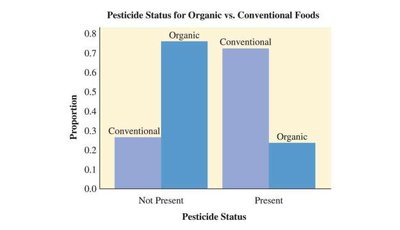
Side-by-side bar charts are useful for comparing conditional proportions across groups. These charts make it easy to see differences in proportions for each category of the explanatory variable.
Interpreting Association
If there is no association between the two variables, the conditional proportions for the response variable will be similar across all categories of the explanatory variable. Significant differences in proportions indicate an association.
Section 3.2: Exploring Association Between Two Quantitative Variables
Scatterplots
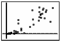
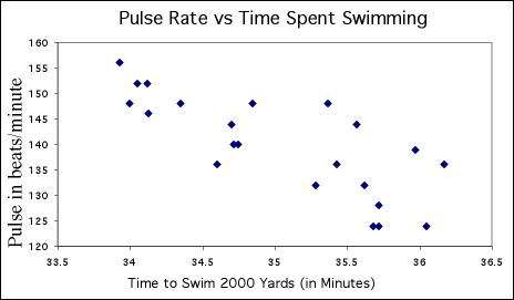
A scatterplot is a graphical display of the relationship between two quantitative variables. The explanatory variable is plotted on the horizontal axis (x), and the response variable is plotted on the vertical axis (y).
Purpose: To visually assess the form, direction, and strength of the relationship between two variables.
Example: Internet usage vs. GDP, batting average vs. team scoring.
Interpreting Scatterplots
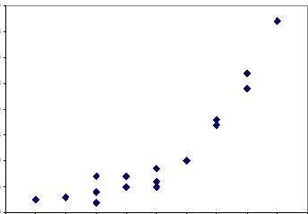
The overall pattern of a scatterplot can be described by its trend (form), direction, and strength. Outliers should also be identified.
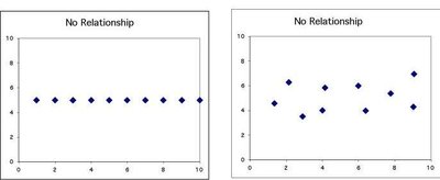
Trend (Form): Linear, curved, clusters, or no pattern.
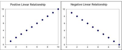
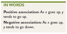
Direction: Positive (both variables increase together), negative (one increases as the other decreases), or no direction.
Strength: How closely the points follow the trend.
Outliers: Points that deviate significantly from the overall pattern.
Strength of Association
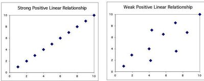
The strength of the relationship is indicated by how much variation there is around the main form. A strong relationship means that knowing the value of one variable allows for a good estimate of the other.
Linear Correlation Coefficient (r)
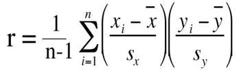
The correlation coefficient (r) measures the strength and direction of the linear association between two quantitative variables. It ranges from -1 to +1.
Positive r: Indicates a positive association.
Negative r: Indicates a negative association.
r close to 0: Indicates a weak association.
r close to +1 or -1: Indicates a strong linear association.
Formula:
Properties of Correlation
Always falls between -1 and +1.
Sign denotes direction: (+) positive, (-) negative.
Unitless measure; does not depend on the variables’ units.
Symmetric: Same value regardless of which variable is response or explanatory.
Not resistant to outliers.
Only measures strength of linear relationship.
Calculating Correlation
Correlation is calculated using the means and standard deviations of both variables. Standardization allows comparison between data sets with different units.
Formula:
Outliers and Influential Points
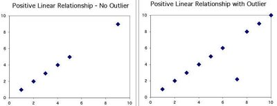
An outlier is a data value that is unusual or unexpected. Outliers can significantly affect the correlation coefficient and the regression line.
Outliers may decrease the strength of correlation.
Influential points can change the direction or form of the relationship.
Lesson Summary
The value of the response variable depends on the explanatory variable.
For two categorical variables, use contingency tables to summarize association.
For two quantitative variables, use scatterplots and measure strength and direction with correlation (r).
Strong linear association: r close to +1 or -1.
Outliers must be identified and evaluated for their influence.
