 Indietro
Association, Correlation, and Regression: Understanding Relationships Between Variables
Guida di studio - Note intelligenti
 Appunti personalizzati basati sui tuoi materiali, ampliati con definizioni chiave, esempi e contesto.
Association Between Variables
Understanding Association
When two variables are measured on the same individuals or cases, they are said to be associated if knowing the value of one variable provides information about the value of the other. Association is a foundational concept in statistics, especially when analyzing relationships between quantitative variables.
For single variables: Examine the overall pattern, shape, center, spread, and presence of outliers.
For pairs of variables: Assess the overall pattern, trend, shape of the trend, strength of association, and any outliers or unusual values.
Roles of Variables
Explanatory and Response Variables
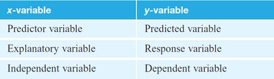
In studies involving two variables, it is important to distinguish between the variable that is used for prediction (explanatory) and the variable being predicted (response). The terminology varies but is summarized in the table below:
x-variable | y-variable |
|---|---|
Predictor variable | Predicted variable |
Explanatory variable | Response variable |
Independent variable | Dependent variable |
Examples:
Tickets sold (response) vs. runs scored (explanatory) in baseball teams.
Grades (response) vs. SAT score (explanatory) for students.
BMI (response) vs. wrist size (explanatory) for individuals.
Scatterplots
Visualizing Relationships
A scatterplot is a graphical tool used to display the relationship between two quantitative variables. Each point represents an individual case, with one variable on the x-axis and the other on the y-axis.
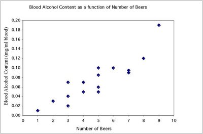
Key features to observe:
Direction (positive or negative association)
Form (linear or nonlinear)
Strength (how closely points follow a pattern)
Outliers (points that deviate from the pattern)
Direction of Association
Positive and Negative Relationships
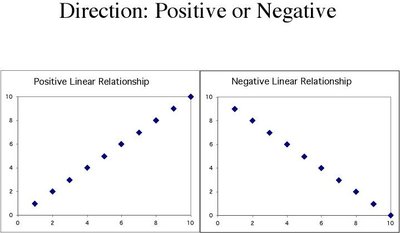
The direction of association describes how the variables move together:
Positive association: High values of one variable tend to occur with high values of the other.
Negative association: High values of one variable tend to occur with low values of the other.
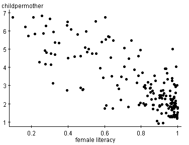
Example: As female literacy increases, the number of children per mother decreases, indicating a negative association.
No Relationship
Independence of Variables
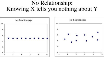
When there is no association, knowing the value of one variable does not provide any information about the other. The scatterplot appears as a random cloud of points.
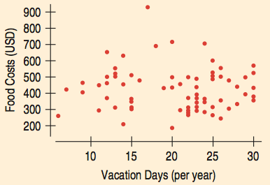
Example: The scatterplot of vacation days and food costs shows no clear pattern, indicating no linear relationship.
Form of Association
Linear and Nonlinear Relationships
The form of the association describes the shape of the relationship:
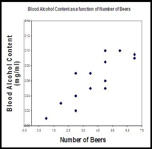
Linear: Points cluster around a straight line.
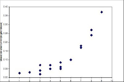
Nonlinear (curved): Points follow a curved pattern.
No relationship: Points are scattered with no discernible pattern.
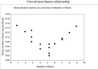
Strength of Association
Quantifying Strength
The strength of the association is determined by how closely the points follow the main form. A strong relationship means that knowing one variable gives a good estimate of the other, while a weak relationship means there is much scatter.
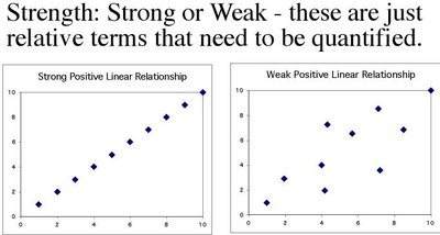
Strong relationship: Points are close to the line or curve.
Weak relationship: Points are widely scattered.
Correlation
Measuring Linear Association
Correlation (denoted as r) quantifies the direction and strength of a linear relationship between two quantitative variables. The value of r ranges from -1 to +1:
r > 0: Positive association
r < 0: Negative association
r = 1 or -1: Perfect linear relationship
r = 0: No linear relationship
The formula for correlation is:
where and are the values of the variables, and are their means, and and are their standard deviations.
Properties of correlation:
Unitless measure
Unaffected by interchanging x and y
Only measures linear relationships
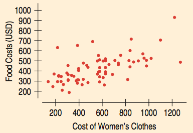
Example: The correlation between cost of women’s clothes and food costs is r = 0.614, indicating a strong positive association.
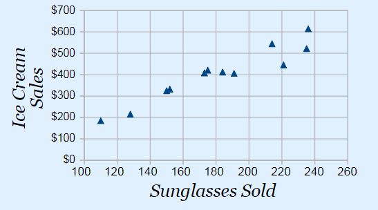
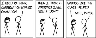
Important: Correlation does not imply causation. A third variable (lurking variable) may influence both variables.
Outliers
Identifying Outliers
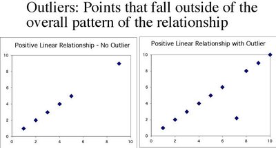
An outlier is a data point that stands away from the overall pattern of the scatterplot. Outliers can have a significant impact on correlation and regression analysis and should always be investigated.

Regression
The Regression Line (Line of Best Fit)
A regression line is a straight line that best describes the relationship between the explanatory and response variables. It is used to predict the average value of the response variable for a given value of the explanatory variable.
Equation of the regression line:
is the predicted value of y
is the slope (change in y for a one-unit increase in x)
is the y-intercept (predicted value of y when x = 0)
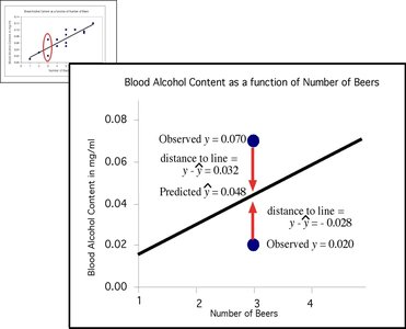
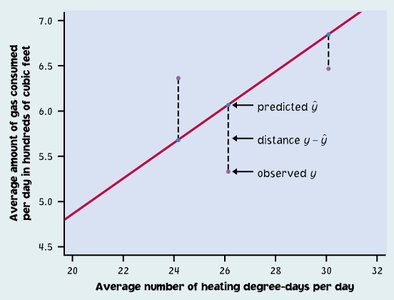
The least-squares regression line minimizes the sum of the squared vertical distances between the observed values and the line.
Example: Predicting fat content from protein in Burger King menu items. Slope = 0.91 means each additional gram of protein is associated with 0.91 more grams of fat.
Interpreting the Regression Line
Making Predictions
The regression line can be used to make predictions within the range of the data. For example, if a sandwich contains 31g of protein, the regression line can predict its fat content.
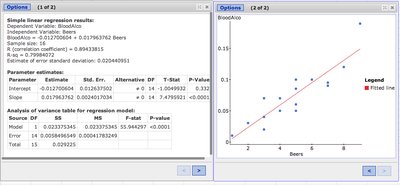
Important: Do not use the regression line to predict values outside the range of the data (extrapolation).
Residuals
Measuring Prediction Error
A residual is the difference between the observed value and the value predicted by the regression line:
Points above the line have positive residuals.
Points below the line have negative residuals.
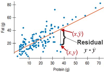
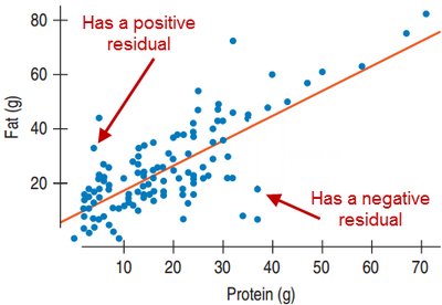
Example: If the actual fat content is 22g but the predicted value is 36.6g, the residual is -14.6g.
Summary Table: Variable Roles
x-variable | y-variable |
|---|---|
Predictor variable | Predicted variable |
Explanatory variable | Response variable |
Independent variable | Dependent variable |
Additional info: These notes cover the core concepts of correlation and regression, including the interpretation of scatterplots, the calculation and meaning of correlation, the construction and use of regression lines, and the importance of residuals and outliers. These are essential topics for understanding relationships between quantitative variables in introductory statistics.
