 Indietro
Describing Data Numerically: Mean, Median, Standard Deviation, and Boxplots
Guida di studio - Note intelligenti
 Appunti personalizzati basati sui tuoi materiali, ampliati con definizioni chiave, esempi e contesto.
Describing Data Numerically
Mean vs. Median
The mean and median are two common measures of the center of a data set. For symmetric distributions, the mean and median are equal, and the balancing point is at the center of the distribution. However, the mean is more sensitive to outliers and skewed data than the median. In skewed distributions, the mean is "pulled" toward the tail more than the median, making the median a better measure of center for such data.
Mean: The arithmetic average of all data values.
Median: The middle value when data are ordered from least to greatest.
Outlier Effect: Outliers have a greater effect on the mean than on the median.
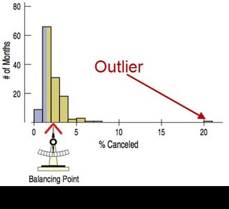
Example: In a distribution of flight cancellations, an outlier month with a very high cancellation rate pulls the mean to the right, while the median remains closer to the bulk of the data.
Standard Deviation and Variance
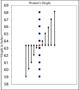
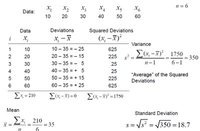
The standard deviation is a measure of how spread out the data values are around the mean. It is calculated as the square root of the variance, which is the average of the squared deviations from the mean. Like the mean, the standard deviation is not resistant to outliers or skewed data.
Variance (s2):
Standard Deviation (s):
Interpretation: The standard deviation describes the typical distance of data points from the mean.
Calculation Steps:
Find the mean of the data.
Calculate the deviation of each data point from the mean.
Square each deviation.
Find the average of the squared deviations (variance).
Take the square root of the variance (standard deviation).
Example: Calculating the mean and standard deviation for a set of book costs at U.S. airports. If the mean is $651 and the standard deviation is $359, the data are considered spread out.
Comparing Variability: Diversity and Standard Deviation
Standard deviation can be used to compare the variability (diversity) of different data sets. A larger standard deviation indicates greater spread among the data values.
Fleet 1: Data values are evenly spread out.
Fleet 2: Data values are clustered at the extremes, resulting in a larger standard deviation.
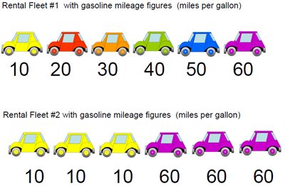
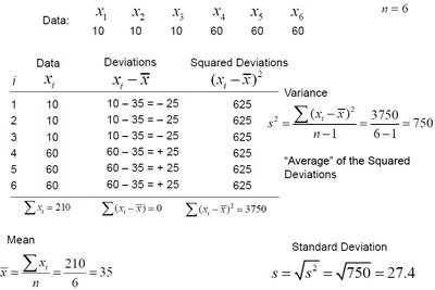
Example: Fleet 2 has a larger standard deviation than Fleet 1, indicating more diversity in mileage figures.
Percentiles, Quartiles, and Interquartile Range (IQR)
Percentiles divide data into 100 equal parts. The nth percentile is the value below which n percent of the data fall. The median is the 50th percentile. The first quartile (Q1) is the 25th percentile, and the third quartile (Q3) is the 75th percentile.
Interquartile Range (IQR): The difference between Q3 and Q1, representing the range of the middle 50% of the data.
Formula:
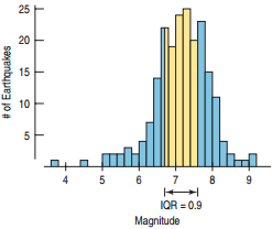
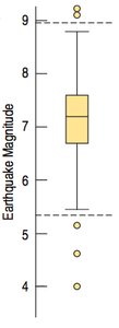
Example: For earthquake magnitudes, if Q1 = 6.7 and Q3 = 7.6, then IQR = 0.9.
Calculating Quartiles in StatCrunch
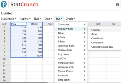
Statistical software such as StatCrunch can be used to calculate quartiles and other summary statistics efficiently. To find Q1 and Q3 in StatCrunch, use the menu: Stat → Summary Stats → Columns.
Boxplots (Box-and-Whisker Plots)
A boxplot is a graphical representation of the distribution of a data set using the five-number summary: minimum, Q1, median, Q3, and maximum. The box shows the IQR, the line inside the box marks the median, and the "whiskers" extend to the most extreme data values within the fences. Outliers are plotted individually.
Five-number summary: Minimum, Q1, Median, Q3, Maximum
Fences: Boundaries for identifying outliers, calculated as:
Lower Fence: Upper Fence:
Any data value outside the fences is considered an outlier.
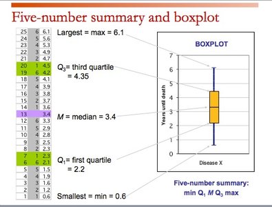
Example: For book costs, if Q1 = $500, Q3 = $670, and IQR = $170, then the lower fence is $245 and the upper fence is $925. Any value below $245 or above $925 is an outlier.
Finding the Fences: Example Calculation
To determine outliers using the 1.5 × IQR rule:
Lower Fence:
Upper Fence:
Example: For earthquake magnitudes, Q1 = 6.7, Q3 = 7.6, IQR = 0.9:
Lower Fence:
Upper Fence:
Values below 5.35 or above 8.95 are considered outliers.
Creating Boxplots in StatCrunch
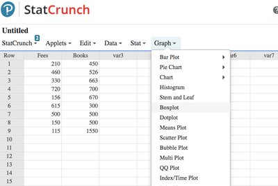
To create a boxplot in StatCrunch, use the menu: Graph → Boxplot.
Additional info: These concepts are foundational for describing and interpreting data distributions in introductory statistics. Understanding the differences between measures of center and spread, and how to visualize them, is essential for effective data analysis.
