 Indietro
Describing, Exploring, and Comparing Data: Measures of Center and Variation
Guida di studio - Note intelligenti
 Appunti personalizzati basati sui tuoi materiali, ampliati con definizioni chiave, esempi e contesto.
Describing, Exploring, and Comparing Data
Measures of Center
Measures of center summarize a data set with a single value that represents the middle or center of its distribution. The three most common measures are the mean, median, and mode.
Mean
The mean (or average) is calculated by summing all values in a data set and dividing by the number of values. It is sensitive to extreme values (outliers), which can significantly affect its value.
Formula for the sample mean:
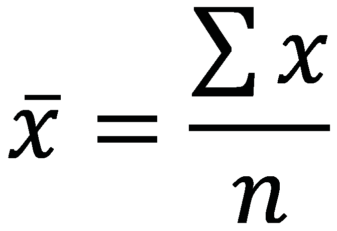
Example: For the data set {5, 10, 12, 14, 3}, the mean is .
Application: The mean is best used for symmetric distributions without outliers.
Median
The median is the middle value when the data are ordered from smallest to largest. If the number of values is even, the median is the average of the two middle values. The median is resistant to outliers.
Steps to find the median:
Sort the data from smallest to largest.
If n is odd, the median is the middle value.
If n is even, the median is the average of the two middle values.
Example: For the data set {5, 10, 12, 14, 3}, sorted: {3, 5, 10, 12, 14}, the median is 10.
Application: The median is preferred when the data set contains outliers or is skewed.
Mode
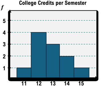
The mode is the value(s) that occur most frequently in a data set. A data set may have one mode (unimodal), two modes (bimodal), or more than two modes (multimodal). The mode can be used for both quantitative and qualitative data.
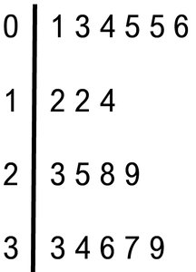
Example (Quantitative): In the data set {0, 0, 0, 2, 2, 3, 4, 1, 2, 2, 0, 4, 1, 3, 0}, the mode is 0.
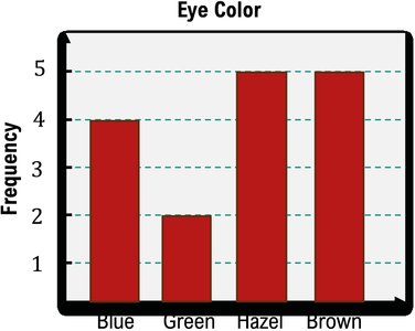
Example (Qualitative): For eye color data, the mode is the color with the highest frequency.
Comparing Mean, Median, and Mode
Each measure of center has advantages and disadvantages depending on the data distribution:
Mean: Uses all values, but is not resistant to outliers.
Median: Resistant to outliers, but does not use all values.
Mode: Useful for categorical data and identifying the most common value.
Measures of Variation
Measures of variation describe the spread or dispersion of data values. The most common are range, variance, and standard deviation.
Standard Deviation
The standard deviation (s for sample, σ for population) measures the average distance of data values from the mean. A larger standard deviation indicates more spread out data.
Formula for sample standard deviation:

Example: For the data set {5, 10, 12, 14, 3, 4}, calculate the mean and then use the formula above to find s.
Interpretation: s = 0 means no spread; higher s means more variability.
Comparing Spread with Graphs
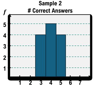
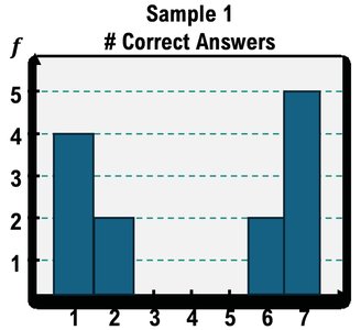
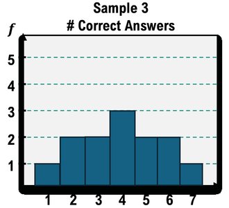
Histograms can visually show the spread of data. Samples with data clustered near the mean have lower standard deviation, while those with data spread out have higher standard deviation.
Describing Data Numerically Using a Calculator
For large data sets, calculators can quickly compute the mean, median, standard deviation, and quartiles. The TI-84 calculator is commonly used in statistics courses.
Enter data into a list (e.g., L1).
Use the STAT and CALC functions to select 1-Var Stats.
Read the output for mean (x̄), standard deviation (s), and quartiles (Q1, Q3).



Interpreting Standard Deviation: The Empirical Rule
The Empirical Rule applies to bell-shaped (normal) distributions and states:
About 68% of data falls within 1 standard deviation of the mean.
About 95% falls within 2 standard deviations.
About 99.7% falls within 3 standard deviations.
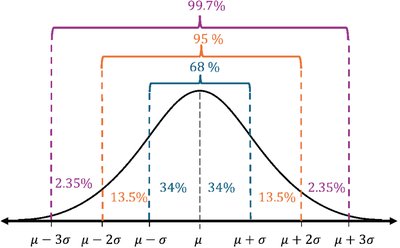
Application: Use the Empirical Rule to estimate the proportion of data within certain intervals.
Percentiles and Quartiles
Percentiles indicate the percentage of data values below a certain value. Quartiles divide data into four equal parts:
Q1: 25th percentile
Q2: 50th percentile (median)
Q3: 75th percentile
The Interquartile Range (IQR) is Q3 - Q1 and measures the spread of the middle 50% of data.
Percentile formula:
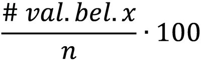
Example: For SAT scores, Q1 and Q3 can be found by ordering the data and finding the values at the 25th and 75th percentiles.
Boxplots (Box and Whisker Plots)
A boxplot visually displays the five-number summary: minimum, Q1, median, Q3, and maximum. It helps identify the spread, center, and potential outliers in a data set.
Example: Construct a boxplot for SAT scores or number of songs in playlists using the five-number summary.

Comparison: Boxplots can be used to compare distributions between groups (e.g., juniors vs. seniors).
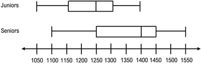
Summary Table: Measures of Center and Variation
Measure | Definition | Best Use | Sensitivity to Outliers |
|---|---|---|---|
Mean | Arithmetic average of all values | Symmetric distributions without outliers | Not resistant |
Median | Middle value when data is ordered | Skewed distributions or with outliers | Resistant |
Mode | Most frequent value(s) | Categorical or discrete data | Resistant |
Standard Deviation | Average distance from the mean | Quantitative data, normal distributions | Not resistant |
IQR | Q3 - Q1 | Skewed data, identifying outliers | Resistant |
