 Indietro
Exploring Data with Tables and Graphs: Visualizing and Summarizing Data
Guida di studio - Note intelligenti
 Appunti personalizzati basati sui tuoi materiali, ampliati con definizioni chiave, esempi e contesto.
Exploring Data with Tables and Graphs
Introduction to Visualizing Data
Visualizing data is a fundamental aspect of statistics, allowing us to summarize, interpret, and communicate information effectively. Different types of graphs are used depending on whether the data is qualitative (categorical) or quantitative (numerical).
Visualizing Qualitative (Categorical) Data
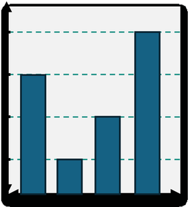
Bar Charts: Used to display the frequency of categories. Each bar represents a category, and the height or length of the bar corresponds to its frequency.
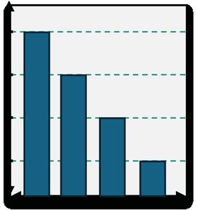
Pareto Charts: A special type of bar chart where categories are ordered from highest to lowest frequency.
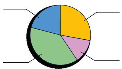
Pie Charts: Show the proportion of each category as a slice of a circle, with larger slices representing higher frequencies or percentages.
Visualizing Quantitative (Numerical) Data
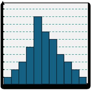
Histograms: Use adjacent bars to show the frequency of data within equal-width intervals (classes). Useful for displaying the shape of data distributions.
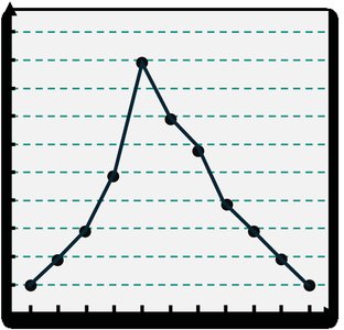
Frequency Polygons: Similar to histograms but use points connected by straight lines to show frequencies at class midpoints.
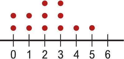
Dotplots: Each data value is represented by a dot above a number line, useful for small data sets.
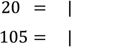
Stemplots (Stem-and-Leaf Plots): Show both the distribution and the actual data values by splitting each value into a "stem" (all but the last digit) and a "leaf" (the last digit).
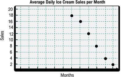
Time-Series Graphs: Display data points in chronological order, useful for identifying trends over time.
Frequency Distributions
Constructing Frequency Distributions
A frequency distribution is a table that organizes data into classes or intervals and shows the number of observations in each class.
Class Limits: The smallest and largest data values that can belong to a class.
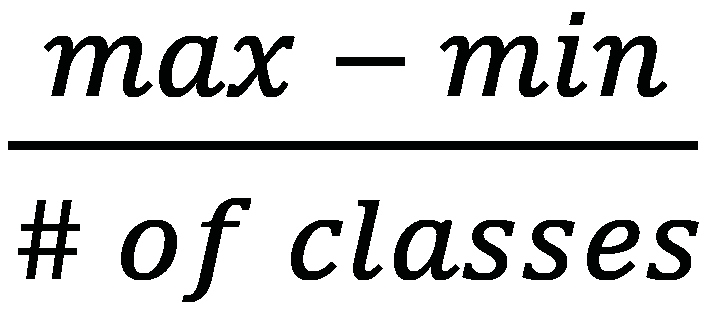
Class Width: The difference between the lower limits of consecutive classes. Calculated as:
$\frac{\text{max} - \text{min}}{\#\ \text{of classes}}$
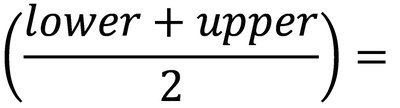
Class Midpoint: The value in the middle of each class interval, calculated as:
$\frac{\text{lower} + \text{upper}}{2}$
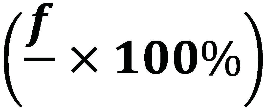
Relative Frequency: The proportion of data values in each class, calculated as:
$\left(\frac{f}{n} \times 100\%\right)$
Histograms
Understanding Histograms
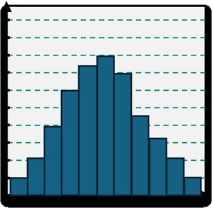
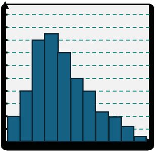
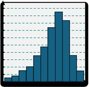
Histograms are graphical representations of frequency distributions for quantitative data. The x-axis represents class intervals (often labeled by class midpoints), and the y-axis shows frequencies. The shape of the histogram can reveal important features of the data distribution:
Normal (Bell-shaped): Symmetrical, with most data near the center.
Skewed Right: Data peaks on the left and trails off to the right.
Skewed Left: Data peaks on the right and trails off to the left.
Uniform: All classes have roughly equal frequencies.
Dotplots
Creating and Interpreting Dotplots
Dotplots are simple graphs for small data sets. Each dot represents one observation, and dots are stacked above each value on a number line. Dotplots are useful for comparing groups and identifying clusters or gaps in the data.
Stemplots (Stem-and-Leaf Plots)
How to Create a Stemplot
Stemplots display quantitative data by splitting each value into a stem (all but the last digit) and a leaf (the last digit). This method preserves the original data values while showing the distribution.
Order the data from smallest to largest.
List stems in a column and write leaves in rows next to their stems.
Time-Series Graphs
Understanding Time-Series Graphs
Time-series graphs plot data points in chronological order, connecting them with line segments. The x-axis represents time, and the y-axis represents the measured variable. These graphs are useful for identifying trends, cycles, and seasonal patterns.
Bar Graphs and Pareto Charts
Bar Graphs
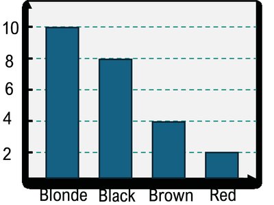
Bar graphs are used to display and compare the frequency of categories in qualitative data. The length or height of each bar is proportional to the frequency or count of each category.
Pareto Charts
Pareto charts are bar graphs with categories arranged in descending order of frequency, making it easy to identify the most significant categories.
Pie Charts
Creating and Interpreting Pie Charts
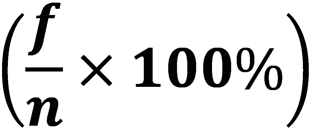
Pie charts show the proportion of each category as a sector of a circle. The size of each sector is proportional to the percentage or frequency of the category. To find the percentage for a category:
$\left(\frac{f}{n} \times 100\%\right)$
Frequency Polygons
Constructing Frequency Polygons
Frequency polygons are line graphs that use points plotted at the class midpoints and connected by straight lines. They are useful for comparing distributions and visualizing the shape of the data.
Key Formulas
Class Width: $\frac{\text{max} - \text{min}}{\#\ \text{of classes}}$
Class Midpoint: $\frac{\text{lower} + \text{upper}}{2}$
Relative Frequency: $\left(\frac{f}{n} \times 100\%\right)$
Example Application: Suppose you have a data set of exam scores. You can organize the scores into a frequency distribution, calculate class midpoints and relative frequencies, and then display the results using a histogram or frequency polygon to analyze the distribution's shape.
