 Indietro
Introductory Statistics Exam 1 Review – Guided Study Notes
Guida di studio - Note intelligenti
 Appunti personalizzati basati sui tuoi materiali, ampliati con definizioni chiave, esempi e contesto.
Q1. Identifying Population, Sample, Variables, and Statistics/Parameters
Background
Topic: Descriptive Statistics – Populations, Samples, Variables, and Statistical Measures
This question tests your understanding of the basic terminology in statistics, including how to distinguish between a population and a sample, identify variables, and classify them as qualitative or quantitative. It also asks you to determine whether a given value is a statistic or a parameter.
Key Terms:
Population: The entire group of individuals or items that you want to study.
Sample: A subset of the population, selected for actual analysis.
Variable: A characteristic or property that can take on different values among subjects in a study.
Qualitative Variable: Describes qualities or categories (not numerical).
Quantitative Variable: Describes numerical values (can be measured or counted).
Statistic: A numerical summary calculated from a sample.
Parameter: A numerical summary describing a population.
Step-by-Step Guidance
Identify the group that the study is interested in (all American college students) and the group actually surveyed (the 2041 students).
List the variables measured in the study (e.g., whether students lived at home, amount spent on textbooks).
Classify each variable as qualitative or quantitative. For quantitative variables, consider if they are measured numerically.
Determine whether the value $413 (average amount spent) is a statistic or a parameter by considering if it comes from the sample or the population.
Try solving on your own before revealing the answer!
Final Answer:
Population: All American college students
Sample: The 2041 American college students surveyed
Variables:
Amount spent on textbooks (quantitative)
Lived at home or not (qualitative)
$413 is a statistic because it is calculated from the sample, not the entire population.
Q2. Classifying Variables as Qualitative/Quantitative and Discrete/Continuous
Background
Topic: Types of Variables
This question asks you to classify variables as qualitative or quantitative, and if quantitative, as discrete or continuous. This is foundational for understanding how to analyze data.
Key Terms:
Qualitative Variable: Non-numeric, describes categories or qualities.
Quantitative Variable: Numeric, describes measurable quantities.
Discrete Variable: Quantitative variable that takes on countable values (e.g., number of students).
Continuous Variable: Quantitative variable that can take on any value within a range (e.g., time, height).
Step-by-Step Guidance
For each variable, ask: Is it a number or a category?
If it is a number, can it take on any value (continuous) or only specific values (discrete)?
Fill in the table for each variable, classifying as qualitative/quantitative and, if quantitative, as discrete/continuous.
Try solving on your own before revealing the answer!
Final Answer:
Time to complete a puzzle: Quantitative, Continuous
Eye Color: Qualitative
Rating of a Movie (1 to 5 Stars): Qualitative
Telephone number: Qualitative
Number of students in a class: Quantitative, Discrete
Q3. Levels of Measurement
Background
Topic: Levels of Measurement
This question tests your ability to identify the level of measurement for different variables: nominal, ordinal, interval, or ratio.
Key Terms:
Nominal: Categories with no order (e.g., eye color).
Ordinal: Categories with a meaningful order, but differences are not meaningful (e.g., movie ratings).
Interval: Ordered, differences are meaningful, but no true zero (e.g., temperature in Celsius).
Ratio: Ordered, differences and ratios are meaningful, true zero exists (e.g., time, height).
Step-by-Step Guidance
For each variable, ask: Is there a true zero? Are differences and ratios meaningful?
Classify each variable as nominal, ordinal, interval, or ratio based on its properties.
Try solving on your own before revealing the answer!
Final Answer:
Time to complete a puzzle: Ratio
Eye Color: Nominal
Rating of a Movie: Ordinal
Temperature of a lake: Interval
Favorite subject: Nominal
Q4. Identifying Types of Sampling
Background
Topic: Sampling Methods
This question asks you to identify the sampling method used in different scenarios: systematic, cluster, stratified, convenience, or simple random.
Key Terms:
Simple Random: Every member has an equal chance of being selected.
Systematic: Every nth member is selected.
Stratified: Population divided into groups (strata), then sampled from each group.
Cluster: Population divided into clusters, some clusters are chosen, all members in those clusters are sampled.
Convenience: Sample is chosen based on ease of access.
Step-by-Step Guidance
Read each scenario and identify keywords (e.g., "every 25th," "all residents on certain floors").
Match the scenario to the correct sampling method based on the definitions above.
Try solving on your own before revealing the answer!
Final Answer:
a. Stratified
b. Systematic
c. Convenience
d. Cluster
e. Simple Random
Q5. Relative Frequency Distribution and Bar Graph
Background
Topic: Frequency Distributions and Graphical Representation
This question asks you to convert frequencies to relative frequencies and to construct a bar graph based on those values.
Key Terms and Formulas:
Relative Frequency:
Bar Graph: A graphical display of data using bars of different heights.
Step-by-Step Guidance
Calculate the total number of responses by adding all frequencies.
For each response category, divide its frequency by the total to get the relative frequency.
List the relative frequencies in a table.
Draw a bar graph with response categories on the x-axis and relative frequencies on the y-axis.
Try solving on your own before revealing the answer!
Final Answer:
New Tolls: 0.410
Increase Taxes: 0.280
No new roads: 0.310
Bar graph: Bars at heights 0.410, 0.280, and 0.310 for each response.
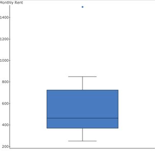
Q6. Interpreting a Boxplot of Monthly Storage Fees
Background
Topic: Boxplots (Box-and-Whisker Plots)
This question asks you to interpret a boxplot, including estimating the median, identifying outliers, and describing the spread of the data.
Key Terms:
Median: The middle value of the data set.
Quartiles (Q1, Q3): Values that divide the data into quarters.
Interquartile Range (IQR):
Outlier: A value that lies outside or
Step-by-Step Guidance
Estimate the median by finding the line inside the box.
Estimate the value below which 75% of the data fall (Q3 or upper whisker).
Look for any points plotted separately from the box and whiskers (potential outliers).
Identify the range of the middle 50% of the data (from Q1 to Q3).
Try solving on your own before revealing the answer!
Final Answer:
a. Median: $450
b. 75% pay less than $750
c. Yes, $1500 is an outlier
d. Middle 50% pay between $375 and $750
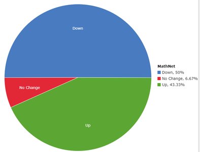
Q7. Interpreting a Pie Chart (Stock Price Changes)
Background
Topic: Pie Charts and Proportions
This question asks you to use a pie chart to determine the number of days a stock price went up, given the total number of days observed.
Key Terms and Formulas:
Pie Chart: A circular chart divided into sectors representing proportions.
Proportion Calculation:
Step-by-Step Guidance
Identify the proportion of days the stock went up from the pie chart (e.g., 43.33%).
Multiply the total number of days (300) by the proportion (as a decimal).
Try solving on your own before revealing the answer!
Final Answer:
Number of days up = 300 × 0.4333 ≈ 130 days
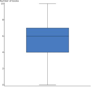
Q8. Interpreting a Boxplot (Books Read Over Summer)
Background
Topic: Boxplots and Data Interpretation
This question asks you to interpret a boxplot, including identifying outliers, quartiles, and the percentage of data below a certain value.
Key Terms:
Q1 (First Quartile): Value below which 25% of the data fall.
Q3 (Third Quartile): Value below which 75% of the data fall.
Outlier: A value that is unusually far from the rest of the data.
Step-by-Step Guidance
Check for any points outside the whiskers (outliers).
Estimate Q1 from the left edge of the box.
Estimate the percentage of students below a certain value using the boxplot's quartiles.
Identify the interval representing the middle 50% (from Q1 to Q3).
Try solving on your own before revealing the answer!
Final Answer:
a. No outliers
b. Q1 = 4 books (25% read ≤ 4 books)
c. 75% read less than 7 books
d. Middle 50%: 4 to 7 books
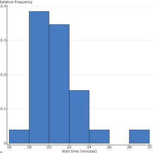
Q9. Interpreting a Relative Frequency Histogram (Wait Times)
Background
Topic: Histograms and Relative Frequency
This question asks you to estimate percentages and counts from a histogram, and to describe the shape of the distribution.
Key Terms:
Relative Frequency: Proportion of observations in each interval.
Histogram: Bar graph showing frequency or relative frequency for intervals of a variable.
Distribution Shape: Describes the overall pattern (e.g., skewed right, symmetric).
Step-by-Step Guidance
Estimate the proportion of customers in each interval by looking at the bar heights.
Add up the proportions for intervals above or below the specified values.
To find the number of customers, multiply the proportion by the total sample size (e.g., 500).
Describe the shape by noting where the bars are tallest and how they taper off.
Try solving on your own before revealing the answer!
Final Answer:
a. 23% waited more than 22 minutes
b. 43% waited less than 20 minutes
c. 75 customers waited between 22 and 24 minutes
d. Distribution is right skewed
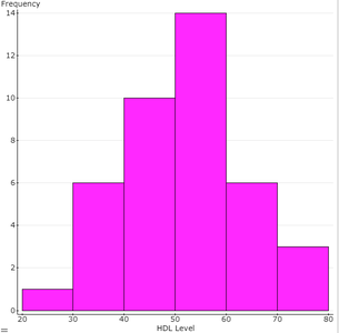
Q10. Frequency Distribution and Histogram for HDL Cholesterol
Background
Topic: Frequency Distributions and Histograms
This question asks you to organize data into a frequency distribution, create a histogram, and identify the mode.
Key Terms and Formulas:
Frequency Distribution: Table showing how many data values fall into each class interval.
Histogram: Bar graph representing the frequency distribution.
Mode: The value that appears most frequently in the data set.
Step-by-Step Guidance
Determine the class intervals starting at 20, with a width of 10 (e.g., 20–29, 30–39, etc.).
Count how many data values fall into each interval and fill in the frequency table.
Draw a histogram with intervals on the x-axis and frequencies on the y-axis.
Identify the mode by finding the value that occurs most often.
Try solving on your own before revealing the answer!
Final Answer:
a. Frequency distribution:
20–29: 1
30–39: 6
40–49: 10
50–59: 15
60–69: 5
70–79: 3
b. Histogram matches the table above.
c. Mode = 51 mg/dL
