 Indietro
Introductory Statistics Test 1 Review – Step-by-Step Study Guidance
Guida di studio - Note intelligenti
 Appunti personalizzati basati sui tuoi materiali, ampliati con definizioni chiave, esempi e contesto.
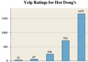
Q13. The following graph shows the ratings (1-5 stars) on Yelp for Hot Doug’s Restaurant. Label the x and y axis.
Background
Topic: Frequency Distributions & Data Visualization
This question tests your ability to interpret and label axes on a bar graph (histogram) that displays frequency data. Understanding how to label axes is fundamental for correctly reading and presenting statistical graphs.
Key Terms:
Frequency: The number of times a particular value or category occurs.
Histogram: A bar graph representing the frequency of data values in different categories or intervals.
Axis labels: The descriptions for the horizontal (x) and vertical (y) axes that clarify what is being measured.
Step-by-Step Guidance
Examine the horizontal axis (x-axis) of the graph. Identify what categories or values are being represented. In this case, the bars correspond to Yelp star ratings (1, 2, 3, 4, 5).
Examine the vertical axis (y-axis). Determine what the numbers represent. Here, the numbers (35, 67, 246, 724, 1675) indicate the frequency of each rating.
Think about appropriate labels: The x-axis should describe the rating categories, and the y-axis should describe the frequency/count of ratings.
Set up your axis labels, but do not write them yet. Consider: "Yelp Star Rating" for the x-axis and "Number of Ratings" or "Frequency" for the y-axis.
Try solving on your own before revealing the answer!
Final Answer:
X-axis label: Yelp Star Rating
Y-axis label: Number of Ratings (or Frequency)
The x-axis shows the possible star ratings (1–5), and the y-axis shows how many people gave each rating.
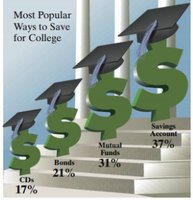
Q14. The following is a USA Today-type graph. Do you think the graph is misleading? Why? If you think it is misleading, what might be done to improve the graph?
Background
Topic: Data Visualization & Graphical Misrepresentation
This question tests your ability to critically evaluate graphs for potential misleading features and suggest improvements. Recognizing misleading graphs is important for interpreting statistics accurately.
Key Terms:
Misleading graph: A graph that visually exaggerates or distorts the data, often through inappropriate scaling, sizing, or design choices.
Proportionality: The visual elements should accurately reflect the numerical values.
Axis scaling: The way the axes are scaled can affect how data is perceived.
Step-by-Step Guidance
Examine the graph carefully. Notice the sizes of the dollar signs and the graduation caps. Do they accurately reflect the percentages shown?
Compare the visual sizes to the actual data values. For example, does the largest dollar sign visually represent 37% compared to the others?
Think about how the graph could mislead viewers. For instance, if the dollar signs are not scaled proportionally to the percentages, viewers might overestimate differences.
Consider improvements: What changes could make the graph more accurate? Ideas include using a bar graph with proportional heights, or scaling the dollar signs correctly.
Try solving on your own before revealing the answer!
Final Answer:
Yes, the graph is misleading. The dollar signs are not scaled proportionally to the percentages, so the visual impact exaggerates the differences between categories.
To improve the graph, use a bar graph with heights proportional to the percentages, or scale the dollar signs accurately. Avoid using pictorial elements that distort the data.
