 Indietro
Scatterplots, Association, and Correlation: Study Notes
Guida di studio - Note intelligenti
 Appunti personalizzati basati sui tuoi materiali, ampliati con definizioni chiave, esempi e contesto.
Scatterplots, Association, and Correlation
Introduction to Scatterplots
Scatterplots are essential tools in statistics for visualizing the relationship between two quantitative variables measured on the same cases. Each point on a scatterplot represents a pair of values (x, y) for a single case, allowing us to observe patterns, trends, and potential associations between variables.
When to Use a Scatterplot
Purpose: To examine the association between two quantitative variables.
Data Structure: Each point corresponds to one case, with coordinates (x, y).
Common Applications: Comparing measurements such as height vs. weight, age vs. income, or, as in the Kentucky Derby example, year vs. winning speed.
Describing a Scatterplot
To describe a scatterplot, focus on four main features:
Feature | What to Look For |
|---|---|
Direction | Positive, negative, or no clear direction |
Form | Linear, nonlinear, or no recognizable form |
Strength | How tightly points follow a single stream or pattern |
Anything unusual | Outliers, clusters, gaps, or changes in pattern |
Practice sentence: There is a [direction] association that is approximately [form] and [strength], with [anything unusual].
Example: Kentucky Derby Winning Speed
The scatterplot below shows the speed (in miles per hour) of Kentucky Derby winning horses each year since 1874. This example can be described using the four features above.
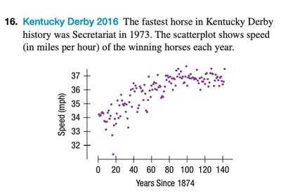
Direction: Positive (as years increase, speed tends to increase)
Form: Approximately linear
Strength: Moderately strong, with points closely following a trend
Anything unusual: Possible outliers or years with unusually high or low speeds
Axis and Variable Roles
Horizontal axis (x): Explanatory variable (independent variable)
Vertical axis (y): Response variable (dependent variable)
Conditions for Discussing Correlation (r)
Before interpreting the correlation coefficient, ensure the following conditions are met:
Condition | Requirement |
|---|---|
1 | Two quantitative variables |
2 | Straight enough (relationship is approximately linear) |
3 | Nothing unusual, especially no influential outliers |
Class rule: Always look at the scatterplot before interpreting r.
Correlation Coefficient (r)
Formula:
Sign of r: Indicates the direction of the linear association (positive or negative).
Magnitude |r|: Indicates the strength of the linear association (closer to 1 means stronger).
Possible values:
Units: Correlation has no units.
Symmetry: Switching x and y gives the same value of r.
Interpreting Scatterplots and Correlation
When analyzing a scatterplot, consider how outliers or unusual points may affect the correlation. Points in certain regions contribute positively or negatively to r, depending on their position relative to the overall trend.
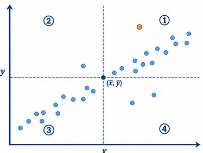
Points in regions 1 and 3: Make positive contributions to r (they reinforce the trend).
Points in regions 2 and 4: Make negative contributions to r (they weaken the trend).
Outliers: Can have a large influence on the value of r, especially if they are far from the main cluster of points.
Worked Example: Drug Abuse Data
A survey reports the percentage of teenagers who used marijuana and other drugs in various countries. To analyze the association:
Explanatory variable (x): Percentage who used marijuana
Response variable (y): Percentage who used other drugs
Country | Marijuana (%) | Other Drugs (%) |
|---|---|---|
Czech Republic | 22 | 4 |
Denmark | 17 | 3 |
England | 40 | 21 |
Finland | 5 | 1 |
Ireland | 37 | 16 |
Italy | 19 | 8 |
Northern Ireland | 23 | 14 |
Norway | 6 | 3 |
Portugal | 7 | 3 |
Scotland | 53 | 31 |
USA | 34 | 24 |
Direction: Positive (higher marijuana use tends to be associated with higher other drug use)
Form: Approximately linear
Strength: Moderate to strong
Anything unusual: Check for outliers or countries that do not fit the trend
Before calculating r, check the three conditions: two quantitative variables, straight enough, and nothing unusual. If these are met, correlation is appropriate.
Calculating and Interpreting r
Prediction: Based on the scatterplot, predict the sign and approximate value of r (positive, close to 1 for strong association).
Calculation: Use statistical software or a calculator to compute r.
Interpretation: For example, "There is a positive, strong, approximately linear association between marijuana use and other drug use among teenagers in these countries."
Switching variables: Switching x and y does not change r, since correlation is symmetric.
Correlation vs. Causation
A large value of |r| shows a strong linear association, but it does not prove causation. Other possible reasons for an association include:
Confounding variables
Coincidence
Reverse causation
Quick Check: True or False
r = -0.85 represents a stronger linear association than r = 0.40. True
If r = 0, there is no relationship of any kind. False (there may be a nonlinear relationship)
A strong correlation proves causation. False
Before interpreting r, look at the scatterplot. True
